

Mastering colour is a fundamental component of personal branding. For the successful man, understanding which colours to combine is a strategic tool, projecting authority, sophistication, and an unwavering attention to detail.
The simplest way to match colours however is to know which two colours go well together.
Certain colour pairings have achieved timeless status for their unerring effectiveness. Integrate these into your core rotation immediately.
Navy Blue & White
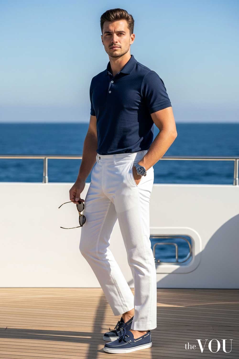
This is arguably the most essential combination in menswear. It is clean, crisp, and projects an air of effortless command.
A sharp navy suit with a brilliant white shirt is the foundation of power dressing. For a more relaxed setting, a navy polo with white trousers is equally authoritative.
Grey & Black
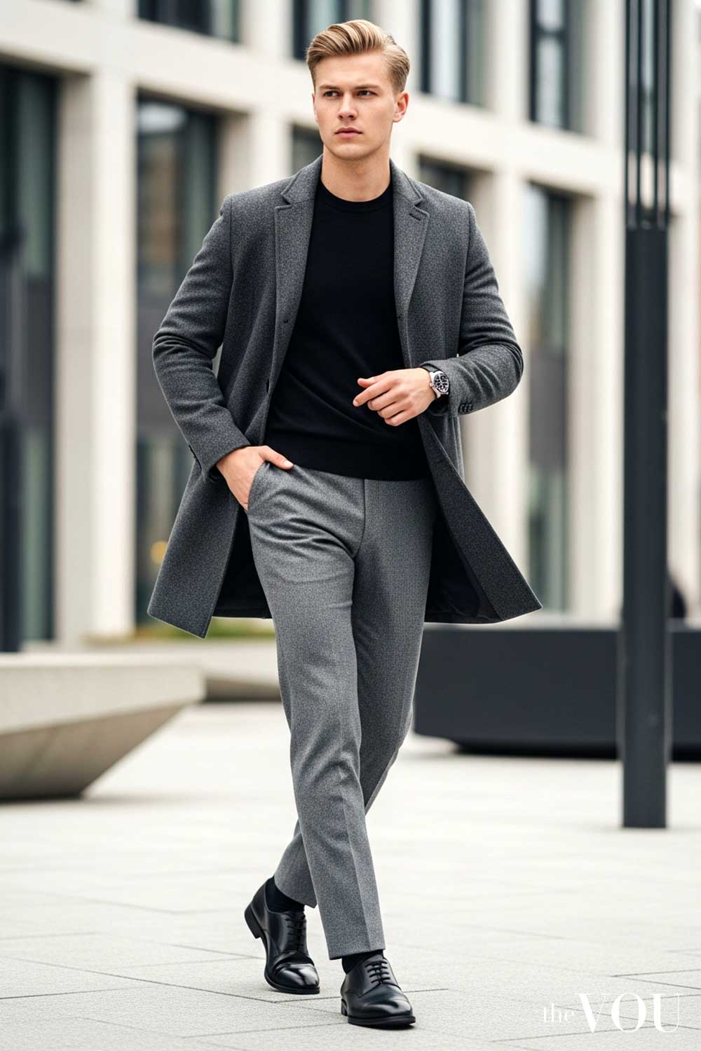
The combination of grey and black is modern, minimalist, and severe. It communicates a focus on form and structure over superfluous detail.
Pair charcoal grey trousers with a black merino wool jumper for a look that is both powerful and understated. This palette is the signature of the urban professional.
Beige & Khaki
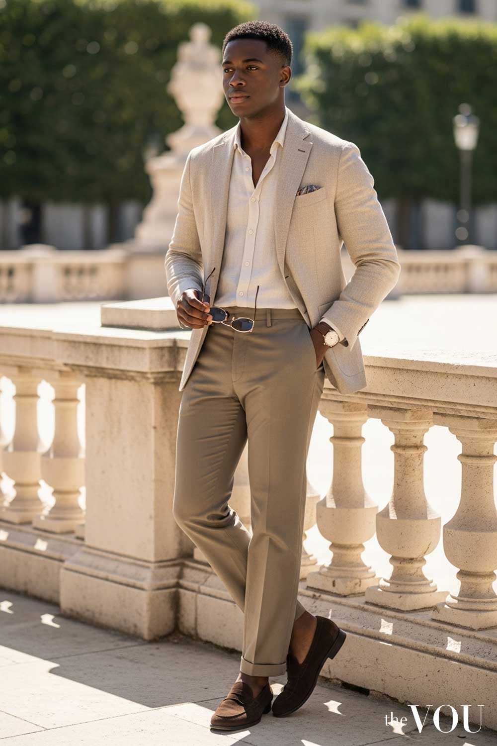
Pairing different shades of neutral tones like beige and khaki creates an understated and sophisticated look. It is a hallmark of intelligent, warm-weather dressing.
Combine a beige linen jacket with khaki chinos for a refined, smart-casual ensemble that speaks of relaxed confidence and worldly experience.
Brown & Cream
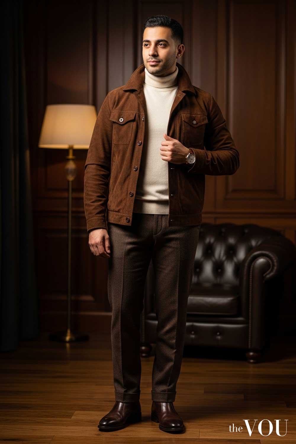
This pairing exudes warmth, luxury, and a connection to heritage. The contrast between the deep, earthy brown and the soft, elegant cream is both comforting and commanding.
Imagine a rich brown leather jacket worn over a thick cream cashmere knit. It is a combination that relies on texture as much as colour to project its superior quality.
Understanding Colour Theory
Before assembling a superior wardrobe, you must first grasp the principles that govern it. Colour theory, centred around the colour wheel, is the non-negotiable science behind visual harmony and contrast.
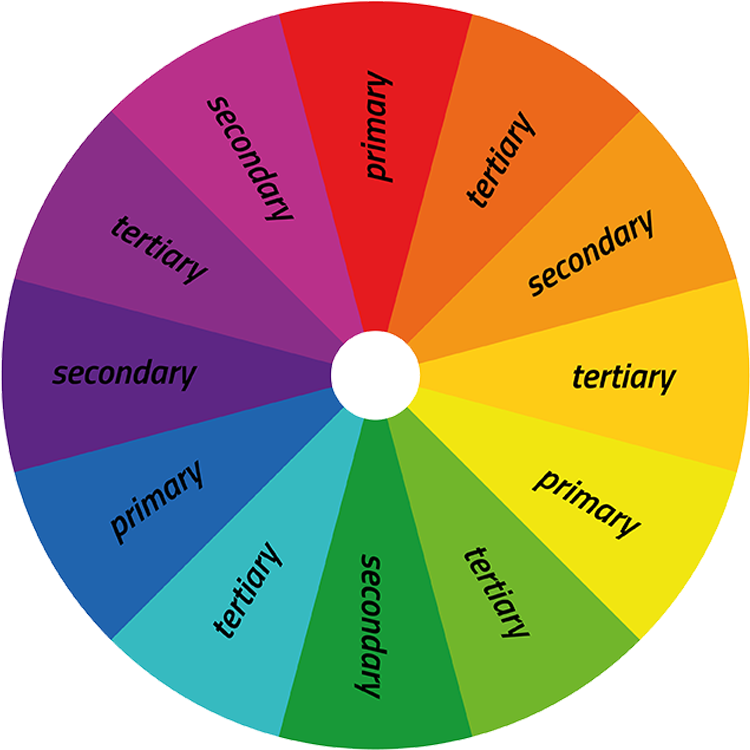
The colour wheel organises colours logically, revealing their relationships. It is comprised of three core categories; primary, secondary, and tertiary colours. Understanding this structure is the first step towards total sartorial control.
Primary Colours: The Building Blocks
Primary colours are the absolute foundation. They are Red, Yellow, and Blue.
These three hues cannot be created by mixing other colours. All other colours in existence are derived from them, making them the elemental source of your palette.
Secondary Colours: The First Mix
Secondary colours are forged by mixing two primary colours. This process yields Green (blue and yellow), Orange (red and yellow), and Purple (red and blue).
These colours offer a broader, yet still fundamental, range for building powerful combinations.
Tertiary Colours: The Nuanced Palette
Tertiary colours represent a more sophisticated level of colour mixing. They are created by combining a primary colour with an adjacent secondary colour.
The results are nuanced shades such as blue-green or red-orange. Mastering these demonstrates a deeper, more refined understanding of your palette.
Other Classic Colour Combinations Every Man Must Master
With a firm grasp of the theory, you can now execute with precision. Specific combinations produce distinct effects, and your task is to deploy the correct one for the desired outcome. These are the core strategies.
Complementary Colours
Complementary colours sit directly opposite each other on the colour wheel. This opposition creates the highest possible contrast, resulting in a bold and confident statement.
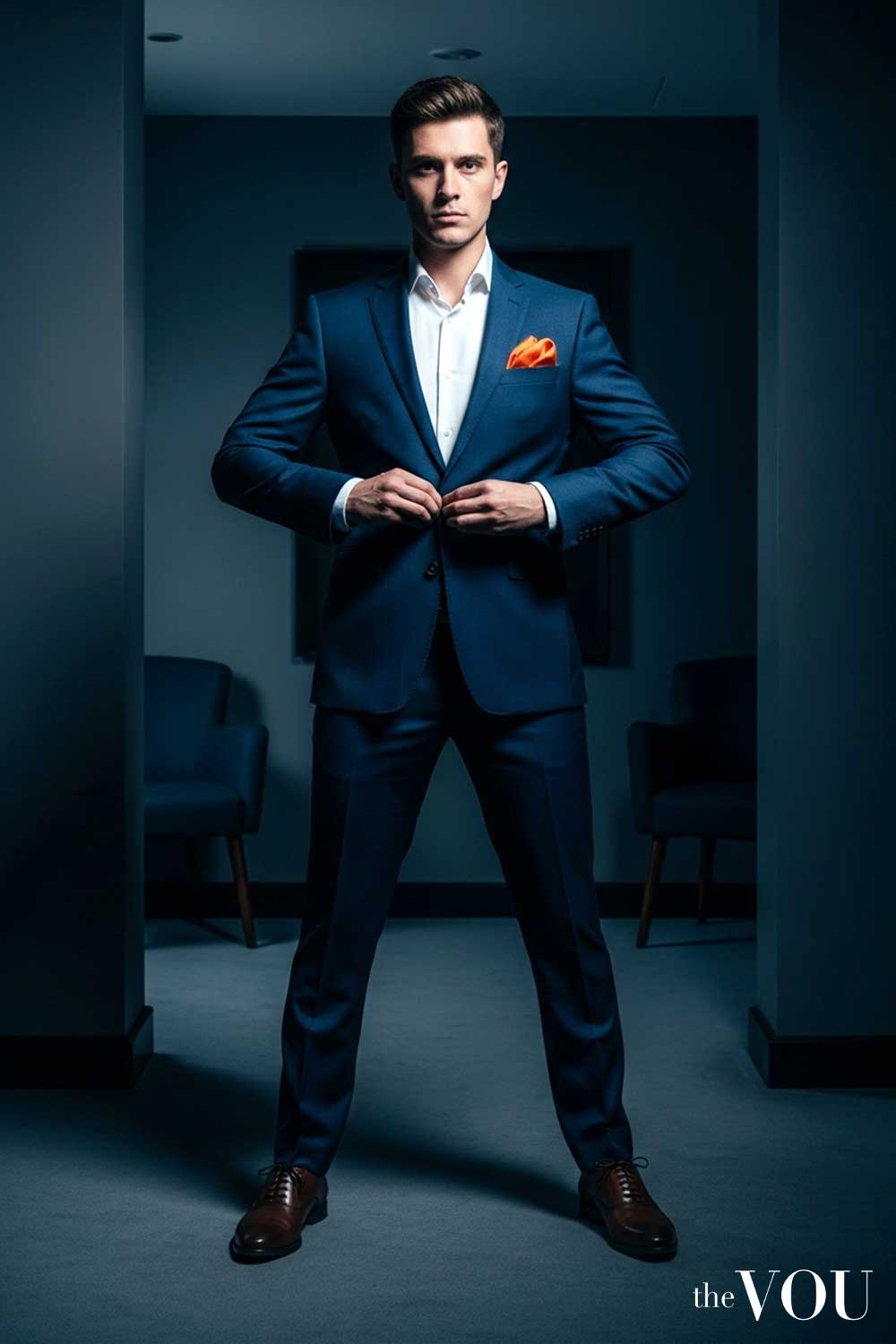
Key pairings include Blue and Orange, Red and Green, or Yellow and Purple. Deploy them when your objective is to be noticed. Use one colour as the base and the other as a sharp accent, such as an orange pocket square on a navy blazer.
Analogous Colours
Analogous colours are neighbours on the colour wheel. This proximity creates a low-contrast, harmonious effect that is exceptionally pleasing to the eye.
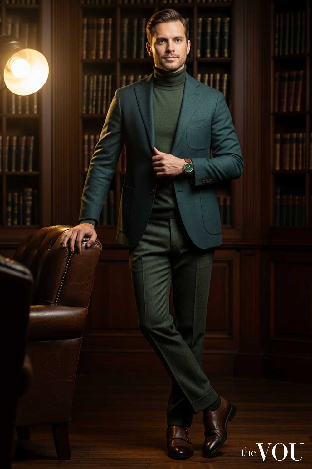
Think of blue paired with a blue-green, or a range of autumnal oranges and reds. This strategy projects a quiet, assured sophistication and is ideal for creating cohesive, elegant looks.
Triadic Colours
A triadic scheme uses three colours that are evenly spaced on the colour wheel, forming a triangle. This approach offers a dynamic balance of contrast and harmony.
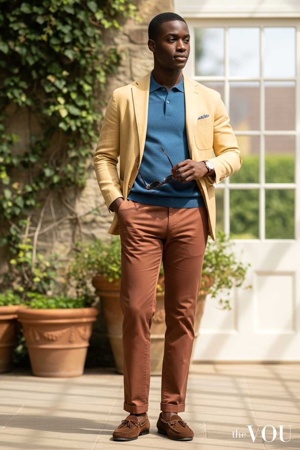
Whilst a classic example is Red, Yellow, and Blue, a more refined application might involve their subtler variants. The key is to let one colour dominate, using the other two as supporting accents for a vibrant yet controlled aesthetic.
Advanced Colour Strategies
Once you have mastered the foundational pairings, you can ascend to more advanced strategies. These techniques demonstrate a superior level of control and sartorial intelligence.
The Monochromatic Approach
A monochromatic outfit uses various shades, tints, and tones of a single colour. This is not a safe or boring choice; it is a deliberate and highly sophisticated statement.

Assembling an entire look from different shades of grey, from charcoal to dove, creates a powerful, textured, and visually cohesive appearance. It signals discipline and an impeccable eye for nuance.
Incorporating Neutrals as a Canvas
Neutrals are not merely ‘safe’ colours; they are the essential canvas upon which you build your look. Black, white, grey, navy, and beige provide the grounding that allows bolder colours to function effectively.
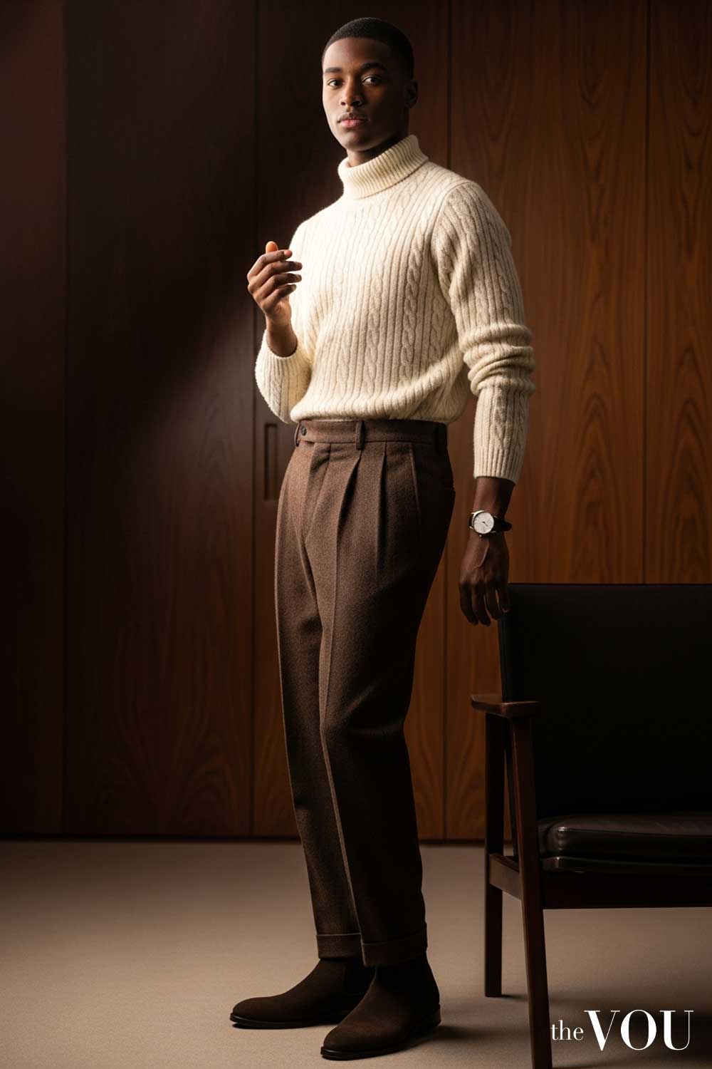
Use a neutral base like grey trousers and a white shirt to anchor a more vibrant piece, such as a burgundy blazer. The neutrals provide balance and prevent the statement colour from overwhelming.
The 60-30-10 Rule
Borrowed from interior design, the 60-30-10 rule provides a simple formula for a perfectly balanced outfit. It dictates a specific distribution of colour; 60% for your dominant colour, 30% for a secondary colour, and 10% for an accent.
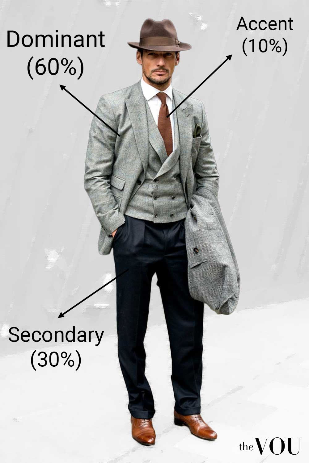
For example; a navy suit (60%) with a light blue shirt (30%) and a red pocket square (10%). This strategic allocation ensures harmony and prevents visual chaos.
Conclusion
Your choice of colour is never arbitrary. It is a declaration of your personal brand, a signal of your status, and a testament to your attention to detail.
By moving beyond guesswork and mastering the foundational principles of colour theory, you gain absolute control over your visual identity. Do not simply wear clothes. Instead, use colour as a strategic tool to build a wardrobe that is as intentional, powerful, and successful as you are.
Aidan Russell’s focus at The VOU is men’s face-shape styling, facial proportions and the way accessories frame the face. His coverage addresses a common starting question: how do you choose glasses, hats or necklines when standard face-shape advice does not quite describe your features?
His subject areas include comparing visible face length and width, recognising mixed features and understanding how frame size, brim shape and neckline placement change an overall look. Rather than making a shape label the final decision, this coverage connects proportions with the effect a reader wants, whether that means adding definition, softening an outline or drawing attention to particular features.
Aidan’s editorial focus also links facial styling with the rest of a man’s wardrobe. The aim is to make comparisons easier when trying on accessories or planning an outfit, while allowing for comfort, fit and personal preference. Readers looking for a starting point in face-shape styling can use this coverage to identify options worth trying, without being confined to one prescribed look.
Mandy Meyer’s focus at The VOU is men’s body-shape styling, garment fit and outfit proportions. Her coverage addresses the practical questions behind a wardrobe choice: how a jacket sits across the shoulders, how trousers fall and how different cuts change the silhouette a wearer wants to create.
Her subject areas include the triangle, inverted triangle, rectangle, oval, trapezoid, hourglass and diamond labels used in body-shape styling. These provide starting references for comparing visible proportions; they do not capture every body or prescribe one correct way to dress. The focus connects those observations with garment shape, construction, length and the relationship between the upper and lower parts of an outfit.
Mandy’s editorial coverage combines visual comparisons with fit checks for comfort and movement. Readers can consider whether a cut gives them the room they need, where clothing pulls or gathers and which changes might support their preferred look. The aim is to make menswear choices more understandable while keeping personal preferences and the wearer’s own styling goals central.
Sara Law’s focus at The VOU is men’s capsule wardrobes, outfit formulas and wardrobe curation. Her coverage addresses readers who want to get more useful combinations from their clothes, particularly across everyday and business-casual settings.
Her subject areas include coordinating shirts, trousers, knitwear, jackets and footwear, identifying gaps and understanding why certain combinations work together. This focus starts with the wearer’s routine and preferences rather than a fixed number of garments. A capsule wardrobe should reflect the situations a man needs to dress for, including the level of formality and the practical demands of his day.
Sara’s editorial coverage gives readers a way to organise existing pieces before deciding what to add. Outfit formulas provide repeatable starting points that can be adjusted through colour, texture, proportions and accessories. The aim is to reduce the difficulty of getting dressed while preserving variety, helping men build a wardrobe that feels connected without making every outfit look the same.