
Start here
What’s This About:
The 6 3 1 colour rule, also written as 60/30/10 and sometimes called the golden rule of colour, suggests one dominant colour, a smaller supporting colour and a small accent.
This guide explains how to use the idea in real outfits, such as:
– what each of the three roles covers
– why visible area, garment count and attention differ
– business, smart casual and weekend outfits with the roles explained
– how patterns, texture and tonal outfits fit
– when another approach is easier
and many more!
Read the numbers as relative emphasis, not a measurement.
Key Points:
01The 60/30/10 idea is usually traced to interior design, where it describes a balance of large, medium and small colour areas.
02You do not need to measure clothes or reproduce exact percentages; a jacket opened or closed changes the balance.
03A small, vivid accent can draw more attention than a much larger neutral area.
04Two-colour, tonal and more colourful outfits can be equally deliberate.
The 6 3 1 colour rule, also written as 60/30/10, suggests one dominant colour, a smaller supporting colour and a small accent.
The idea is a composition aid for large, medium and small areas, so you do not need to measure clothes or reproduce exact percentages.
Menswear writers often call the same idea the golden rule of colour.
The split is usually traced to interior design, where a room is said to look balanced when three colours appear in roughly these proportions, and the idea carries over to clothes as a rough prompt.
The rule can help when several colours compete for attention.
It cannot guarantee a pleasing outfit, and it does not require every man to wear three colours; a two-colour combination or a more colourful outfit can be equally deliberate.
The Three Roles
Scroll horizontally to see all columns →
| Role | What it does | Possible garments |
|---|---|---|
| 6: dominant | Creates the largest visible colour area and sets the tone | A suit, a coat, or related jacket and trousers |
| 3: supporting | Provides a smaller area with a different colour or depth | A shirt, knit or contrasting trousers |
| 1: accent | Adds a smaller point of difference | A tie, pocket square, socks, shoes or watch strap |
These are examples of placement, not fixed percentages for each garment.
A shirt beneath a buttoned jacket shows far less area than the same shirt worn alone, and a coat becomes the dominant colour as soon as you put it on.
Visible Area, Garment Count and Attention Are Different
Two navy garments do not automatically equal 60 per cent.
A small red tie may draw more attention than a much larger grey shirt, because light and dark contrast, vividness, pattern and shine all change which detail you notice first.
Likewise, grouping navy jeans and a grey jacket as a neutral base does not make them one colour.
You can use that flexible grouping, but call it a base containing two colours, and count visible shoes and accessories honestly when you want a strict three-colour exercise.
Three Outfits With the Roles Explained
Business Suit: a Flexible Three-Role Example
Wear a charcoal suit, white shirt, burgundy tie, charcoal socks and black Oxfords.
Charcoal is dominant, white supports it and burgundy supplies the small coloured detail; the black shoes are an additional visible colour, so the outfit is a three-role arrangement with four colours, not a measured 60/30/10 outfit.
A navy suit with a crisp white shirt and a burgundy tie is the other classic starting point for a corporate setting.
Choose the suit and footwear because they suit the workplace rather than forcing a mathematical balance.
Smart Casual: Stone, Navy and Brown
Try stone chinos and a stone unstructured jacket with a navy polo, dark brown loafers, brown socks and a brown belt if needed.
Stone forms the largest light area, navy supplies the darker centre and brown finishes the lower edge.
Slight differences between the stone jacket and chinos are acceptable if you like them together; separates do not need to match like a suit.
Open or close the jacket to see how much navy appears.
Weekend: Blue, Cream and Olive
Wear dark blue jeans, a blue casual jacket, a cream crewneck, olive boots and olive socks.
Blue covers the largest area, cream supplies the lighter supporting area and olive appears at the feet; the two blue garments may differ in shade, and the example groups those related blues openly.
Use brown boots if those are the suitable pair you own, replacing the olive group with brown.
If you change the jacket to grey, you have added another colour, which may still make a useful outfit as a looser version of the idea.
Build the Balance Step by Step
– Choose the garments and footwear the occasion and weather require.
– Identify the largest colour area, including your outerwear.
– Add a supporting colour with enough difference to create the effect you want; it need not be lighter.
– Try a small accent only if the outfit needs one.
– Check the outfit seated and standing, with the jacket on and off, and stop when the clothes work for your day.
If the accent seems too strong, try a smaller visible area or a less vivid version.
If the whole outfit feels flat, a lighter or darker supporting garment may make more difference than adding another hue.
Using the Colour Wheel and the Occasion
For a quieter look, choose analogous colours, which sit next to each other on the colour wheel, for the dominant and supporting roles.
For a bolder look, use a complementary colour, from the opposite side of the wheel, in the small accent area.
The setting decides how bold to be: in corporate settings, a subdued and traditional selection usually fits, while social events and casual days leave more room for brighter supporting and accent colours.
Patterns, Texture and Tonal Outfits
A blue-and-white striped shirt contains both colours.
Beneath navy tailoring, the shirt can connect the blue base and a white pocket square, and a checked jacket may contain several colours even when it looks subdued at a distance; repeat one of those colours elsewhere if that helps the combination.
Texture adds interest without adding a colour: the surface of a tweed blazer gives depth to the dominant colour, while patterned or flecked fabric may also introduce extra colours, so inspect the actual cloth instead of relying on its product name.
A patterned tie or pocket square can carry several accent colours within the small accent area.
A tonal outfit applies the same idea with shades of one colour: a charcoal suit, a light grey shirt and a dark slate tie give a subtle, layered result.
When Another Approach Is Easier
For a T-shirt and trousers, a roughly equal two-colour division may be more natural than adding accessories.
For a uniform or conventional formal dress, follow the requirements.
For a colourful jacket you love, let the jacket occupy a large area without treating that as a mistake.
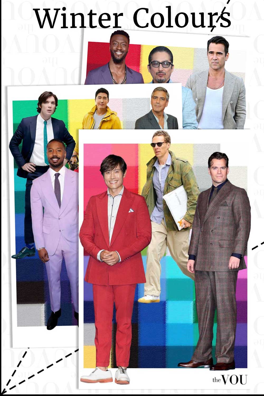
Seasonal palettes concern colour directions, not compulsory outfit proportions, and you can explore the colours you prefer within or outside the exercise.
Use the three-colour guide for counting and the 80/20 guide for a mostly-neutral alternative.
Frequently Asked Questions
Q. Is the 6 3 1 rule the same as the golden rule of colour?
In menswear writing, yes: both names usually describe the same 60/30/10 split of a dominant, supporting and accent colour.
Q. Do I have to measure the percentages?
No.
The numbers describe relative emphasis, and the balance changes as soon as you open a jacket or add a coat.
Q. Does a tonal outfit break the rule?
No.
You can apply the three roles with different depths of one colour, such as charcoal, light grey and slate.
Mandy Meyer’s focus at The VOU is men’s body-shape styling, garment fit and outfit proportions. Her coverage addresses the practical questions behind a wardrobe choice: how a jacket sits across the shoulders, how trousers fall and how different cuts change the silhouette a wearer wants to create.
Her subject areas include the triangle, inverted triangle, rectangle, oval, trapezoid, hourglass and diamond labels used in body-shape styling. These provide starting references for comparing visible proportions; they do not capture every body or prescribe one correct way to dress. The focus connects those observations with garment shape, construction, length and the relationship between the upper and lower parts of an outfit.
Mandy’s editorial coverage combines visual comparisons with fit checks for comfort and movement. Readers can consider whether a cut gives them the room they need, where clothing pulls or gathers and which changes might support their preferred look. The aim is to make menswear choices more understandable while keeping personal preferences and the wearer’s own styling goals central.