
Start here
What’s This About:
Yes, you can investigate colour at home by comparing garments in reasonably consistent light and keeping a short record, although a final seasonal label is not required for the exercise to be worthwhile.
This guide walks through a home colour comparison step by step, such as:
– gathering a mirror, daylight and garments you already own
– recording your starting conditions
– keeping each comparison consistent
– asking one colour question at a time
– investigating a palette direction
– checking a real outfit before shopping
and many more!
Treat each result as feedback to test, not a verdict on your wardrobe.
Key Points:
01Compare warmth, lightness and intensity separately, using pairs of garments that differ mainly in the one quality you are testing.
02Use indirect daylight, a plain background and a steady mirror position; photographs can shift colour through exposure, white balance and processing.
03Repeated preferences can suggest a seasonal family to explore, such as warmer and softer pointing towards Autumn, but these routes are starting points rather than diagnostic equations.
04“No clear difference” is a useful result, and a second opinion or a practitioner offers feedback rather than proof or absolute certainty.
You can investigate colour at home by comparing garments under reasonably consistent conditions and keeping a short record.
You may find a useful palette direction, or simply learn which versions of a shirt colour you prefer.
A final seasonal label is not required for the exercise to be worthwhile.
The procedure below separates warmth, lightness and intensity so that a preference for one garment is less likely to become an unsupported conclusion about your whole wardrobe.
Gather a small, useful set
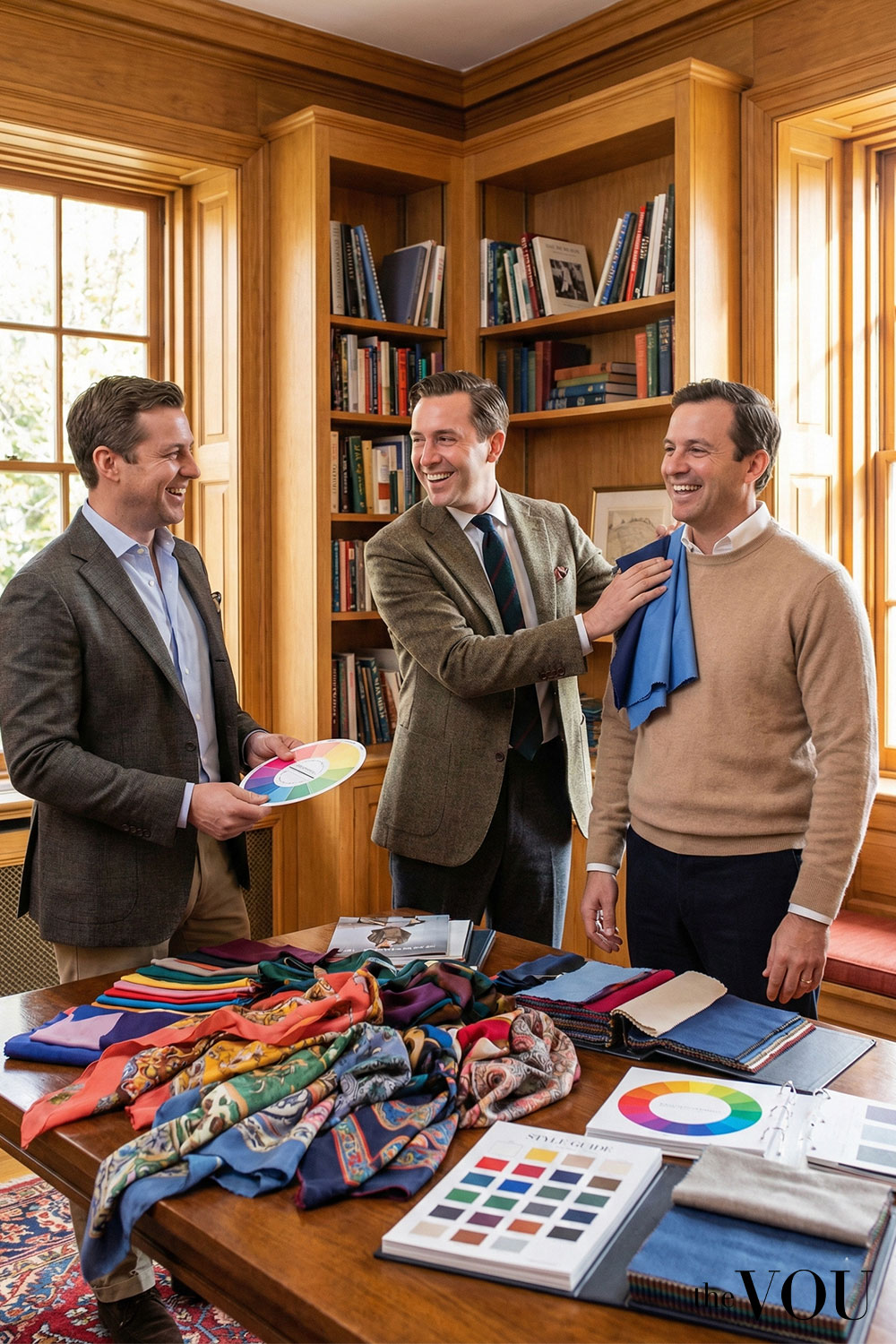
Use a mirror, a place with indirect daylight, a simple background, a notebook and plain clothes or scarves you already own.
You do not need special drapes.
Choose fabrics large enough to show a similar area beneath the face; tiny swatches are less useful for imagining a whole shirt.
Aim for a warmer/cooler pair, a lighter/darker pair and a clearer/more muted pair.
Similar fabric finishes help.
If your wardrobe does not contain a reasonable pair, leave that question open rather than buying something just to complete the exercise.
1. Record your starting conditions
Note the date, lighting, current hair colour, visible natural roots if any, beard and brows.
Describe your skin depth separately from its visible cast.
Include mixed colours in the irises.
Do not infer natural hair from an old photograph whose colour may be altered by lighting or processing.
Remove tinted glasses for the comparison if practical, and avoid coloured products on the face.
A bald head, grey hair or a beard does not prevent the exercise.
You are recording the appearance in front of you, not checking eligibility for a category.
2. Keep the comparison reasonably consistent
Face a window without direct sun on your face.
Avoid mixing very different light sources.
Cover a strongly coloured top with a quiet, plain cloth, and keep your face and mirror position steady.
Hold one garment beneath your chin, put it aside, then show the second at the same height and width.
Repeat in the opposite order.
Look at your face as well as the fabric.
Does one add a cast you dislike, make features harder to distinguish, or draw more attention than you want?
“No clear difference” is a useful result.
Photographs can help you remember an outfit, but automatic exposure, white balance and processing can alter its apparent colour.
Do not compare a sunny photograph with a shaded one and attribute every difference to the garment.
3. Ask one colour question at a time
Scroll horizontally to see all columns →
| Question | A useful starting pair | Keep as similar as possible |
|---|---|---|
| Warmer or cooler? | A peach-leaning pink and a cooler rose | Lightness, intensity, texture and visible area |
| Lighter or darker? | A light grey-blue and a deeper grey-blue | Hue direction, softness and finish |
| Clearer or softer? | A clear mid-blue and a greyed mid-blue | Lightness, warm/cool direction and finish |
Check the real garments.
Their names alone cannot establish a matched pair.
If you compare a vivid magenta silk scarf with a dark rust jumper, warmth, intensity, depth and finish all change.
It can tell you which of the scarf and the jumper you prefer, but not why.
Contrast is another question: how much difference do you want between the garments in an outfit?
Black and white have strong light-dark contrast without being vivid hues.
Do not use that pairing as a test of colour intensity.
4. Make a short record
Scroll horizontally to see all columns →
| Field | Example entry |
|---|---|
| Conditions | Indirect window light; plain grey background; no dyed hair |
| Question and garments | Softness: clear mid-blue shirt versus greyed blue shirt |
| Observation | The clear shirt catches my attention before my face; no obvious skin-cast difference |
| Preference | I prefer the quieter shirt for work |
| Limitation | The clear shirt is slightly shinier |
| Next comparison | Repeat with two matte fabrics if available |
Do not turn the example into a scoring system.
A preferred softer shirt could support exploring softer palettes, but its finish and intended use also contributed to the choice.
5. Investigate a palette direction
Repeated warmer-and-clearer preferences suggest exploring Spring; warmer-and-softer ones suggest Autumn.
Cooler-and-softer preferences lead towards Summer, and cooler-and-clearer ones towards Winter.
These are starting routes within The VOU’s convention, not diagnostic equations.
The twelve-season system adds distinctions inside the four families.
More labels do not, by themselves, establish greater accuracy.
Use the main seasonal guide to compare those distinctions after you have useful garment observations.
If warmth remains unclear but softer colours work well, compare Soft Summer and Soft Autumn.
If light colours are the clearest preference, compare Light Spring and Light Summer.
Do not convert uncertainty into a neutral undertone or assume all possible palettes must be equally suitable.
6. Check a real outfit before shopping
Try your preferred shirt with existing grey trousers, familiar loafers and socks that connect to the trousers.
Add the jacket you actually wear to work.
A shirt held in isolation and a small collar visible under a jacket create different arrangements.
Keep a useful black coat or white shirt even if it is not a palette favourite.
Test a preferred scarf, knit or tie near the face; you may find the combination gives you the effect you want.
When another opinion helps
Repeat unclear comparisons in similar light, or ask someone to describe what they see before telling them your preferred label.
Agreement is useful feedback, not proof.
A practitioner can structure comparisons and explain their framework if you want further help.
Before paying, ask which system they use, how they handle mixed results, and whether they will demonstrate outfits with colours you already wear.
No consultation should need a promise of absolute certainty to offer practical value.
Related guides on The VOU:
Seasonal Colour Analysis Quiz for Men
Is Olive Skin Tone Cool or Warm?
How Do I Find My Personal Colour Palette?
15 True/Cool Winter Male Celebs for Styling Inspo and Ideas
Light Spring Colour Palette for Men: How to Check It and Wear It
What Happens if You Wear Wrong Colours for Your Undertone?
10 Worst Colours for Soft Autumn Palette
Mandy Meyer’s focus at The VOU is men’s body-shape styling, garment fit and outfit proportions. Her coverage addresses the practical questions behind a wardrobe choice: how a jacket sits across the shoulders, how trousers fall and how different cuts change the silhouette a wearer wants to create.
Her subject areas include the triangle, inverted triangle, rectangle, oval, trapezoid, hourglass and diamond labels used in body-shape styling. These provide starting references for comparing visible proportions; they do not capture every body or prescribe one correct way to dress. The focus connects those observations with garment shape, construction, length and the relationship between the upper and lower parts of an outfit.
Mandy’s editorial coverage combines visual comparisons with fit checks for comfort and movement. Readers can consider whether a cut gives them the room they need, where clothing pulls or gathers and which changes might support their preferred look. The aim is to make menswear choices more understandable while keeping personal preferences and the wearer’s own styling goals central.