
Start here
What’s This About:
The four main colour palettes are the seasonal families, Spring, Summer, Autumn and Winter, and each splits into three palettes, giving twelve in all.
This guide helps you find and use your palette, such as:
– the four families at a glance and the two questions behind them
– what to look for in your skin, hair and eyes
– how to check a shortlist with real garments
– all twelve palettes with neutrals, accents and a complete outfit
– accessories, grey hair and changing appearance
and many more!
A palette is a guide for choosing clothes, not a diagnosis.
Key Points:
01Spring and Autumn lean warm; Summer and Winter lean cool.
02Spring and Winter colours are clearer; Summer and Autumn colours are softer.
03Lightness, colour intensity and contrast are separate observations, and no single feature decides your palette.
04Garment comparisons in steady daylight are more useful than quick checks such as vein colour.
Your seasonal palette is a group of colours to explore alongside your natural skin colouring, hair and eyes.
Spring and Autumn lean warm; Summer and Winter lean cool.
The twelve-palette system makes finer distinctions between lighter, deeper, brighter and more muted colouring.
Start by recording what you see in your features.
Use the route below to choose a small shortlist, check it with real clothes, then try a complete outfit.
Each of the twelve guides includes named neutrals and accents, a complete outfit and a neighbouring palette to compare.
Start with three useful distinctions
Skin depth is how light or dark your skin appears.
Undertone is the warm or cool quality considered in colour analysis. Two people with a similar skin depth can need different comparisons.
A visible golden, rosy or olive cast is a clue to record, rather than a season by itself.
Lightness and colour intensity are different. Pale blue and navy differ mainly in lightness.
A vivid medium blue and a greyed medium blue differ in intensity, often called chroma, clarity or softness in styling.
You can compare these separately.
Contrast describes a difference between areas. Dark hair against light skin creates more contrast between hair and skin than light hair against light skin.
Deep skin with silver hair can also have a large difference.
In clothing, white with navy has more contrast between light and dark than medium blue with navy.
White + navy / greyed blue + navy
The CIE definitions of lightness, chroma and perceived contrast explain why these are separate observations.
In the guides below, “bright” means vivid colour; it does not mean that skin should look lighter.
The four main palettes at a glance
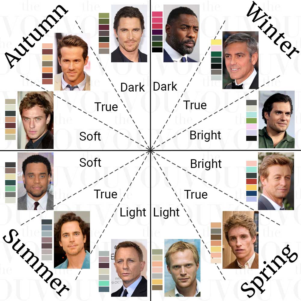
The four main colour palettes in men’s fashion are the seasonal families, and each is split into three palettes in the twelve-season system used here.
Two questions sort them: do warmer or cooler colours compare better near your face, and do clearer or more muted colours compare better?
Scroll horizontally to see all columns →
| Family | Lean and character | Colours the family often includes |
|---|---|---|
| Spring | Warm and clear | Camel, light moss green, coral, peach, ivory and clear warm blues |
| Summer | Cool and soft | Sky blue, lavender, rose-beige, soft fuchsia and greys from light flannel to charcoal |
| Autumn | Warm and soft | Terracotta, mustard, olive green, deep teal and coffee brown |
| Winter | Cool and clear | Black, crisp white, royal blue, emerald green and ruby red |
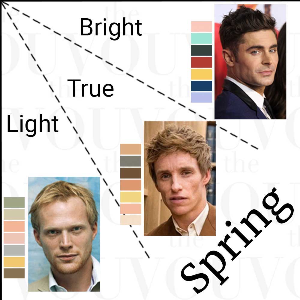
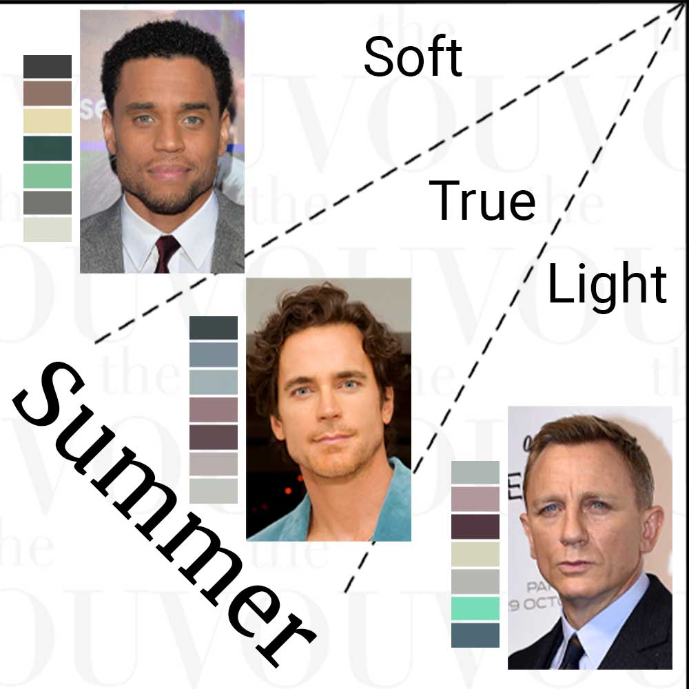
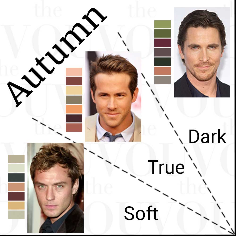
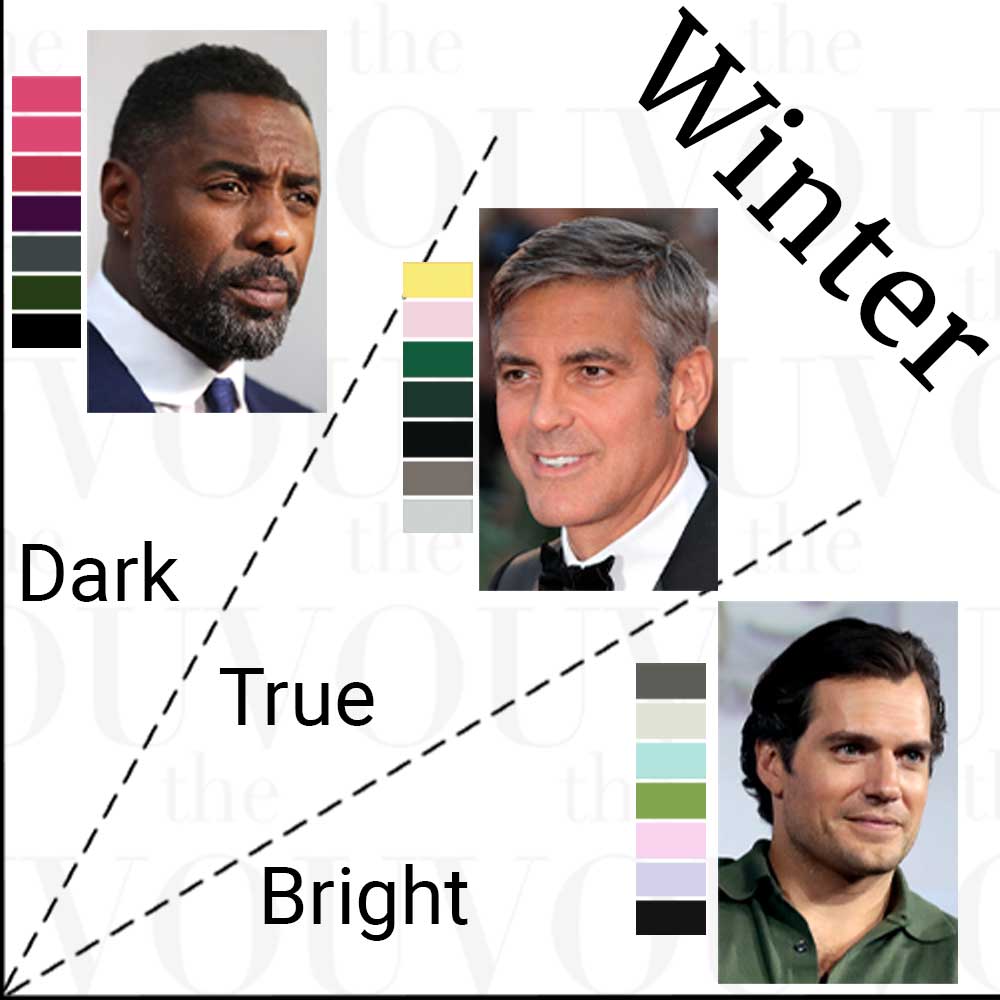
Men who suit a family are often described with certain colouring, such as warm-looking colouring for Spring and Autumn or strong contrast for many Winters, but no single feature decides the family, and no family is tied to a skin depth or ethnicity.
Learn what to look for in your features
Use a mirror in even, indirect daylight.
Look at your face and neck together, then your natural hair or visible roots, brows and irises.
Keep the light and your position steady.
If you use tinted products or have dyed hair, note that context rather than confusing it with natural colouring.
Use the notes below to describe depth, colour cast and contrast in your own words; no single description covers every combination.
Skin depth and visible colour cast
Compare skin depth first.
Then look for a visible peach, rosy, golden, olive or more neutral-brown cast across the face and neck.
Temporary redness on one cheek should not decide the whole description.
Natural-looking hair colours, including grey
Record hair depth and tone separately.
“Medium brown with golden highlights” tells you more than “brown”.
Check natural roots when hair is coloured.
Grey can be mixed through darker hair or dominate the whole head, changing the contrast you see today.
Iris colour and variation
Look at the coloured part around the pupil.
Record the main colour and any visible secondary area: for example, grey-green with a brown centre.
Notice whether the colours appear distinct or blended.
The same broad eye-colour name can cover several appearances.
The combined difference between light and dark
Compare hair, eyebrows and skin as a group, then notice the eyes.
Deeper colouring overall and stronger contrast are different observations.
Grey hair or a beard can change that relationship.
Record your observations, then choose a shortlist
Use this worksheet as a note template.
Words such as light, deep, golden, ash, clear and blended describe what to investigate next.
If the clues differ, keep both observations in the record.
Your observation sheet
Write these notes on paper or in your notes app.
- Skin
- Depth: ____ · Visible cast: ____ · Redness/tan context: ____
- Natural hair
- Depth: ____ · Golden/copper/ash/mixed tones: ____ · Grey/dye context: ____
- Irises
- Main colour: ____ · Secondary colour or pattern: ____ · Clearer/blended effect: ____
- Together
- Hair/brow-to-skin difference: ____ · What stands out most: ____
- Cloth checks
- Pieces and light used: ____ · Repeated observation: ____
- Starting point
- Provisional palette(s), or comparison still unresolved: ____
A compact route to your starting palette
Keep temperature, colour intensity and depth separate:
- Temperature: consider a warm, cool or unclear lean across your combined feature observations and garment comparisons. A provisional warm lean suggests comparing Spring with Autumn; a cool lean suggests comparing Summer with Winter.
- Intensity: compare clearer and more muted colours at similar lightness. Look for repeated differences in unwanted colour cast and how easily you notice the facial features. This helps refine the family comparison.
- Depth: record lightness or darkness separately. Use it when exploring subtype palettes and outfit combinations; it does not select a family or make light colouring a requirement for Spring.
Warm lean + observations favouring clearer colours
Compare Spring
Light, True/Warm or Bright/Clear Spring
Warm lean + observations favouring more muted colours
Compare Autumn
Soft, True/Warm or Deep/Dark Autumn
Cool lean + observations favouring more muted colours
Compare Summer
Light, True/Cool or Soft Summer
Cool lean + observations favouring clearer colours
Compare Winter
Bright/Clear, True/Cool or Deep/Dark Winter
These are provisional comparison directions.
Consider depth separately; it does not choose the family.
If temperature or intensity remains unclear, keep the corresponding family comparisons open.
If both are unclear, keep all four families available.
Hair or skin depth alone does not close a family.
Once the broader observations have narrowed the possibilities, the subtype guides offer neighbouring comparisons: Light Spring / Light Summer, Soft Autumn / Soft Summer, Bright Spring / Bright Winter, and Deep Autumn / Deep Winter.
Use these where their palette descriptions fit the broader evidence, rather than sending dark-haired readers directly to the Deep pair.
When warmth or coolness is the strongest repeated observation, the True/Warm or True/Cool guides offer further comparisons alongside the other candidates.
Compare the full colour group rather than deciding from a single blue, brown or pink.
Two hypothetical dark-haired comparisons:
- A dark-haired reader records a warm lean and repeatedly notices less unwanted cast with clearer warm colours than with muted warm colours. They can compare Spring with Autumn, including the Bright Spring direction. Dark hair does not exclude Spring or settle the choice.
- A dark-haired reader records a cool lean. They can compare softer cool Summer colours with clearer cool Winter colours at similar lightness. The repeated observations guide the provisional choice; dark hair alone does not select Winter.
The free seasonal colour quiz for men is another optional starting point; check its suggestion with real garments.

Worked example: from mixed clues to a provisional Soft Summer match
This is a hypothetical example showing how to use the worksheet.
Scroll horizontally to see all columns →
| Step | Observation | What it suggests doing next |
|---|---|---|
| Natural features | Medium-brown hair with an ash-looking tone; grey-green irises with a brown centre; medium skin with no obvious warm or cool lean | Keep skin temperature unresolved. Hair and eyes provide context, not separate season votes. |
| Combined appearance | The hair, brows and eyes show moderate differences in depth, with a generally blended colour effect | Start by comparing softer colours. Soft Summer and Soft Autumn are a manageable pair. |
| First clothing comparison | In the same light, a vivid blue draws attention away from the face; a similarly light greyed blue leaves the facial features easier to notice | Repeat with a second colour pair to check whether lower intensity is consistently useful. |
| Warm or cool comparison | With both options muted, blue-grey produces less of a yellow-looking cast across the face and neck than a warm camel. The observation repeats after swapping the garments again | Start with Soft Summer as the provisional palette; retain Soft Autumn as the neighbouring comparison if later observations differ. |
| Wardrobe use | A grey-blue polo works with a mid-grey jacket and taupe trousers already in the wardrobe | Keep the useful combination and the notes explaining it. |
The example depends on those reported observations.
It does not establish a colour type for anyone pictured in this article.
Worked example: fair skin, auburn hair and hazel eyes
This hypothetical reader records very fair skin, no distinct visible cast, auburn hair and hazel irises.
The fair depth is observable; the warm or cool interpretation is still open.
Auburn hair and any golden-brown areas in the irises make warm comparisons worth exploring, but do not establish Spring or Autumn.
An unclear skin observation is not proof of neutral temperature or muted colouring.
Begin with warmer and cooler versions of a colour at similar lightness and intensity, such as two soft pink shirts.
Then compare clearer and more muted colours at similar depth.
If warmer colours repeatedly work better, investigate Spring and Autumn; if cooler colours work better, investigate Summer and Winter.
Keep a mixed result in the notes instead of forcing it into a type.
For a practical first outfit, keep navy trousers and brown loafers already owned, then compare a cream shirt with a soft blue one beneath the same jacket.
Wear the combination you find useful and record why.
This gives the reader something to wear while the seasonal label remains unresolved; it does not prove that either shirt belongs exclusively to one palette.
Check the shortlist with real garments
You can begin with shirts, scarves, towels or other plain cloth you already have.
Similar garments in a shop are another option; there is no need to buy a full set of drapes.
- Keep the light, angle and background steady. Stand in indirect daylight and move strong surrounding colours away from your face. Avoid a camera filter or a screen casting coloured light onto your skin.
- Change one main feature of the comparison. Choose similar garment shapes and finishes. To explore temperature, compare warmer and cooler versions of similar lightness. To explore intensity, compare a vivid and a greyed colour at similar depth. Use a separate light/deep comparison.
- Look at the face and neck before judging the outfit. Notice an added colour cast, whether features remain easy to see and whether the difference repeats when you swap the cloth. Record “I like this colour” separately from a change you observe beside your face.
- Repeat a close result. Try another pair in the same colour family or repeat on another day in similar light. If observations conflict, keep the neighbouring palette in your shortlist rather than forcing a conclusion.
For example, peach pink and cooler pink can help explore temperature; vivid blue and greyed blue can explore intensity; pale blue and navy can explore lightness.
Retail colour names vary, so compare the actual garments.
A cream and white comparison is useful only when their finish and depth are reasonably comparable.
Professional providers also differ in how they combine observations. Colour Me Beautiful's men's service considers skin, hair and eye colour together. House of Colour describes comparative drapes in natural daylight.
The route here is a practical self-assessment aid, not a scored version of either provider's method.
Quick checks are weaker than garment comparisons.
Vein colour on the inner wrist is often used as a hint, blue or purple suggesting cool and greenish suggesting warm, but skin depth and lighting affect what you see, and the result does not place you in a season; if it is unclear, leave it unclassified.
If you book an analyst, ask which system they use, how they handle mixed or uncertain observations, and what you receive for the price.
Use the twelve palette guides
Each guide gives a colour relationship to look for, four illustrative neutrals, six accents and one complete outfit with its garments listed.
Choose a few colours you will wear rather than trying to buy every shade.
Names and swatches are references: fabric, lighting and screens affect how colours appear.
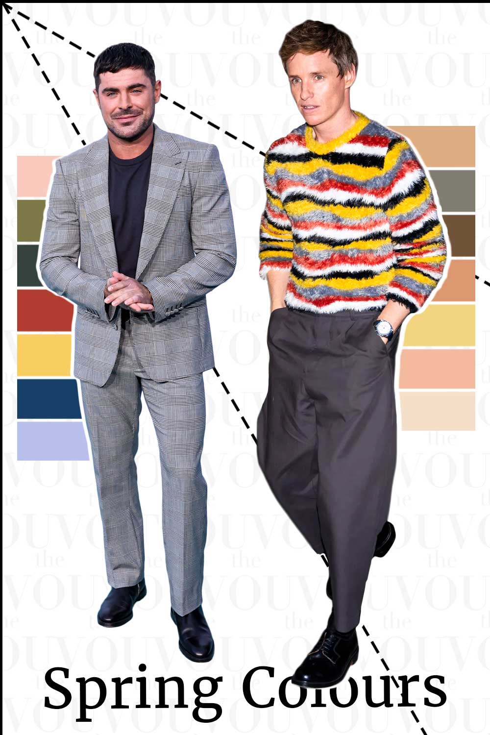
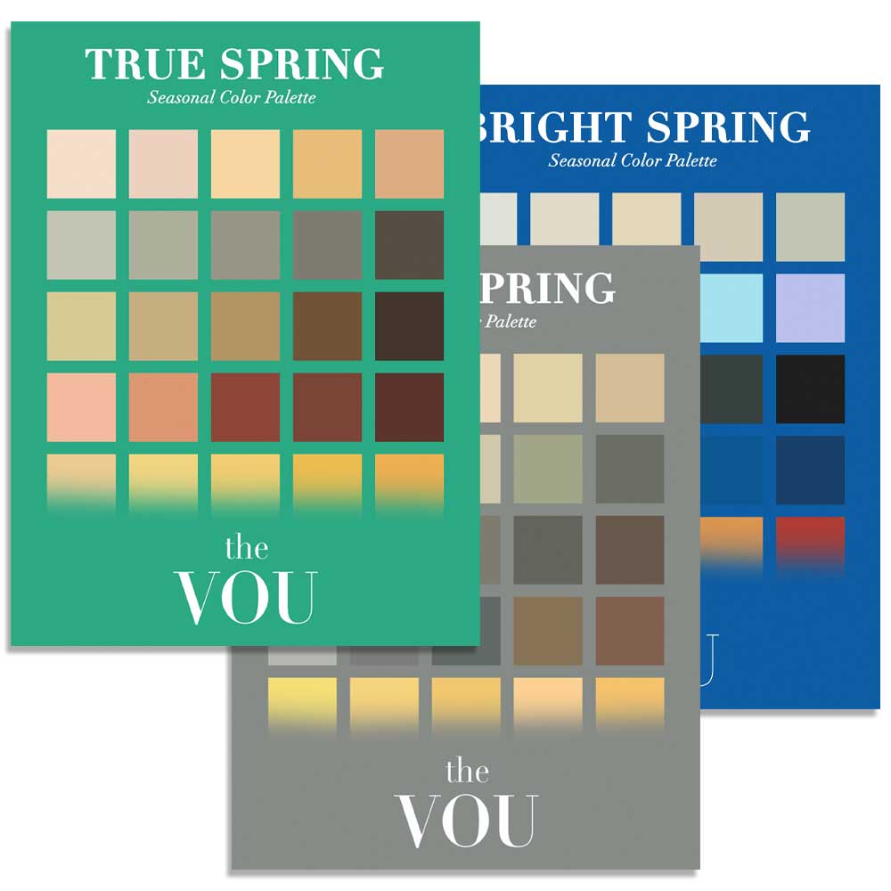
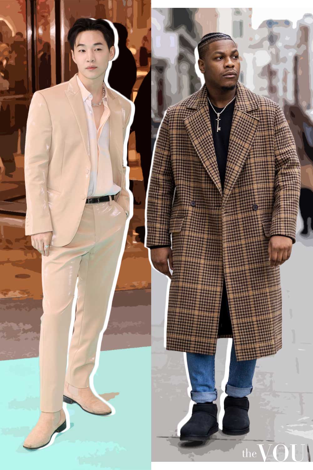
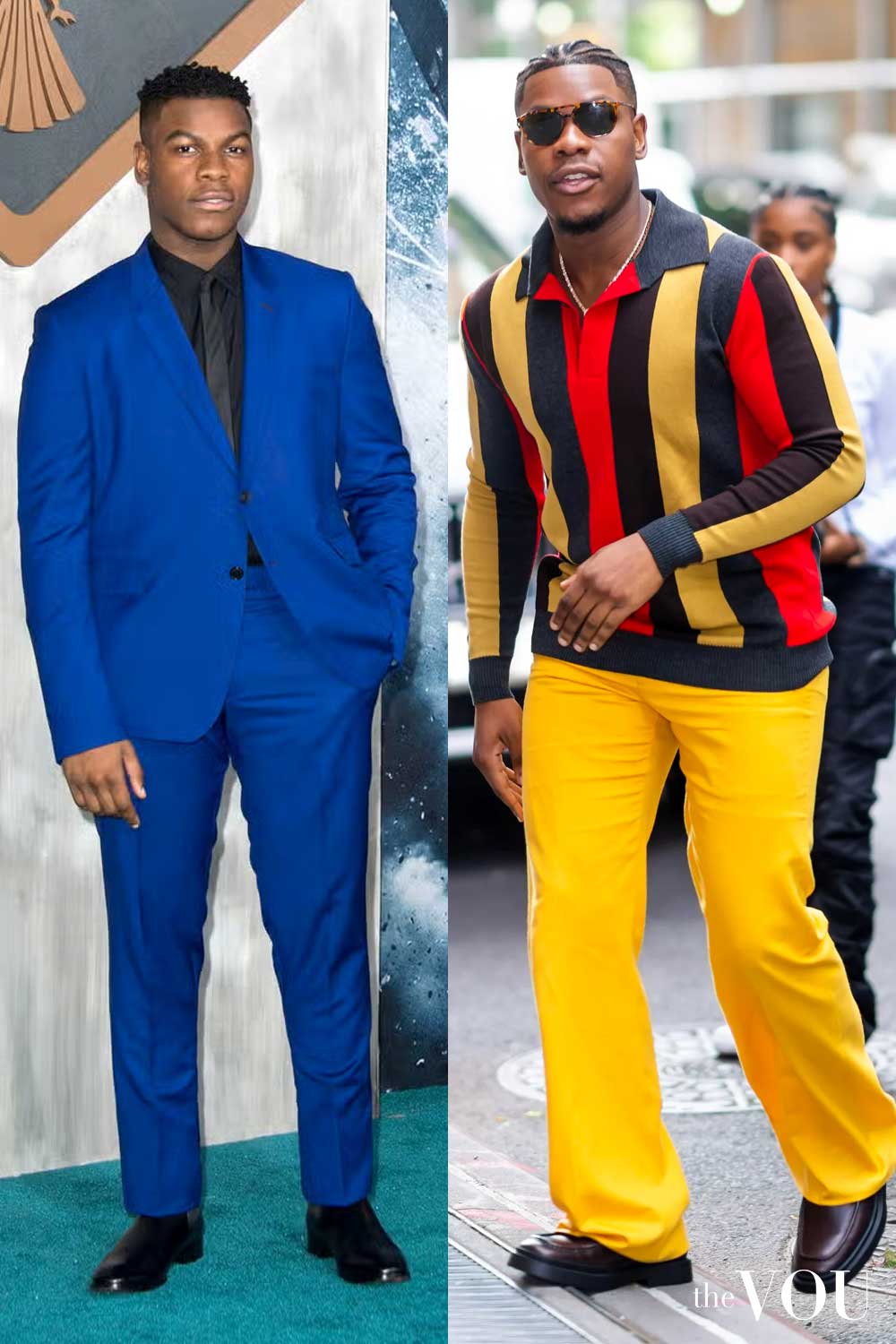
The outfit examples describe clothing combinations to try; the pictures in these guides are colour ideas, and a photograph cannot confirm anyone’s colour season.
Spring · 1 of 12
Bright / Clear Spring
Clarity leads within a warm-leaning palette.
Bright Winter is the cooler neighbouring comparison.
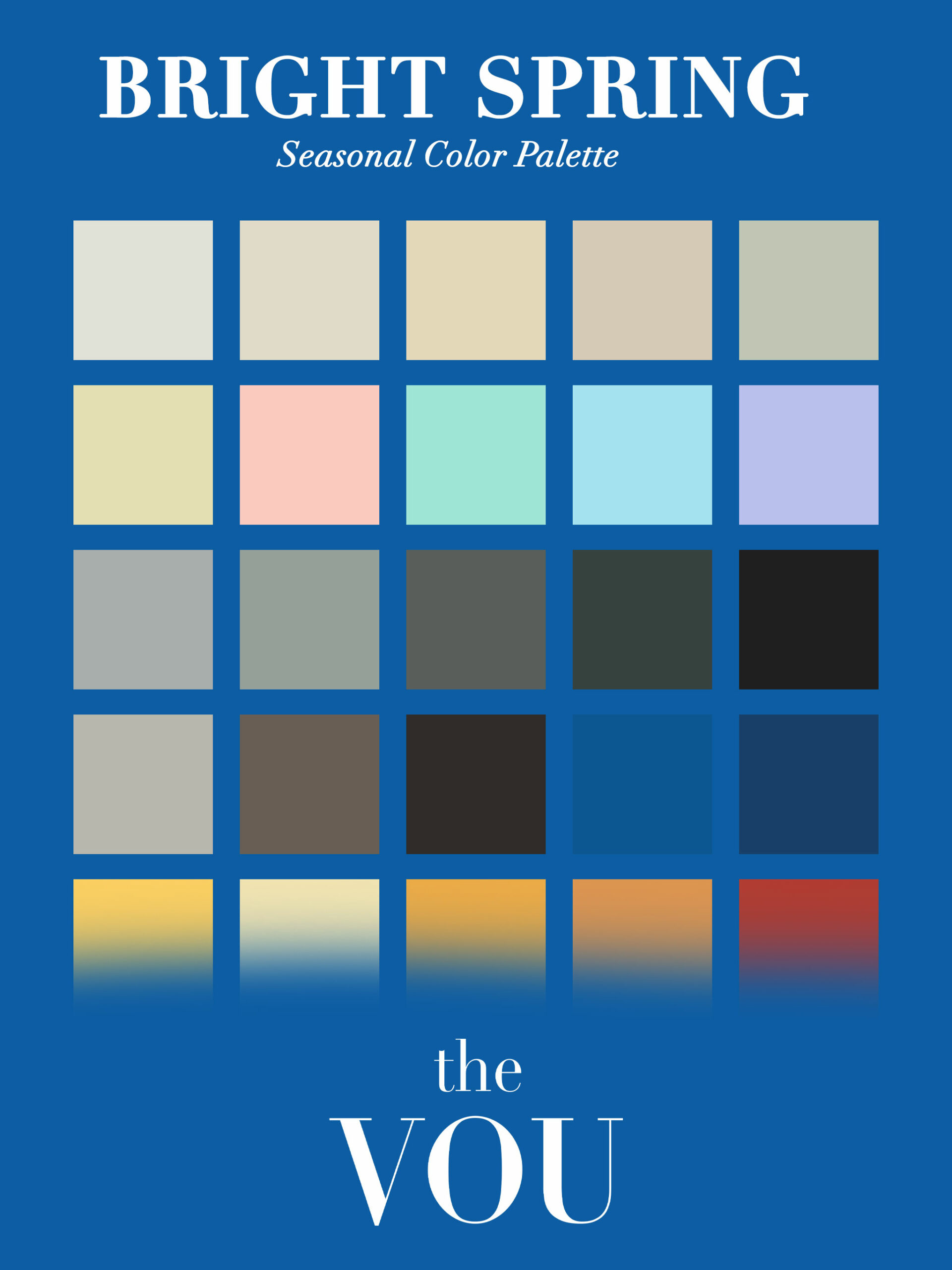
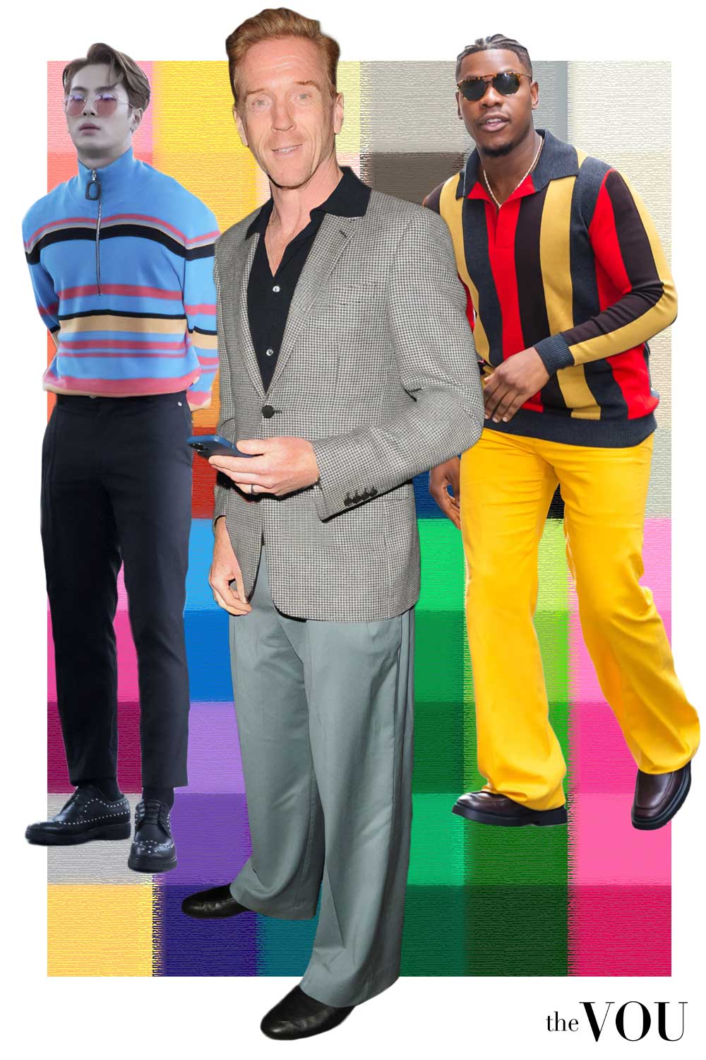
When stronger, clearer colour is a noticeable part of the overall appearance, compare the Bright pair.
Dark hair can be part of that picture; compare the whole face rather than treating blond hair as a requirement.
Neutrals to build around
Accents to try
Turquoise under camel
The clear turquoise polo gives the outfit a vivid centre.
Camel and navy provide quieter areas, while brown loafers and the watch keep the finish restrained.
- Camel blazer
- Turquoise fine-knit polo
- Navy tailored trousers
- Brown suede penny loafers
- Gold-coloured watch with brown strap
Spring · 2 of 12
True / Warm Spring
Warmth is prominent, with clear, lively colour.
Compare this with the earthier warmth of True Autumn.
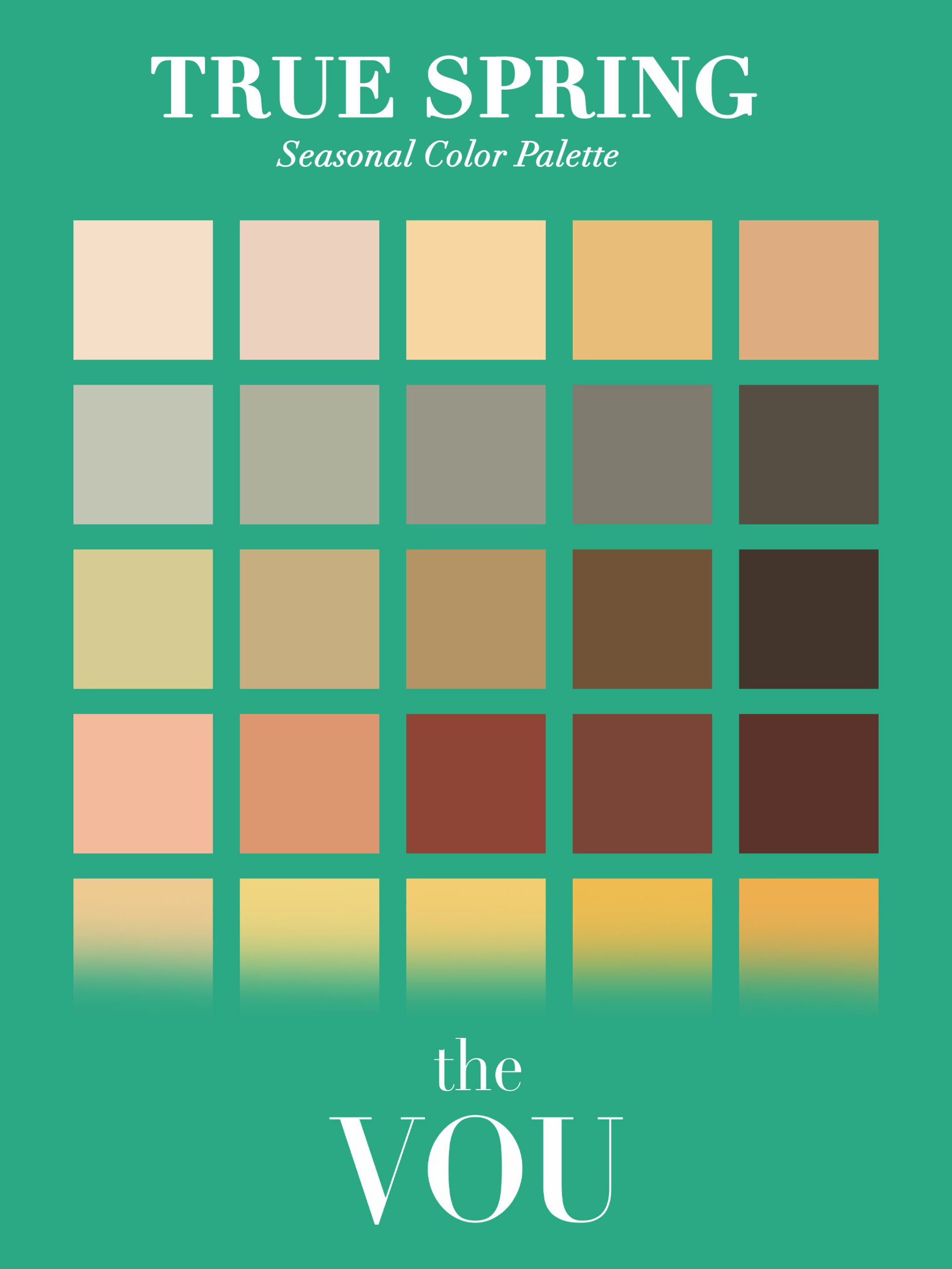
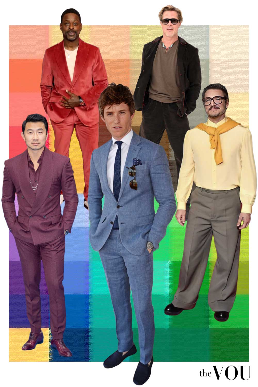
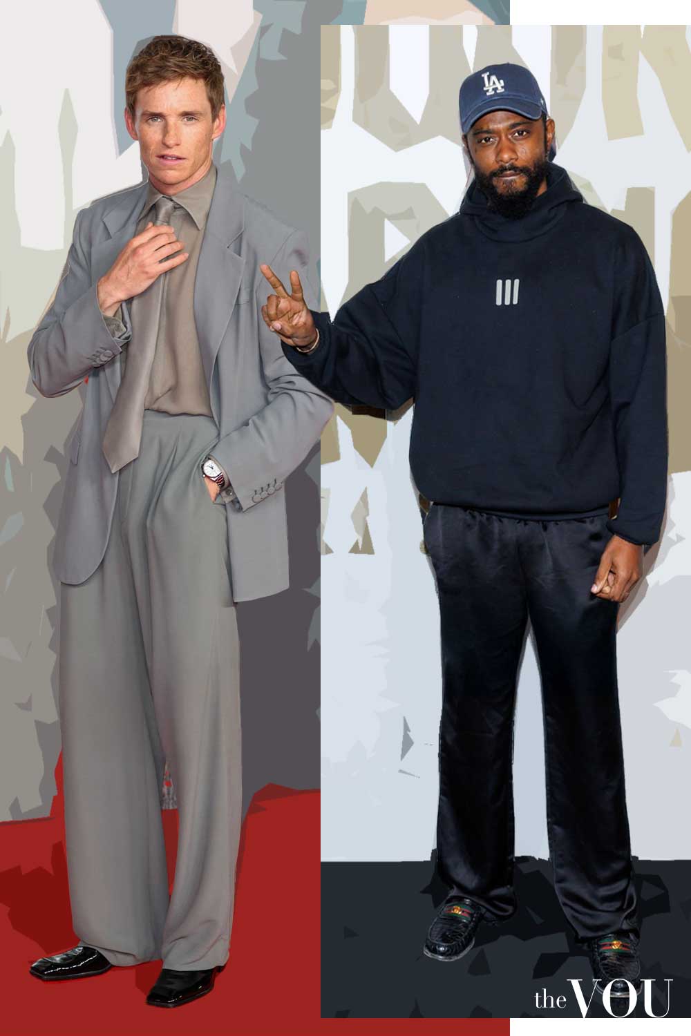
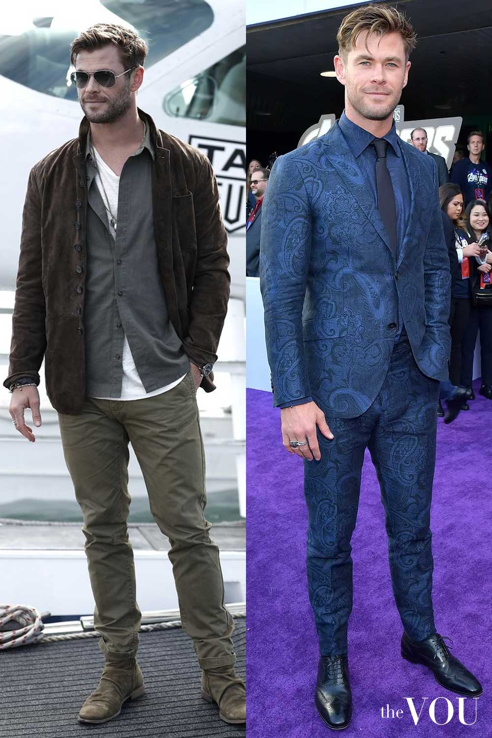
Golden or coppery tones across several features can suggest starting with the warmer families.
Check the clearer versus earthier colour difference before choosing between Spring and Autumn.
Neutrals to build around
Accents to try
Coral, cream and brown suede
A coral shirt carries the colour near the face.
Cream trousers lighten the combination; the belt, loafers and watch strap relate through brown.
- Coral shirt
- Cream pleated trousers
- Brown suede penny loafers
- Brown leather belt
- Gold-coloured watch with brown strap
Spring · 3 of 12
Light Spring
Lightness leads, with a gentle warm lean and clearer colour than the Light Summer direction.
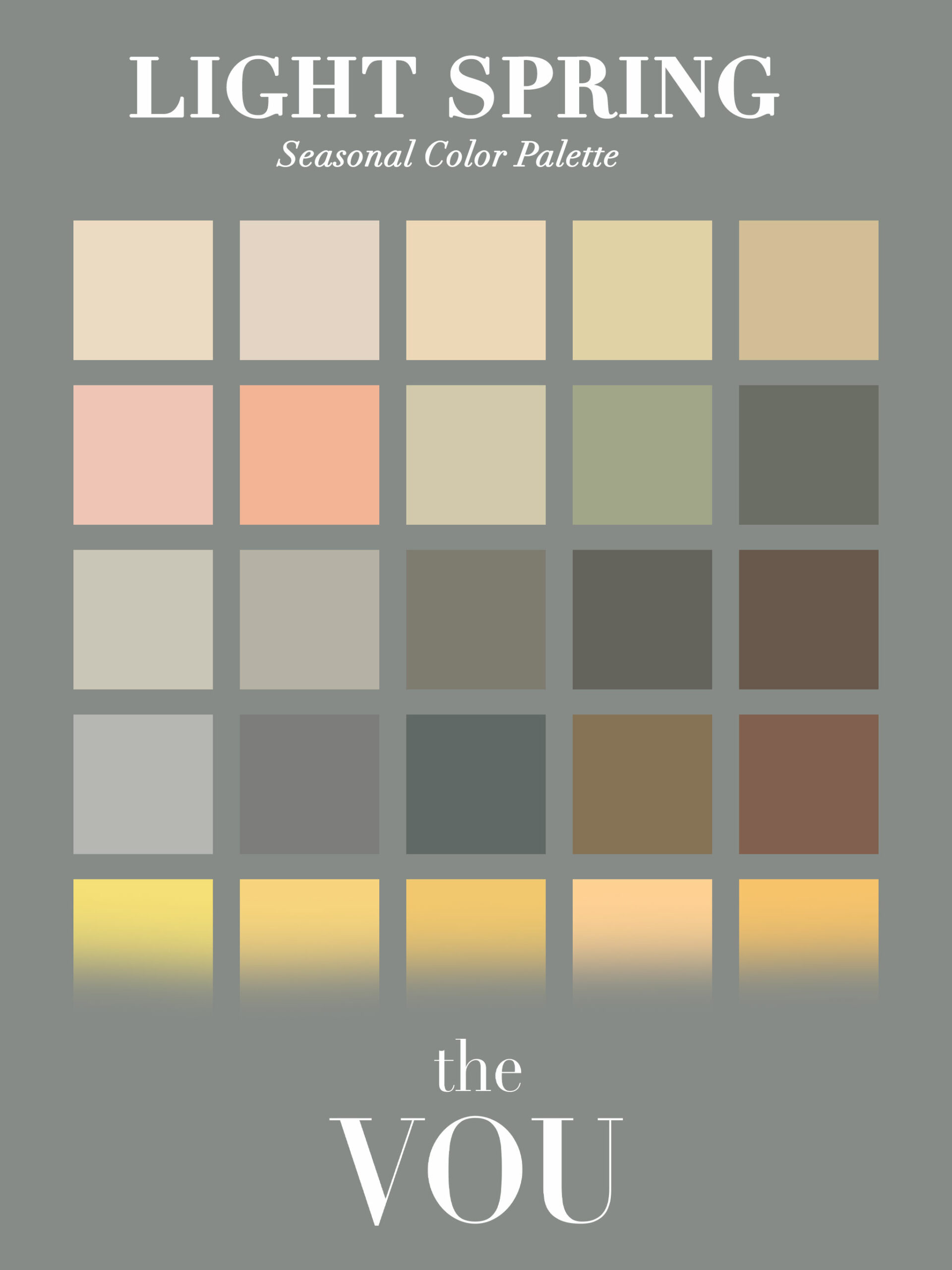
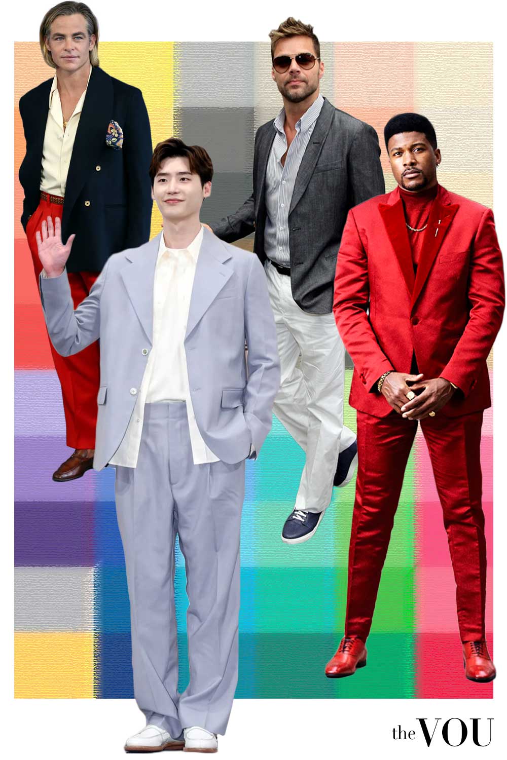
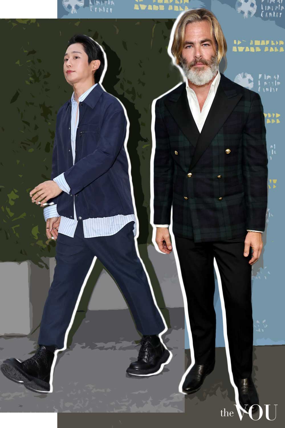
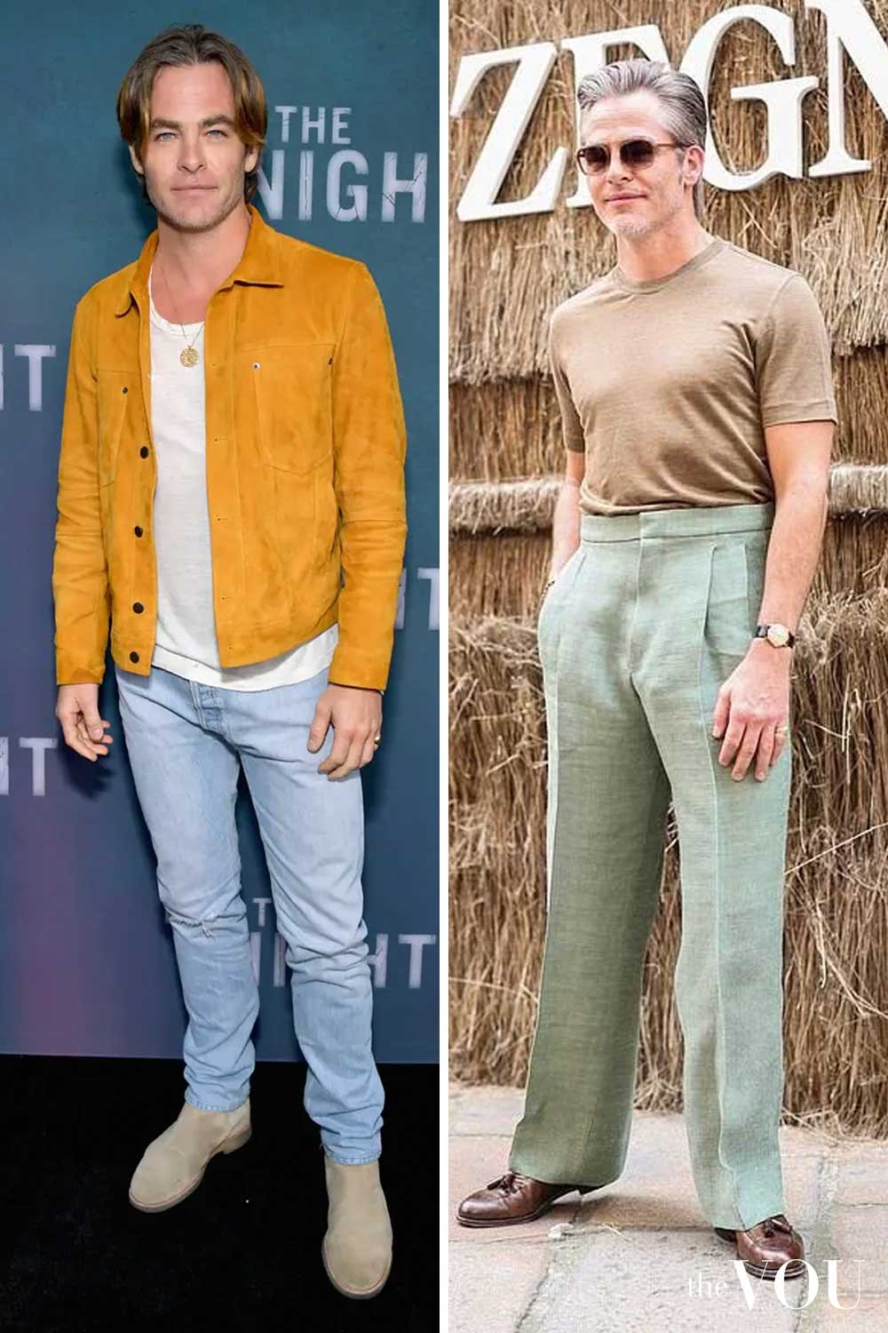
If the combined appearance of your skin, hair and eyes is relatively light, compare the two Light palettes first.
Then check whether the warmer or cooler versions add less distracting colour cast beside your face.
Neutrals to build around
Accents to try
Sand tailoring with a small green accent
The sand suit and ivory shirt keep most of the outfit light.
The green tie supplies colour in a narrow area; brown shoes give a practical finish.
- Sand two-piece suit: jacket and trousers
- Ivory shirt
- Green tie
- Ivory pocket square
- Brown cap-toe Oxfords
- Dark-brown socks
- Gold-coloured watch with brown strap

Summer · 4 of 12
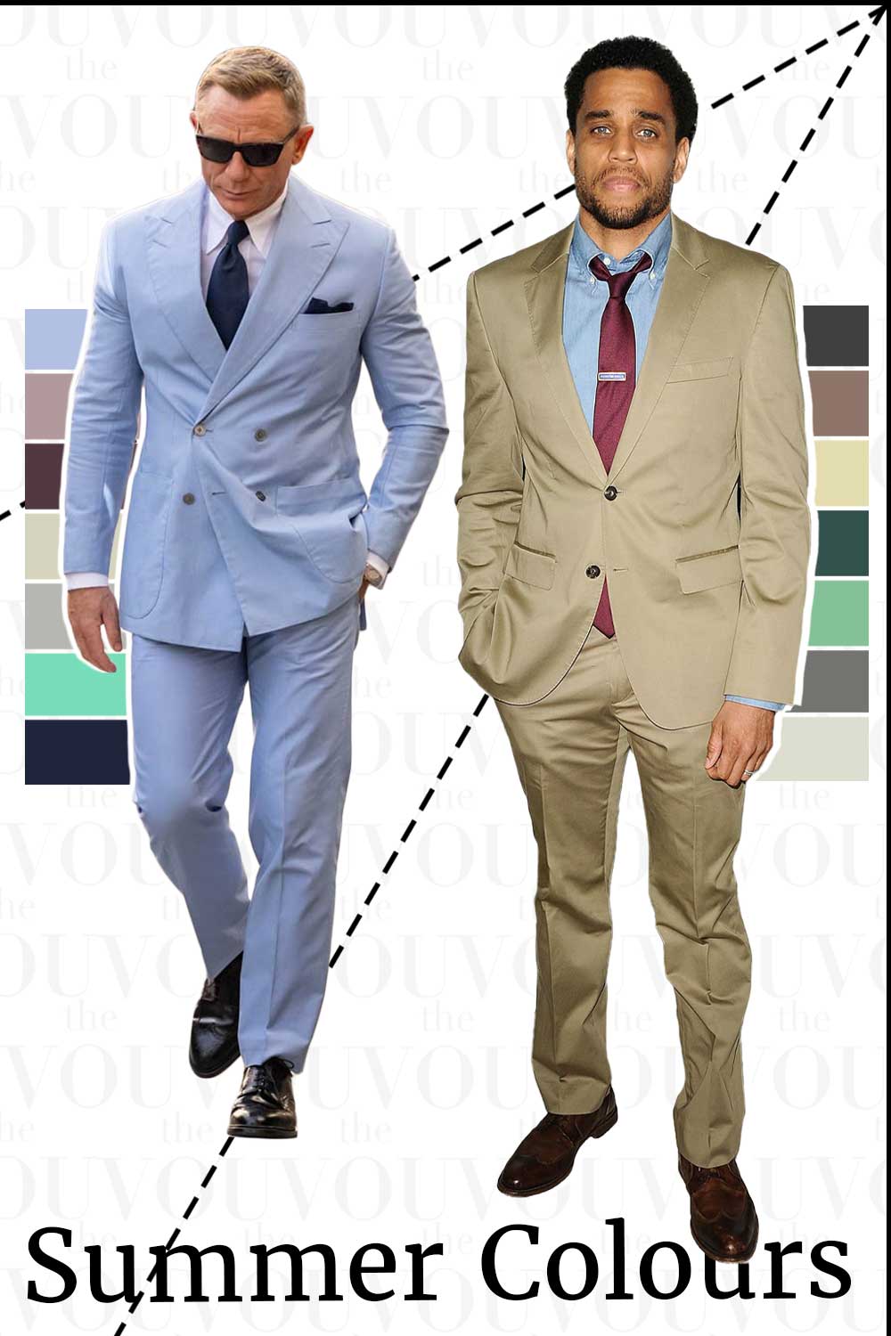
Light Summer
Lightness leads with a cool lean and a softer finish than Light Spring.
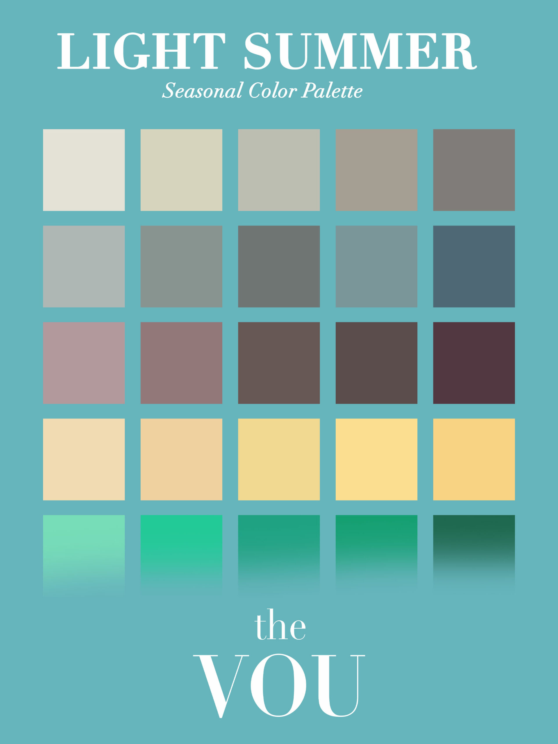
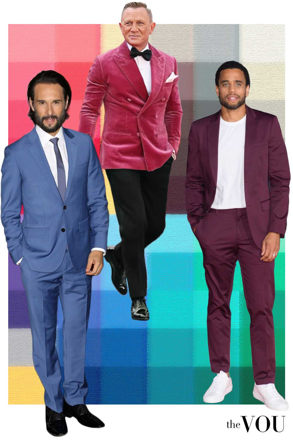
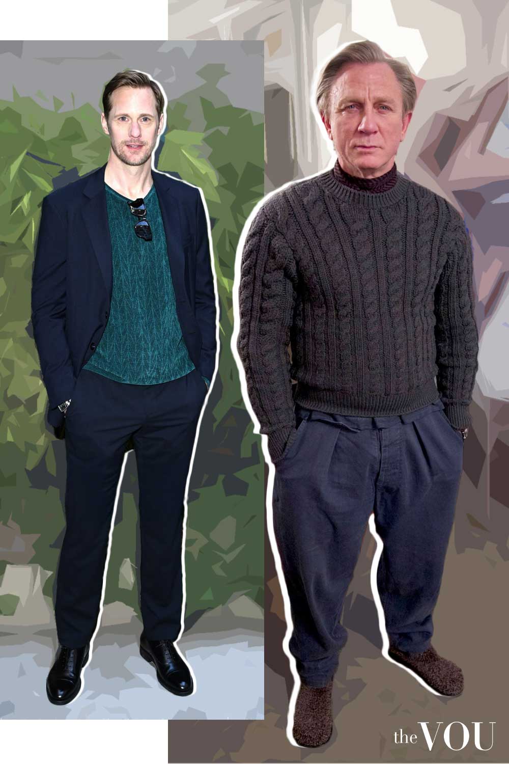
Start here when the overall colouring looks relatively light and cooler light colours are worth testing.
Compare the complete combination of skin, hair and irises; no single pale feature settles the result.
Neutrals to build around
Accents to try
Powder blue and light grey
A powder-blue knit polo and light-grey chinos make a light, quiet combination.
Taupe loafers and the restrained belt and watch add definition without a large dark jacket block.
- Pale powder-blue long-sleeve knit polo
- Light-grey chinos
- Taupe suede loafers
- Grey-brown belt
- Silver-coloured watch with brown strap
Summer · 5 of 12
True / Cool Summer
Coolness is prominent, with medium or softer intensity compared with the Winter direction.
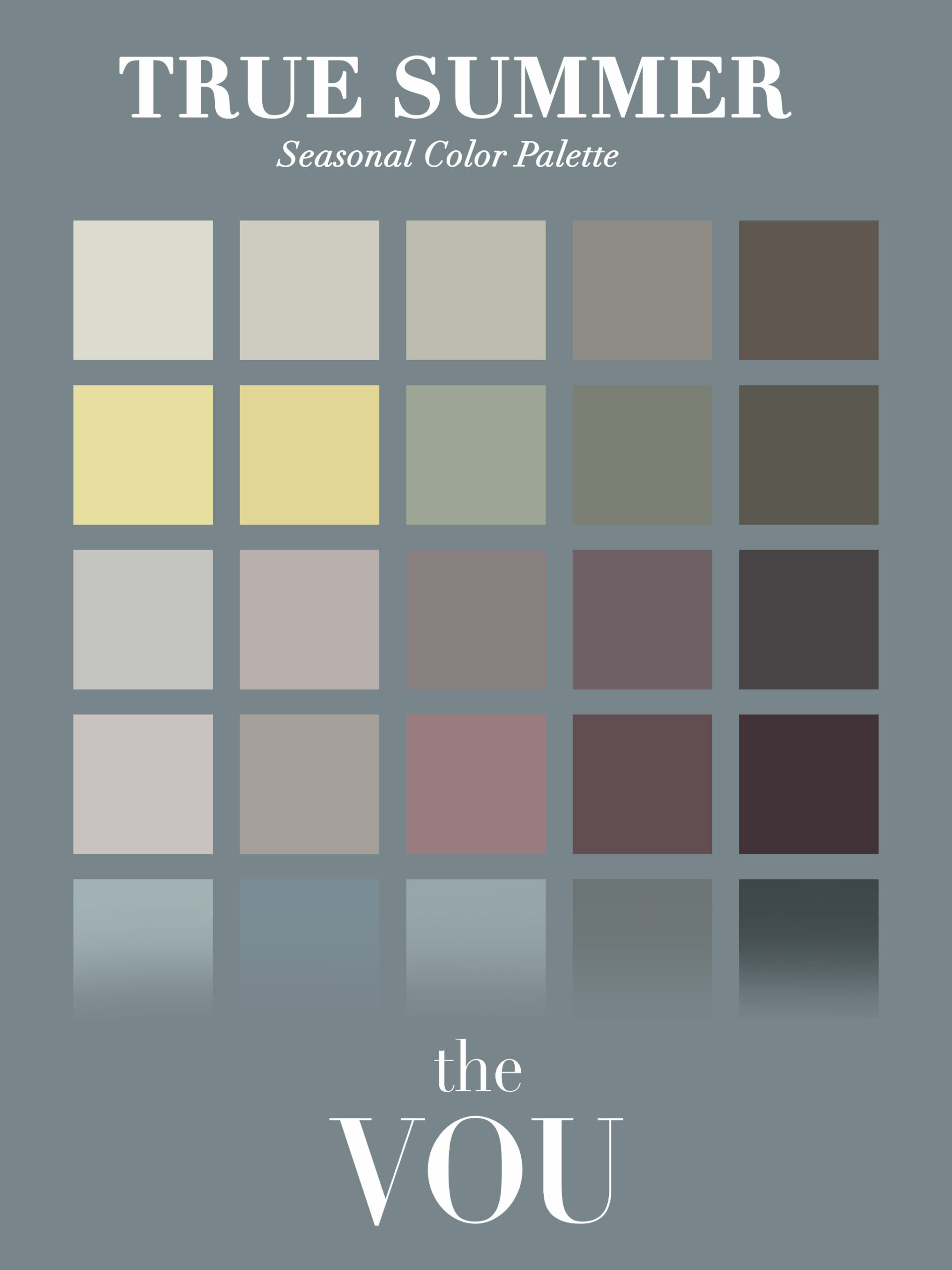
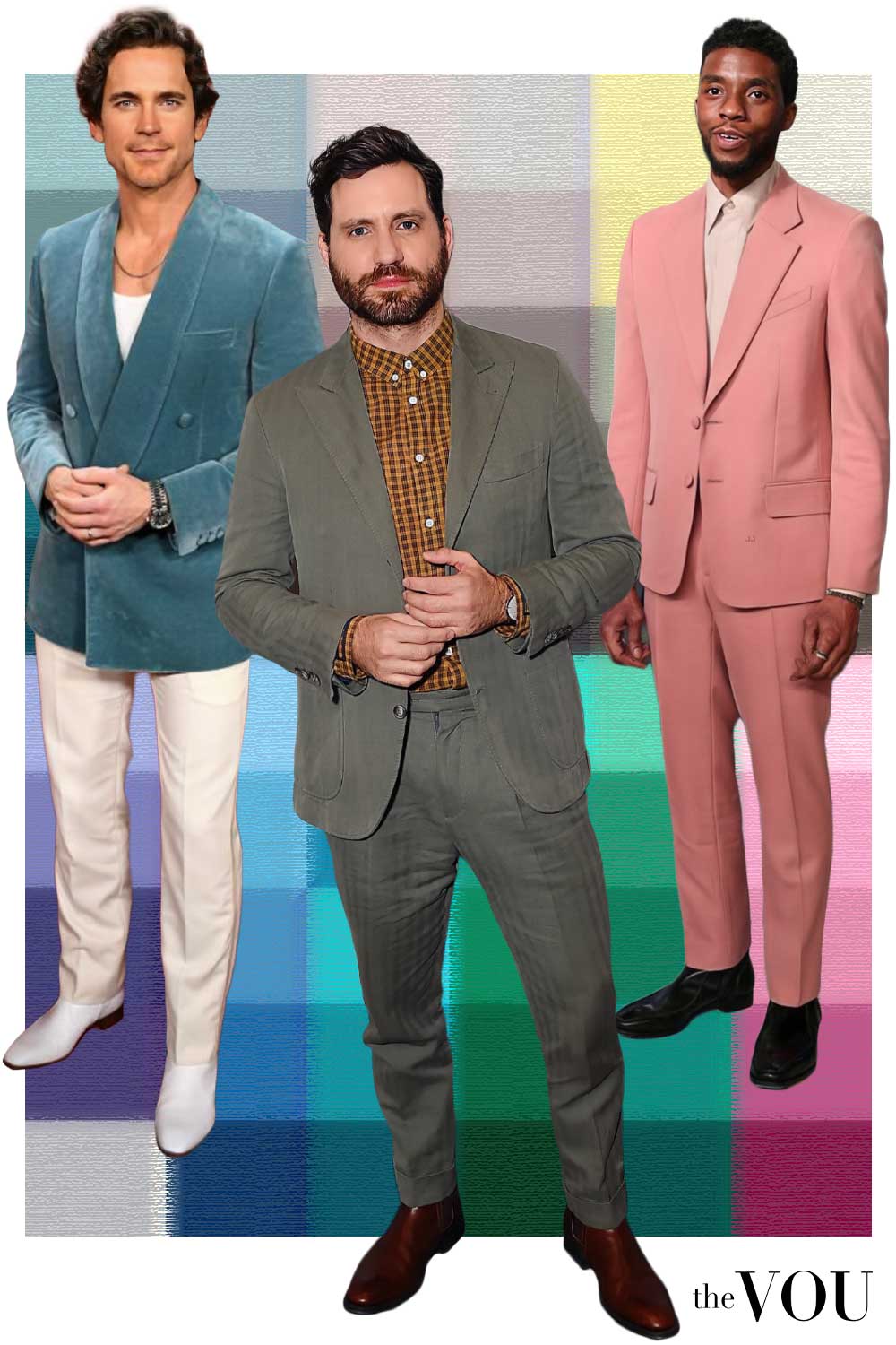
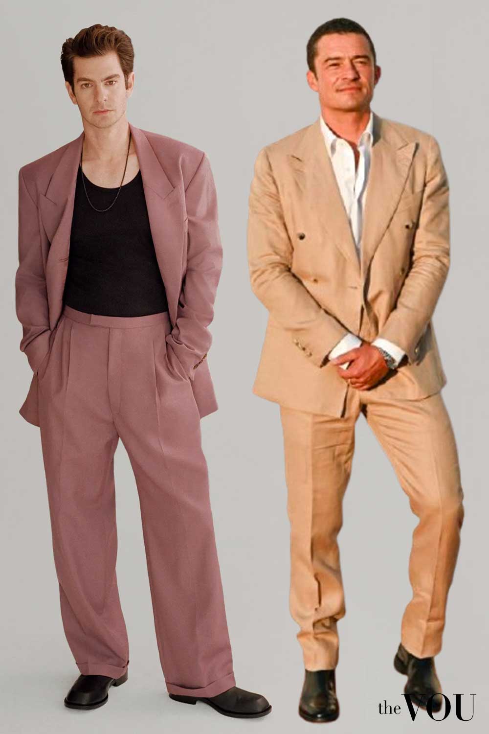
Ash-looking hair and greyed or blended iris colours can provide context.
Where a cool lean appears across the observations, compare cool softened colours with cool clearer ones.
Neutrals to build around
Accents to try
Grey tailoring with blue and plum
The pale-blue shirt and muted-plum tie bring colour to a mid-grey suit.
The white pocket square is a small contrast; dark-brown shoes ground the outfit.
- Mid-grey two-piece suit
- Pale-blue shirt
- Muted-plum tie
- White pocket square
- Dark-brown cap-toe Oxfords
- Charcoal-grey dress socks
- Silver-coloured watch with brown strap
Summer · 6 of 12
Soft Summer
Muted colour leads, with a cool lean.
Related mid-tones can keep the whole outfit quiet while still showing distinct colours.
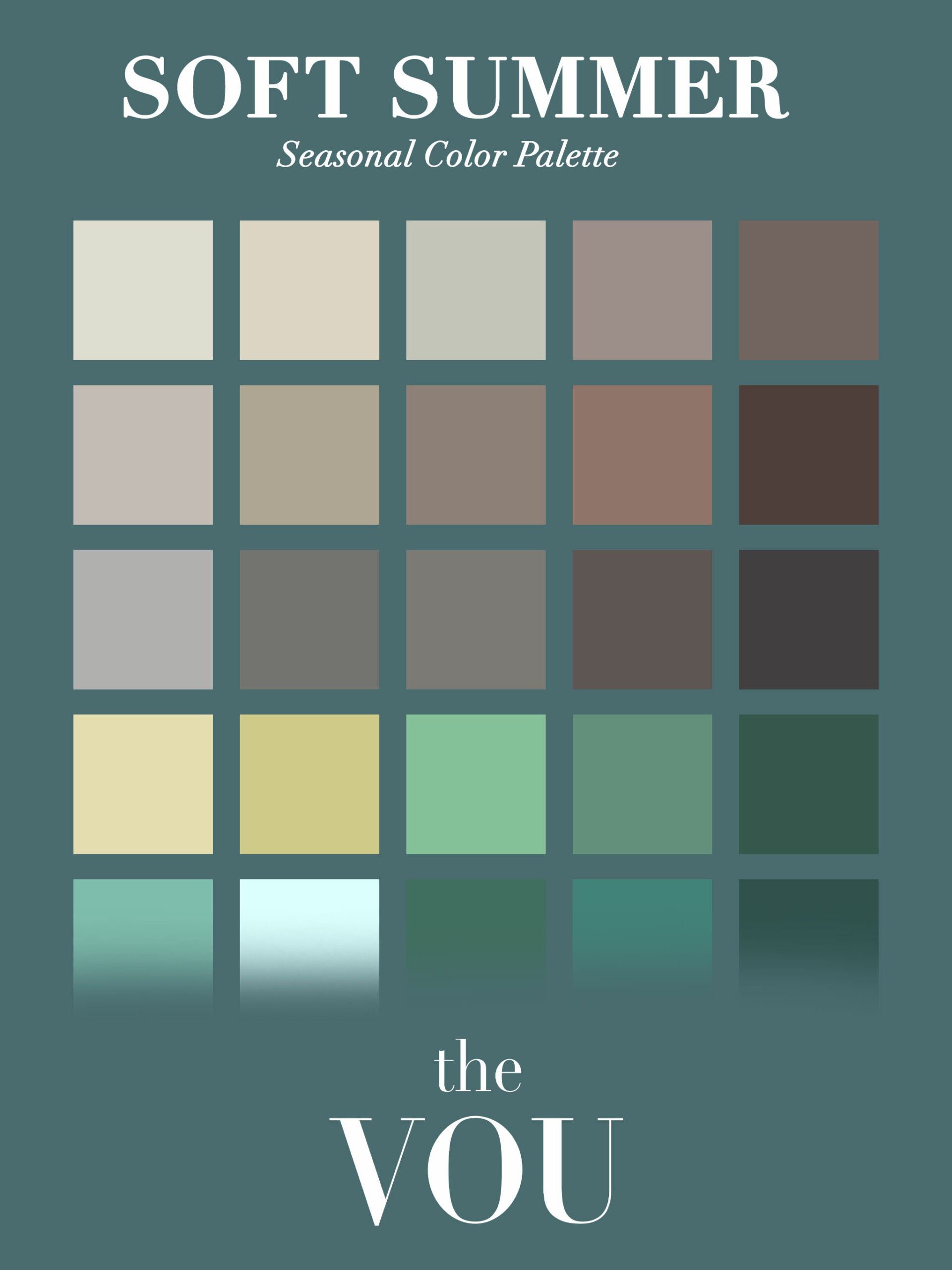
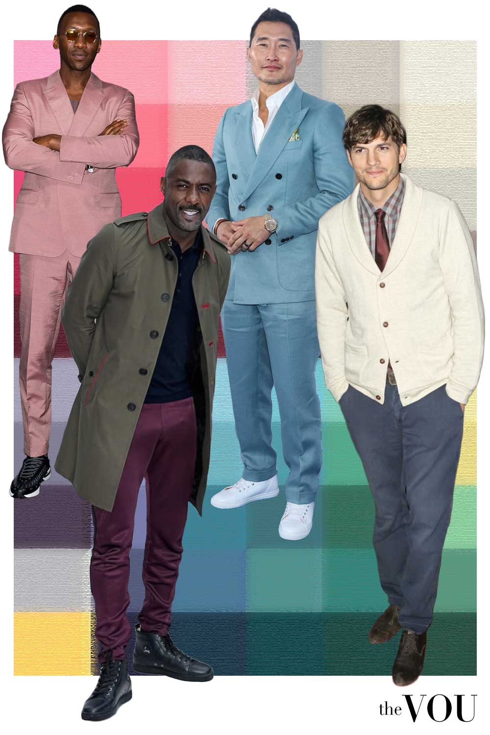
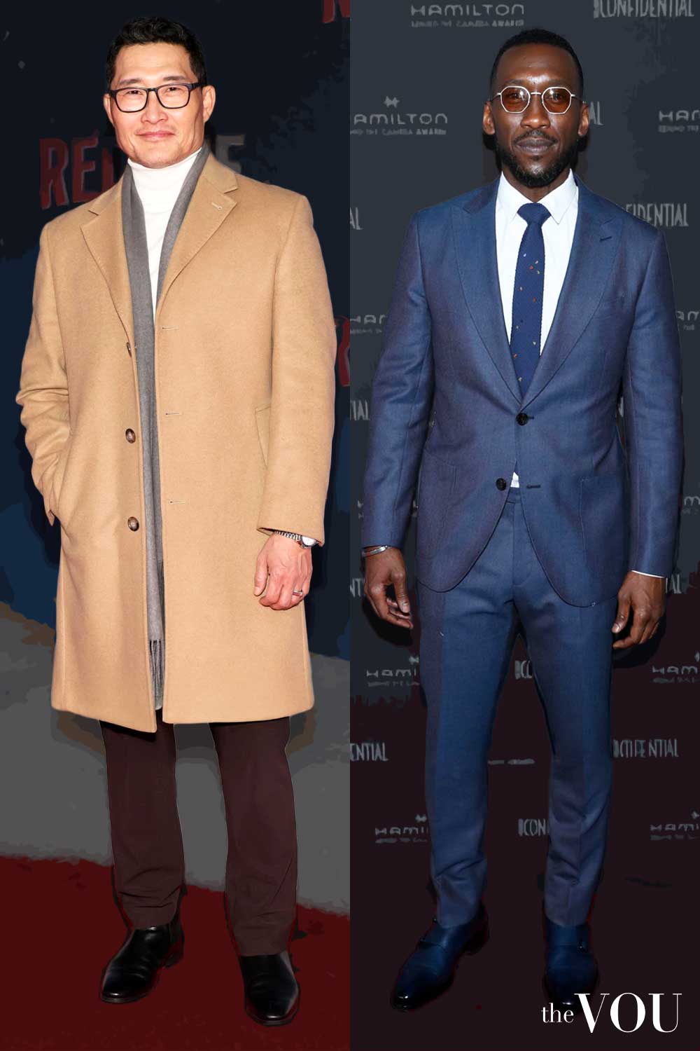
A blended colour effect across the natural features suggests comparing the two Soft palettes.
Assess that separately from the amount of contrast between light and dark between hair and skin.
Neutrals to build around
Accents to try
Grey-blue, soft grey and taupe
The grey-blue polo, mid-grey jacket and cool taupe trousers sit close in depth.
Brown loafers, belt and a restrained watch give the outfit a defined finish.
- Mid-grey blazer
- Grey-blue knit polo
- Cool taupe tailored trousers
- Brown suede penny loafers
- Brown leather belt
- Silver-coloured watch with brown strap
Autumn · 7 of 12
Soft Autumn
Softness leads, with gentler warmth than True Autumn.
Olive, taupe and ecru can create an understated base.
Warm-looking observations combined with a more blended colour effect suggest exploring this palette.
The key comparison is muted warmth against muted coolness, rather than simply light against dark.
Neutrals to build around
Accents to try
Olive, ecru and camel
An olive overshirt and ecru knit give two distinct textures near the face.
Camel chinos and brown chukka boots continue the warmer, earthy group; a small bracelet completes the look.
- Olive corduroy overshirt
- Ecru crew-neck jumper
- Camel chinos
- Brown suede chukka boots
- Brown leather belt
- Narrow gold-tone chain bracelet
Autumn · 8 of 12
True / Warm Autumn
Warmth is prominent, with earthy colour and more depth than the lighter Spring direction.
Golden, coppery or warm-brown observations can suggest the warmer families.
Compare earthier warmth with clearer warmth to distinguish this direction from True Spring.
Neutrals to build around
Accents to try
Camel knit and brown check
The camel rollneck provides a warm central colour against the brown checked blazer.
Dark olive trousers and brown brogues add depth, with a gold-coloured watch as a small accent.
- Brown checked blazer
- Camel rollneck
- Dark-olive tailored trousers
- Dark-brown brogues
- Gold-coloured watch with brown strap
Autumn · 9 of 12
Deep / Dark Autumn
Depth leads with a warm lean, sharing a boundary with Deep Winter.
Lighter accents can separate the darker garments.
A deeper overall colour impression suggests comparing the two Deep palettes.
Record skin depth separately: dark hair and eyes do not settle the warm or cool direction.
Neutrals to build around
Accents to try
Chocolate tailoring with rust
The chocolate suit carries most of the depth.
An ecru shirt and cream pocket square add light, while the rust tie, dark-brown shoes and gold-coloured watch keep the warmer direction visible.
- Chocolate-brown two-piece suit
- Ecru shirt
- Rust textured tie
- Cream pocket square
- Dark-brown cap-toe Oxfords
- Dark-brown socks
- Gold-coloured watch with brown strap
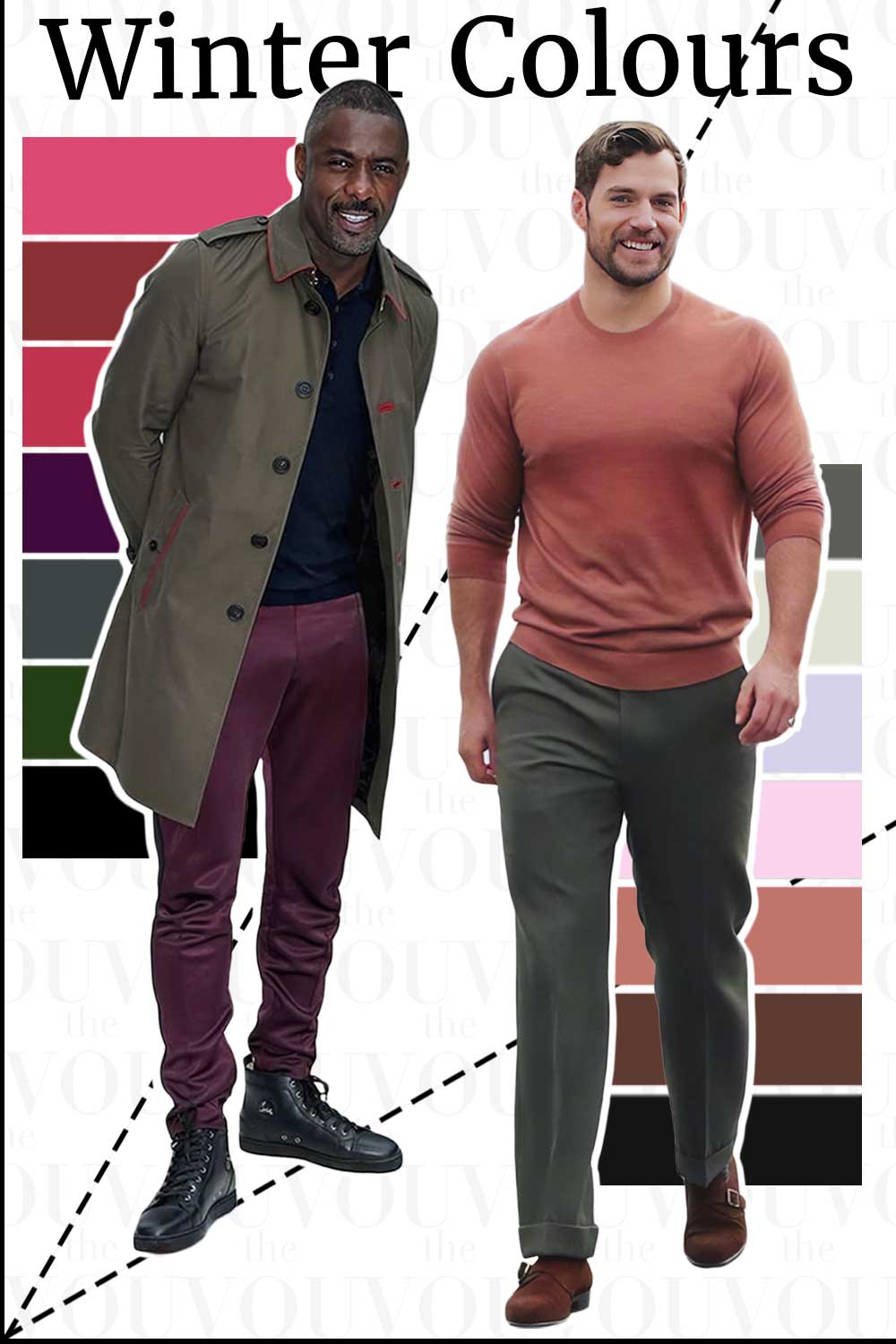
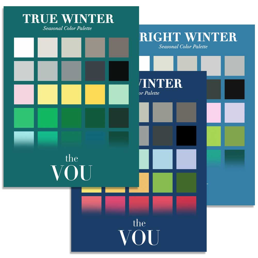
Winter · 10 of 12
Bright / Clear Winter
Clarity leads with a cool lean.
A vivid top or a small crisp accent can carry the effect without making every garment bright.
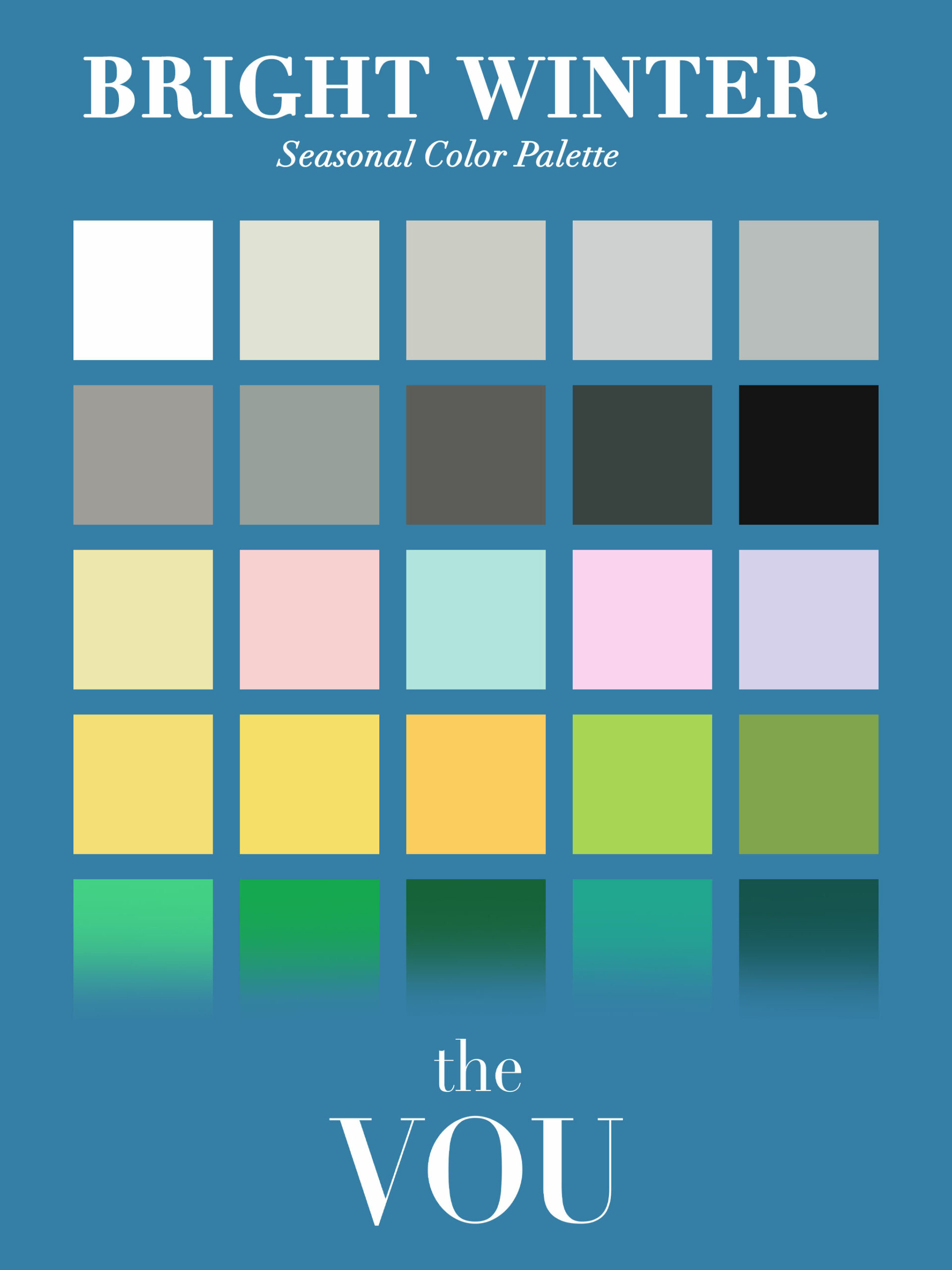
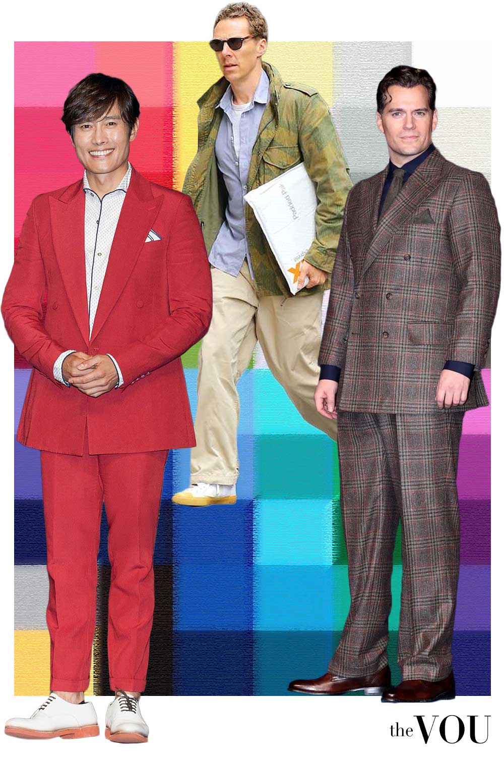
If clear colour and distinct feature differences stand out, compare the Bright pair.
Then check the cool versus warm lean with similarly vivid colours.
Neutrals to build around
Accents to try
Cobalt with a white collar
The cobalt jumper supplies the vivid colour, with a small white collar for contrast.
Charcoal trousers, black boots and a silver-coloured watch keep the rest of the outfit simple.
- Cobalt crew-neck jumper
- White collared shirt
- Charcoal tailored trousers
- Black Chelsea boots
- Black leather belt
- Silver-coloured watch with black strap
Winter · 11 of 12
True / Cool Winter
Coolness is prominent with clearer colour than True Summer.
Deep neutrals and light accents give several contrast options.
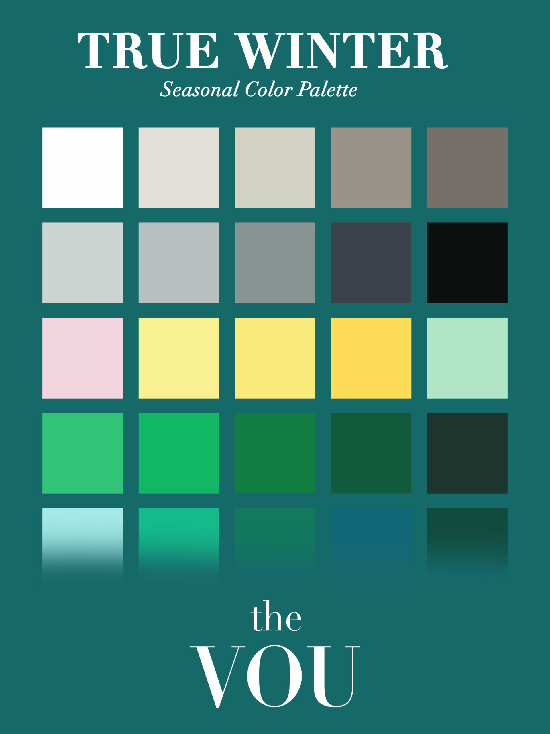
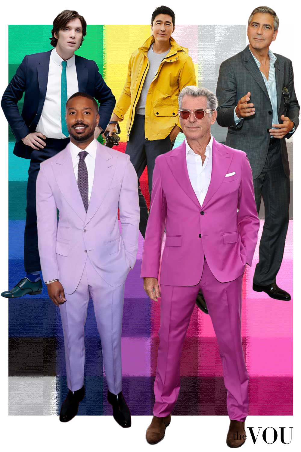
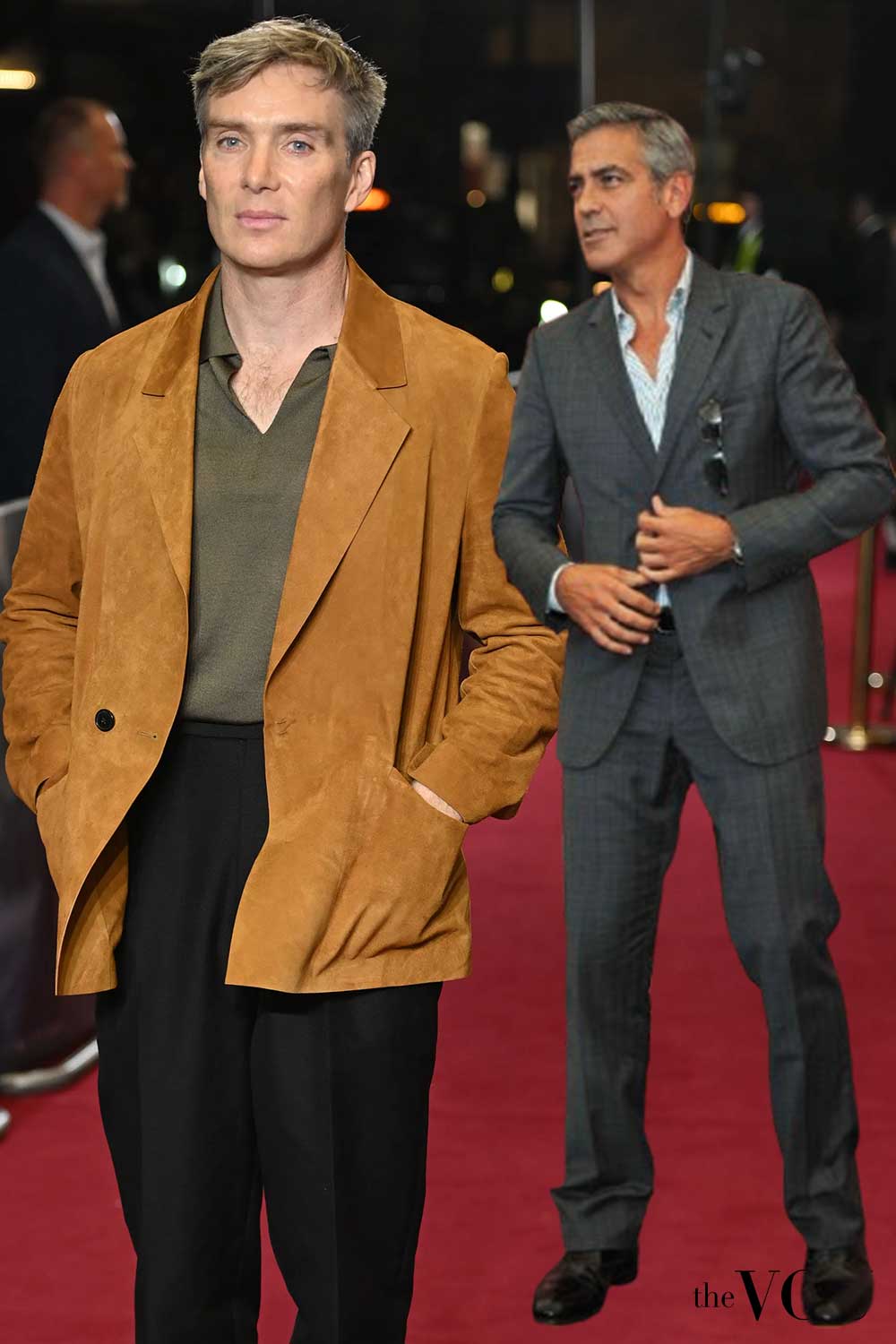
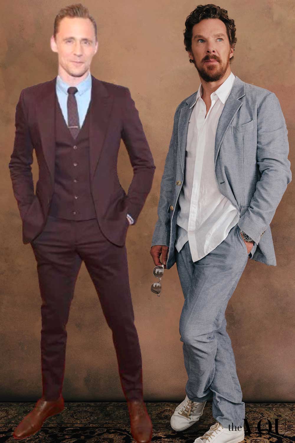
When a cool lean is apparent, compare the clearer and softer cool palettes.
Grey hair can change the visible contrast, so assess the current combination of features.
Neutrals to build around
Accents to try
Navy, white and burgundy
A white shirt creates a crisp edge under the navy blazer.
Charcoal trousers and burgundy loafers add depth, with dark frames and a silver-coloured watch completing the outfit.
- Navy blazer
- White shirt
- Charcoal trousers
- Burgundy loafers
- Dark dress socks
- Black leather belt
- Silver-coloured watch with black strap
- Black squared sunglasses
Winter · 12 of 12
Deep / Dark Winter
Depth leads with a cool lean.
Small light or clearer accents can distinguish the dark garments in a complete outfit.
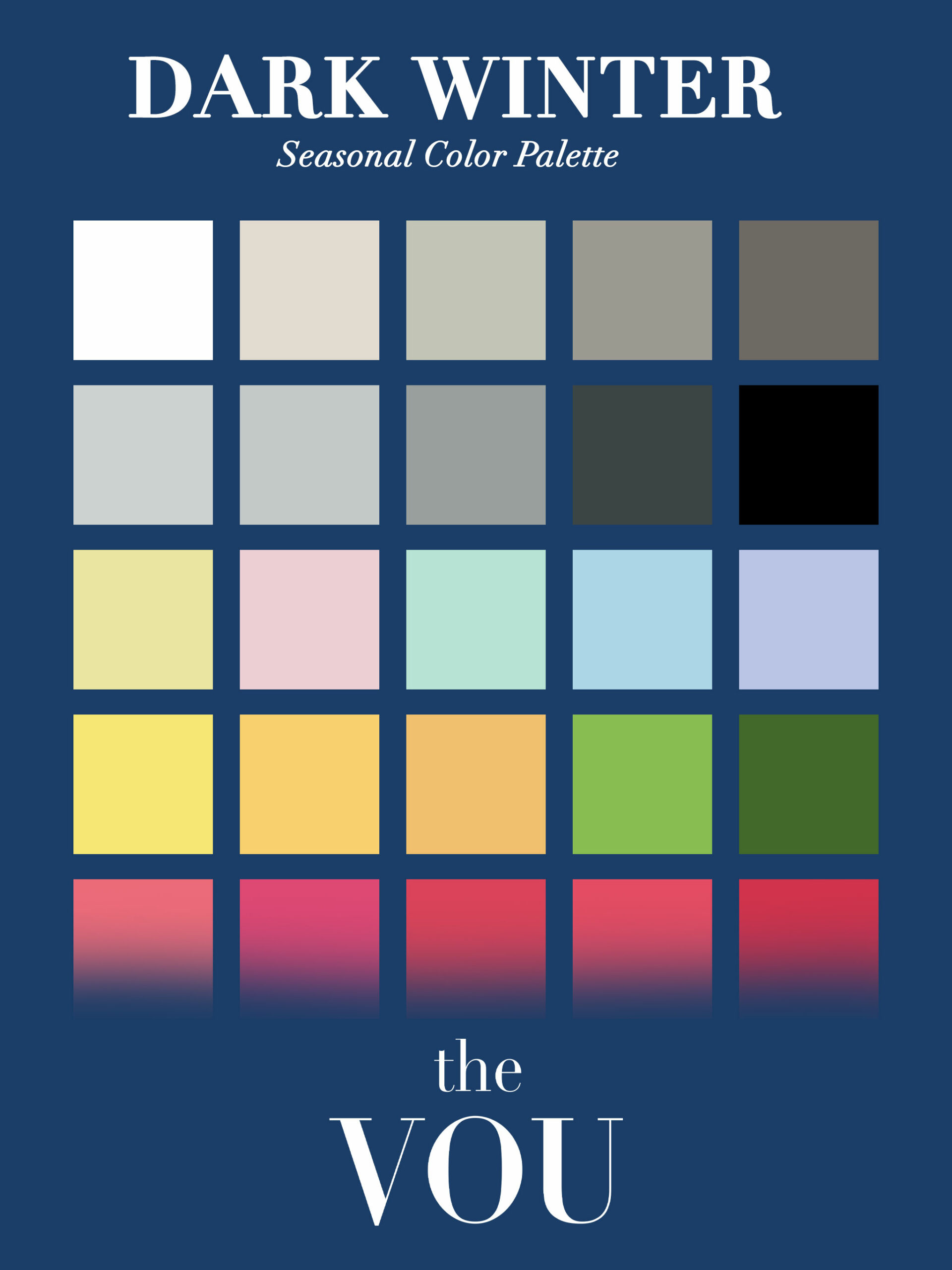
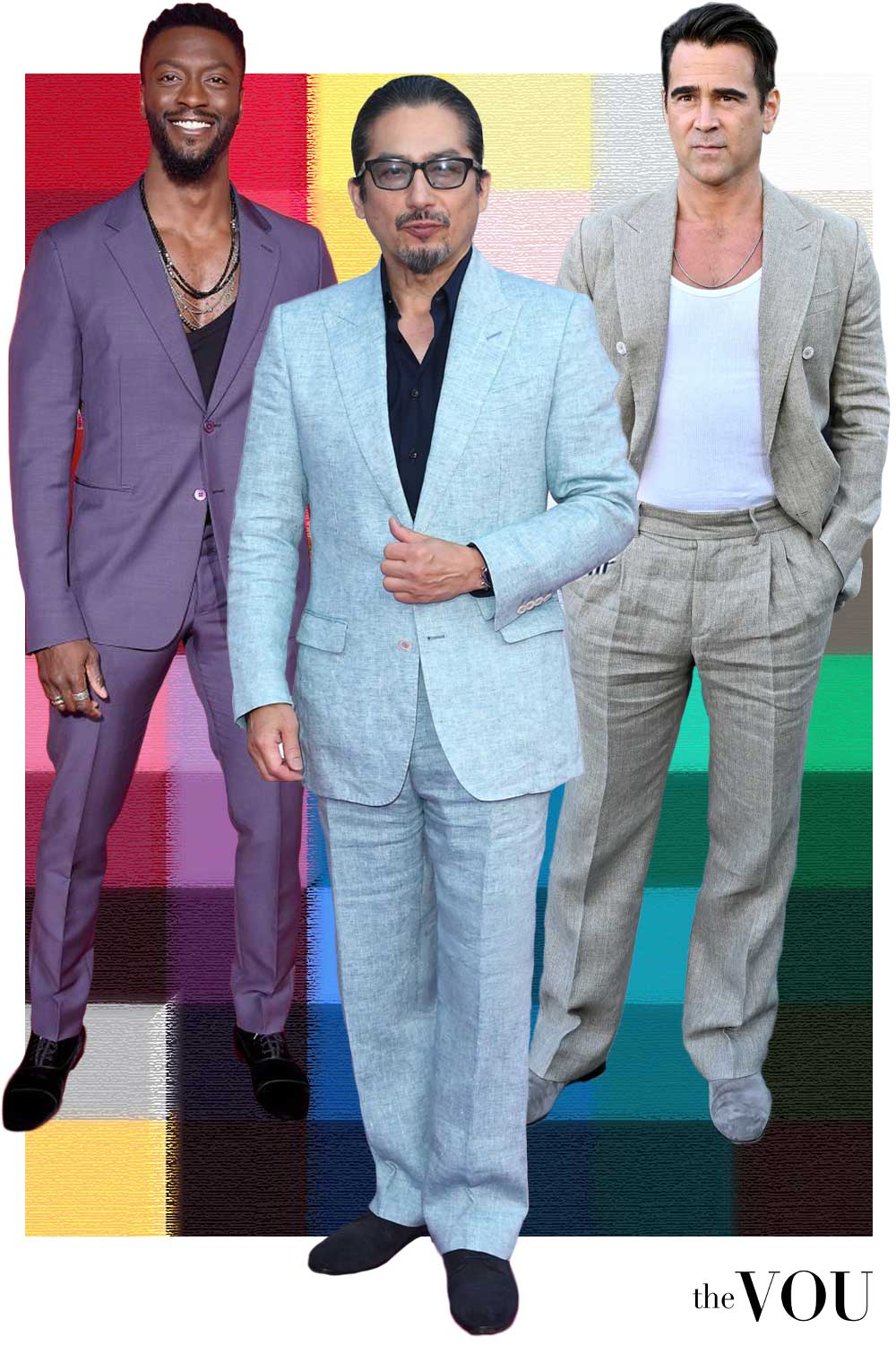
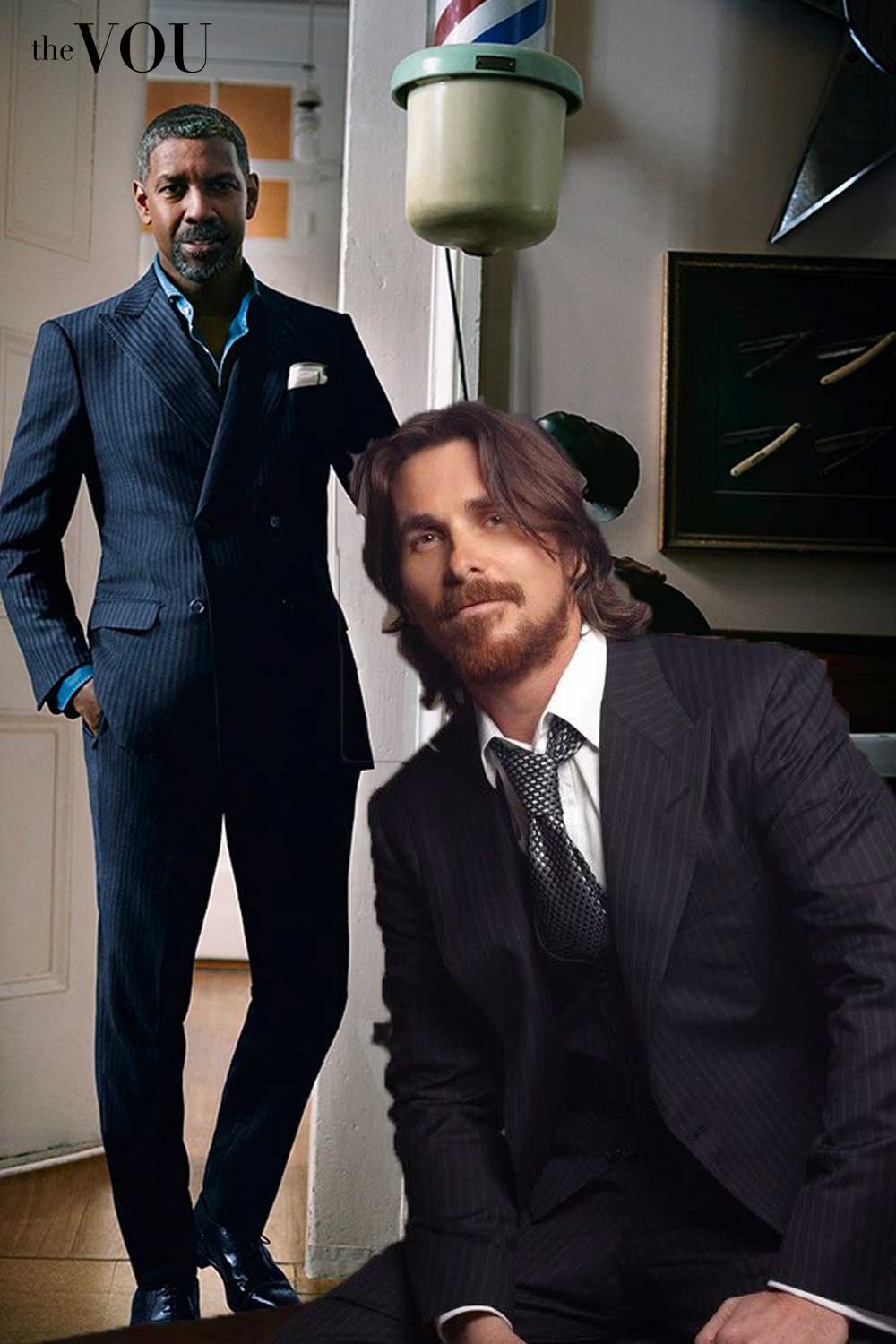
If the overall colouring is deeper, compare the Deep pair before relying on skin depth or a dark-hair label.
The relevant difference is the warm or cool lean at a comparable depth.
Neutrals to build around
Accents to try
Midnight navy with sapphire blue
A midnight-navy suit provides the deep base.
The white shirt and pocket square give defined light areas; a sapphire-blue tie and black Oxfords keep the outfit crisp.
- Midnight-navy two-piece suit
- White shirt
- Sapphire-blue tie
- White pocket square
- Black cap-toe Oxfords
- Dark-navy dress socks
- Silver-coloured watch with black strap
Make the palette work with your wardrobe
Begin with a jacket or coat, two tops and a pair of trousers you already use.
Swap one top or add a scarf, then look at the complete outfit.
A familiar neutral can stay useful while you explore a new colour near your face.
For restrained old-money styling, keep the silhouette, detailing and colour choices deliberate: a fine knit, well-fitting tailoring and maintained shoes make a repeatable foundation.
Let one accent carry the colour, or use several related mid-tones with different textures.
Keep useful clothes. A dark coat can work with a lighter collar; a bright colour can appear in a small scarf or pocket square.
Choose the effect you want instead of treating a palette as a list of prohibitions.
Match the occasion. Office tailoring, a weekend lunch and black tie have different requirements.
Use your colour choices within the dress code.
For a formal outfit, the shirt, tie or pocket square often gives enough room to introduce an accent.
Accessories: compare colour, scale and finish together
Scroll horizontally to see all columns →
| Item | What to compare | Practical priority |
|---|---|---|
| Glasses | Honey/tortoiseshell or warmer metal against grey, navy or cooler metal; then compare light and dark rim weights | Comfortable bridge and temple fit, appropriate lenses and a frame shape you enjoy |
| Sunglasses | Frame colour and lens tint separately, in the light where you will wear them | Suitable protection and fit |
| Watches and jewellery | Similar sizes in warmer or cooler finishes; polished versus matt surfaces | Comfort, usefulness and how the accessories relate to the outfit; mixed metals can be intentional |
| Shoes and belts | Leather colour, finish and how dark it appears against the trousers | Occasion, fit and condition; related colours need not be identical in a casual outfit |
| Ties, scarves and pocket squares | A palette accent against the shirt or jacket it will accompany | Fabric weight, pattern scale and the amount of colour you want |
| Hats | Crown colour, brim shadow and the collar beneath it | Head fit, weather and overall proportions |
Colour and shape are separate decisions.
The VOU's face-shape guide discusses proportions; the personal-style guide and dressing-by-occasion guide address the wider outfit.
Grey hair, dyed hair, bald heads and changing appearance
With grey or white hair, record the colour and contrast you see now.
An older photograph can add context.
With dyed hair, check natural roots where possible, then put your usual hairstyle back into the picture when deciding how you want to dress.
With little or no scalp hair, use the visible skin, irises, brows and any facial hair; leave a missing observation open.
Frameworks differ on permanence.
House of Colour describes its seasonal label as lifelong, while Colour Me Beautiful's tonal system offers reassessment as appearance changes.
Whichever vocabulary you use, you can reconsider the lightness and contrast of your outfits after a visible change.
The same observation process is available across skin depths and ethnic backgrounds.
The descriptions above are examples, not eligibility categories.
If a colour difference is difficult for you to see, ask someone to describe it and label the garments in your notes.
Keep the comparison unresolved when the distinction is not observable.
What the labels and evidence can tell you
This article uses a common twelve-season convention.
True/Warm, True/Cool, Bright/Clear and Deep/Dark are paired names here. Kettlewell's current framework uses sixteen subtypes, separating True Spring from Warm Spring and True Summer from Cool Summer.
Colour Me Beautiful uses tonal distinctions.
Ask which framework produced a result before treating similar labels as identical.
The twelve names also appear in 12 Blueprints' seasonal guide catalogue.
Feature observation and controlled colour comparison can guide styling.
A 2021 study by Perrett and Sprengelmeyer studied observers choosing simulated clothing colours for twelve white women's faces with fair or tanned skin.
That finding does not establish twelve-season accuracy for men or every skin depth.
Vein appearance is influenced by several optical factors, as research by Kienle and colleagues explains.
Veins, lip colour, nail beds, tanning behaviour or one hair/eye label cannot supply a confirmed seasonal result.
No deliberate sun exposure is needed; the American Academy of Dermatology explains that tanning reflects UV damage.
The pictures in this guide show colour and outfit ideas; screens and images cannot establish a person's undertone or reproduce a professional draping appointment.
Keep a useful result
Write down your natural-feature observations, the garments compared and the repeated differences you noticed.
Keep the palette or comparison set your observations support, including more than two possibilities when needed, then save a complete outfit you would wear.
An unresolved seasonal label does not prevent useful wardrobe choices.
Those notes are useful in a shop or in a conversation with an image consultant.
If you want individual help, ask The VOU about its current colour-assessment service, including how it handles mixed results and what practical guide you receive.
Related guides on The VOU:
Spring Seasonal Colour Palette for Men (With Styling Guide)
Summer Seasonal Colour Palettes for Men
5 Ideal Metals for Soft Autumn Men
Winter Colour Palettes for Men: Bright, True and Deep Explained
Is There a Free Colour Analysis App?
The 7 Men’s Body Shapes, and How to Tell Which Describes You
Why Image Consultants Are Key to Your Professional Success
What is an Outfit in Fashion and Why is it Different from Attire
Autumn Colour Palettes for Men: Soft, True and Deep Autumn Explained
Bright/Clear Spring Colour Palette Complete Guide for Men
Ideal Colours for True/Warm Spring Men
Light Spring Colour Palette for Men: How to Check It and Wear It
Soft Autumn Colour Palette for Men: How to Check It and Wear It
True/Warm Autumn Colour Palette for Men: How to Check It and Wear It
Deep/Dark Autumn Colour Palette for Men: How to Check It and Wear It
Bright/Clear Winter Colour Palette for Men: How to Check and Wear It
True/Cool Winter Colour Palette for Men: How to Check and Wear It
Deep/Dark Winter Colour Palette for Men: How to Check and Wear It
How to Develop Your Personal Style
What is a Personal Stylist and Why You Need One
How to Style Inverted Triangle Men with Bright Clear Spring Colours
15 Bright/Clear Spring Male Celebrities
Hourglass Shaped Men with Bright Spring Colour Palette
The Old Money Capsule Wardrobe: 16 Essentials for Men
Smart Casual Dress Code Decoded for Modern Gentlemen
Inverted Triangle Men Dressing Guide with True/Warm Spring Colours
15 True/Warm Spring Male Celebrities
Hourglass Body Shape Men Styling Tips with Light Spring Colours
15 Light Spring Male Celebrities
How to Find and Choose the Best Image Consultant for You
All Types of Dress Codes Every Gentlemen Must Know
True/Cool Summer Colour Palette
What is Fashion? All 4 Fashion Facets Explained in Detail
15 Light Summer Male Celebrities
How to Find the Best Personal Stylist for You
15 True/Cool Summer Male Celebs for Styling Inspo and Ideas
What Is A Fashion Trend and Why Trendy Fashion Matters So Much
Navy Blazer Styling Guide for Gents
15 Soft Summer Male Celebrities
15 Bright/Clear Winter Male Celebs for Styling Inspo and Ideas
15 True/Cool Winter Male Celebs for Styling Inspo and Ideas
15 Male Celebrities With Winter Colour Palette
15 Deep/Dark Winter Male Celebs for Styling Inspo and Ideas
Deep/Dark Winter Men Styling Guide and Wardrobe Essentials
Bright Spring Seasonal Colour Palette for Men
True Spring Seasonal Colour Palette for Men
Light Spring Seasonal Colour Palette for Men
Light Summer Seasonal Colour Palette for Men
True Summer Seasonal Colour Palette for Men
Soft Summer Seasonal Colour Palette for Men
Bright/Clear Winter Colour Palette for Men
Styling Beyond Seasonal Colours
Knowing your seasonal palette is a small step towards dressing like a confident and successful gentleman.
For comprehensive guidance, consider working with an experienced image consultant.
Your body type and colour palette are a starting point; our guide to styling by occasion, location, season and time of day covers the next step.
And if you want to learn, we’re here to help; start by knowing your body type and unique colour palette so you can select clothes for your body shape in colours that match your skin, eyes, and hair.
It also helps to know which fashion brands to shop from and how to style these garments, footwear, and accessories to create a look of subtle luxury and success.
Our guides also cover heritage fashion brands and styling by occasion, location, season and time of day.
If you feel overwhelmed, we can help, starting with three free quizzes:
1. Find Your Body Type
Different garments flatter different physiques, so knowing your body type is the first step in dressing like a confident man; take our free body shape quiz for men.
Once you know your unique body type, take the second free quiz to discover your unique colour palette.
2. Find Your Seasonal Colours
Remember, fashion comes in various colours, but not every hue complements your natural colour.
Take our free seasonal colour quiz for men to find the colours that suit you.
3. Find Your Fashion Style
By now, you should already know your body type and unique colour palette, so the next step is to discover your personal fashion style.
To find it, take our free fashion style quiz for men; it suggests a style direction, outfit ideas and fashion brands to explore.
Personal Help from The VOU
For personal help, you can book a consultation with our image consultants and fashion stylists.
Our styling services for men are paid consultations; the shop page lists what each one includes.
Owning luxury clothes is not enough on its own; knowing your body type and colour palette makes styling by occasion, location, season and time of day easier.
Contact us to book a consultation once you have taken the three free quizzes.
Mandy Meyer’s focus at The VOU is men’s body-shape styling, garment fit and outfit proportions. Her coverage addresses the practical questions behind a wardrobe choice: how a jacket sits across the shoulders, how trousers fall and how different cuts change the silhouette a wearer wants to create.
Her subject areas include the triangle, inverted triangle, rectangle, oval, trapezoid, hourglass and diamond labels used in body-shape styling. These provide starting references for comparing visible proportions; they do not capture every body or prescribe one correct way to dress. The focus connects those observations with garment shape, construction, length and the relationship between the upper and lower parts of an outfit.
Mandy’s editorial coverage combines visual comparisons with fit checks for comfort and movement. Readers can consider whether a cut gives them the room they need, where clothing pulls or gathers and which changes might support their preferred look. The aim is to make menswear choices more understandable while keeping personal preferences and the wearer’s own styling goals central.