
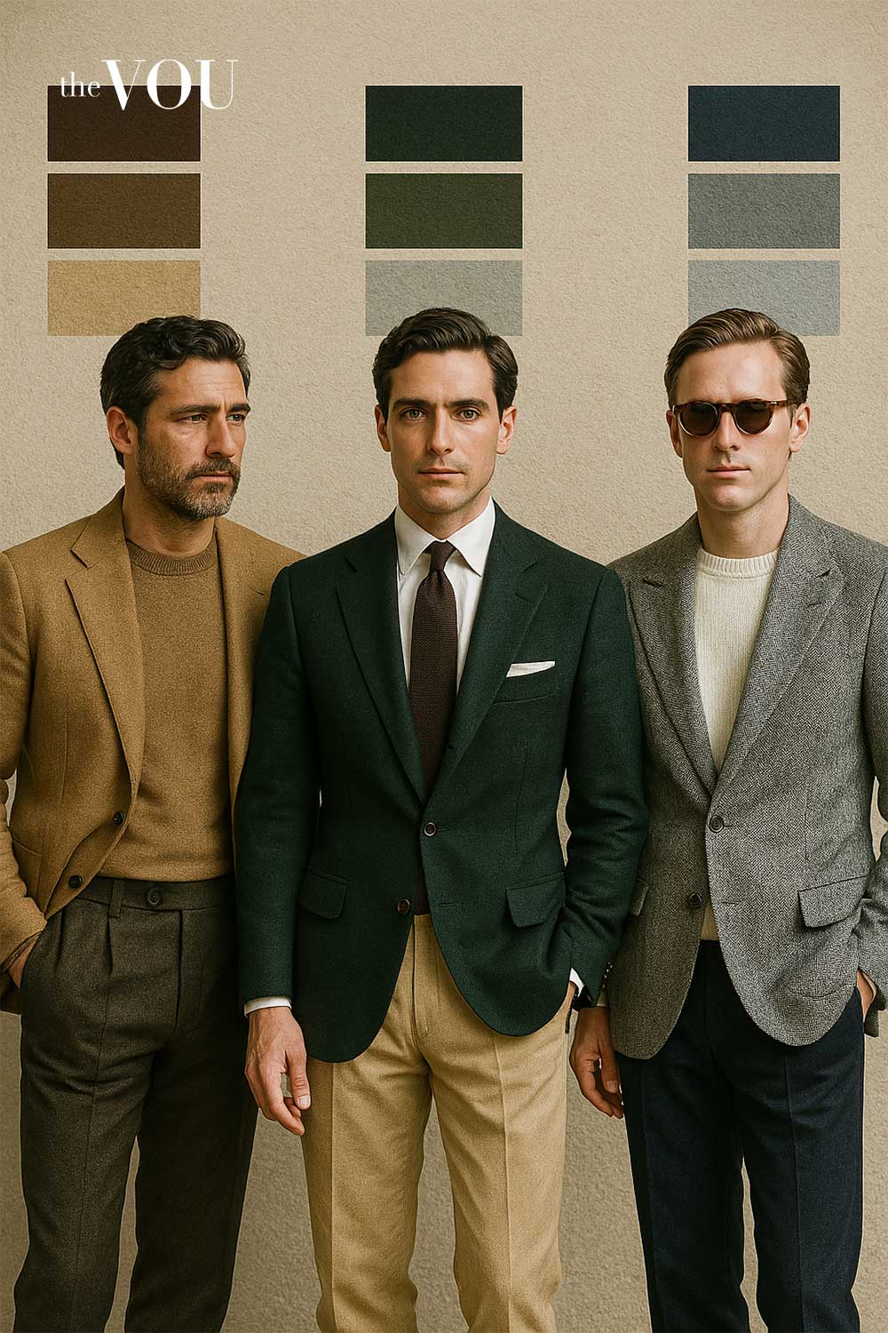
Best Old Money Colour Combinations
Old money aesthetics in fashion encapsulate a distinct principle centered on understated elegance.
This style is rooted in the traditions of affluent families who have amassed wealth over generations, valuing subtlety over extravagance.
The origins of this aesthetic can be traced back to historical norms where opulence was less about display and more about refinement.
By emphasizing quality craftsmanship and timeless design, old money fashion communicates wealth without the need for overt signals.
At the heart of old money aesthetics is a commitment to traditional styling, prioritising classic silhouettes and high-quality fabrics.
Men who embrace this style tend to favor stylish, durable clothing made from natural materials, reflecting a respect for artisanal heritage.
This commitment establishes an enduring and versatile wardrobe, allowing seamless transitions across various social contexts and further affirming the old money ethos.
Color palettes are essential in embodying old money aesthetics, often focusing on muted and sophisticated hues.
Earthy tones, navy blues, and classic whites are staples, chosen for their ability to convey elegance without drawing undue attention.
These colors symbolize a refined lifestyle that appreciates tradition and heritage. Moreover, the principle of ‘less is more’ is pivotal. Utilizing a restrained color scheme elevates the appearance of sophistication and taste.
Fashion choices in this realm are not tied to fleeting trends but are instead steeped in a philosophy of timelessness, allowing ensembles to transcend seasons and fads.
Thus, understanding old money aesthetics requires appreciating its historical context, where quality, subtlety, and tradition create a cohesive approach to men’s styling.
By focusing on these core principles, one can curate an enduring wardrobe that reflects the refined values of old money without succumbing to the temptation of ostentation.
Main Old Money Color Palettes
Old money style is not merely about wealth but also about the subtlety and sophistication of color choices.
The color palettes epitomising this style reflect a refined sensibility, often drawing from nature and traditional aesthetics.
These combinations, favored by individuals in the upper echelons of society, resonate with elegance and a timeless appeal. Here, we explore several key color palettes that characterize old-money styling.
A prominent palette includes muted shades of navy blue, charcoal gray, and cream. Navy blue is often perceived as a color of authority and stability, making it an excellent choice for formal suits and blazers.
Pairing it with charcoal gray creates a sophisticated and subdued contrast. Complimenting these colors with cream adds a touch of softness, making this combination ideal for business attire or formal events.
Another classic combination features earthy tones such as olive green, burnt sienna, and tan. Olive green is a subtle choice that evokes a connection to nature, often suitable for casualwear and jackets.
Burnt sienna adds warmth and richness, enhancing a wardrobe’s depth, while tan complements both colors without overwhelming them.
This palette can be effectively utilized in seasonal wardrobes, particularly during the autumn months.
Lastly, one cannot overlook the timeless appeal of monochromatic schemes. Shades of gray, from light ash to deep slate, can convey professionalism while enabling the wearer to express depth through texture.
A gray suit enriched with a lighter gray shirt maintains a cohesive yet striking appearance.
Accessories in varying shades of gray can further enhance this ensemble, exemplifying how old money styling leans toward elegance in simplicity.
Understanding these classic color palettes is essential for anyone looking to refine their wardrobe in accordance with old money aesthetics.
By thoughtfully mixing and matching these shades, individuals can cultivate a sophisticated style that echoes tradition and modernity.
20 Best Old Money Color Combinations for Men
Embracing an old money aesthetic is about sophistication, subtlety, and timelessness. Below, we present 20 tailored color combinations that capture the essence of classic men’s styling.
These color palettes resonate with a refined sensibility and are exceptionally versatile, offering a range of options suitable for various occasions.
1. Navy and White: A traditional pairing, navy suits with white shirts exude elegance. This combination is perfect for both business and formal events.
2. Burgundy and Cream: Deep burgundy neckties paired with cream-colored dress shirts create warmth and richness, ideal for evening gatherings.
3. Charcoal and Light Grey: Two shades of grey provide a sophisticated monochromatic look, suitable for all professional settings.
4. Forest Green and Tan: This earthy combination adds a touch of nature and is suitable for casual outings and weekend brunches.
5. Khaki and Navy: Khaki trousers with a navy blazer strike a balance between laid-back and polished, making it great for semi-formal occasions.
6. Dusty Blue and Soft Pink: Introducing softer hues brings a fresh twist, perfect for spring and outdoor events.
7. Olive Green and Light Brown: A rich palette that speaks volumes without being ostentatious, fitting for autumn gatherings.
8. Slate Blue and White: A lighter alternative to navy, this combination pairs beautifully with white for a summer look.
9. Chocolate Brown and Beige: Earth tones create warmth and depth, suitable for winter settings.
10. Steel Grey and Rust: This contemporary combination blends modernity with tradition, ideal for creative environments.
11. Maroon and Sage: A less common pair, maroon and sage suits formal occasions remarkably well, providing a unique yet classic style.
12. Aubergine and Cream: Deep purple evokes luxury, and when combined with cream, it provides a gentle balance for formal attire.
13. Cream and Brown: Subtle yet classic, this combination is perfect for less formal settings and delivers sophisticated appeal.
14. Dusty Rose and Grey: A muted approach ideal for social gatherings, this combination is both stylish and classy.
15. Black and Charcoal: A refined take on black attire, pairing different shades of charcoal adds depth while remaining chic.
16. Pewter and Ivory: This elegant blend works beautifully for formal events, maintaining an air of sophistication.
17. Sand and Blue: The lightness of sand paired with blue creates a breezy look perfect for coastal gatherings or summer outings.
18. Teal and Beige: Teal adds a touch of color while beige grounds the look, suitable for both casual and formal occasions.
19. Slate Grey and Mauve: Mauve softens the boldness of slate grey, making it suitable for semi-formal events where a hint of style is necessary.
20. Midnight Blue and Gold: A striking combination for evening events, midnight blue suits accentuated with gold accessories radiate elegance.
These curated color combinations exemplify the essence of old money style, allowing men to express their sophistication effortlessly.
Whether dressing for business or leisure, embrace these palettes for a timeless and classic look.
Best Colours for Old Money Accessories
In the realm of old money aesthetics, accessories play a pivotal role in enhancing one’s overall appearance while adhering to the principles of understated elegance.
The selection of the right accessories can significantly elevate classic color combinations, reflecting a commitment to quality and timeless style.
Accessories like ties, pocket squares, watches, and shoes are not merely functional; they serve as essential components that complete an ensemble, providing an opportunity for personal expression without compromising sophistication.
When considering ties, opting for rich, muted tones can complement the traditional palettes associated with old money style.
A navy or deep burgundy tie, for example, pairs seamlessly with various shirts and suits, creating a harmonious look.
Similarly, a pocket square, while a small detail, can add a subtle touch of flair to an outfit.
Selecting a pocket square that features a soft pattern or texture can enrich the overall ensemble without overwhelming it.
Such choices reflect an understanding of balance in style, crucial to achieving a refined appearance.
Watches serve not only as tools for telling time but also as statements of personal taste and discernment.
A classic timepiece crafted from quality materials is a hallmark of the old money ethos, echoing a preference for longevity over trends.
When choosing shoes, classic styles such as brogues or loafers in neutral colors can maintain a cohesive look.
Quality craftsmanship is paramount; investing in well-made shoes ensures durability and a polished finish that complements any outfit.
Ultimately, the key to blending accessories with old money color combinations lies in selecting pieces with the same commitment to elegance and timelessness.
Accessories should enhance rather than dominate the outfit, embodying the principle that true style is characterized by subtlety and refinement.
Mandy Meyer’s focus at The VOU is men’s body-shape styling, garment fit and outfit proportions. Her coverage addresses the practical questions behind a wardrobe choice: how a jacket sits across the shoulders, how trousers fall and how different cuts change the silhouette a wearer wants to create.
Her subject areas include the triangle, inverted triangle, rectangle, oval, trapezoid, hourglass and diamond labels used in body-shape styling. These provide starting references for comparing visible proportions; they do not capture every body or prescribe one correct way to dress. The focus connects those observations with garment shape, construction, length and the relationship between the upper and lower parts of an outfit.
Mandy’s editorial coverage combines visual comparisons with fit checks for comfort and movement. Readers can consider whether a cut gives them the room they need, where clothing pulls or gathers and which changes might support their preferred look. The aim is to make menswear choices more understandable while keeping personal preferences and the wearer’s own styling goals central.
Aidan Russell’s focus at The VOU is men’s face-shape styling, facial proportions and the way accessories frame the face. His coverage addresses a common starting question: how do you choose glasses, hats or necklines when standard face-shape advice does not quite describe your features?
His subject areas include comparing visible face length and width, recognising mixed features and understanding how frame size, brim shape and neckline placement change an overall look. Rather than making a shape label the final decision, this coverage connects proportions with the effect a reader wants, whether that means adding definition, softening an outline or drawing attention to particular features.
Aidan’s editorial focus also links facial styling with the rest of a man’s wardrobe. The aim is to make comparisons easier when trying on accessories or planning an outfit, while allowing for comfort, fit and personal preference. Readers looking for a starting point in face-shape styling can use this coverage to identify options worth trying, without being confined to one prescribed look.
Ana Alves focuses on sustainable menswear, vegan materials and alternatives to buying every wardrobe item new. Her coverage at The VOU connects environmental questions with practical clothing decisions: what to keep, what to repair and how to assess a purchase when a product’s sustainability claims are difficult to compare.
Her subject areas include vintage and second-hand shopping, clothing rental, material descriptions and the information behind vegan fashion claims. This focus considers condition, fit, care requirements and likely use alongside a garment’s stated composition. It also separates specific sourcing or production information from broad labels that do not explain how a product was made.
Ana’s approach to wardrobe planning starts with the clothes a reader already owns. Her coverage supports men who want to reduce unnecessary purchases, find useful pieces second-hand or compare alternatives to animal-derived materials. The aim is to make those choices clearer without presenting one material, retailer or shopping method as an automatic guarantee of lower environmental impact.