
Start here
What’s This About:
Use your colour palette as styling guidance: start with clothes you already wear, pick a few base colours, and try preferred shades in shirts, knitwear or scarves near your face without replacing everything outside the palette.
This guide explains how to apply a palette across complete outfits, such as:
– giving colours a base, near-face or accent role
– using seasonal direction without a uniform
– controlling depth, intensity and contrast separately
– four complete outfits to adapt
– formal dress codes, footwear, belts and metals
– making existing clothes work harder
and many more!
Let the occasion, fit and your own preferences lead, with the palette as a helpful guide.
Key Points:
01Base, near-face and accent are flexible roles; one colour, such as navy, can serve as a shirt near the face in one outfit and as trousers in another.
02Judge the actual fabric rather than its retail name, because “sage” or “navy” can describe quite different shades and a screen swatch is not an exact specification.
03Depth, intensity and contrast are separate controls; a mid-blue shirt beneath navy tailoring softens light-dark jumps without changing your personal label.
04An event’s dress code takes priority over a palette, so conventional black tie still calls for a white formal shirt and a black bow tie.
Use your colour palette to make outfits easier to assemble.
Begin with clothes you already wear, identify a few useful base colours, and try preferred shades in shirts, knitwear or scarves near your face.
You do not need every colour on a swatch card, and you do not need to replace everything outside it.
Whether your palette came from a consultation, an app or your own comparisons, treat it as styling guidance.
Fit, comfort, the occasion and your own preferences still matter.
Give colours a job
Choose base colours that connect several garments, near-face colours you enjoy, and accents that add interest.
These are roles, not fixed categories or mandatory wardrobe percentages.
Scroll horizontally to see all columns →
| Role | Where to use it | How to choose |
|---|---|---|
| Base | Trousers, tailoring, coats and frequently worn shoes | Start with colours in useful clothes you own: navy, grey, brown, olive, cream or black |
| Near-face colour | Shirts, polos, knitwear, jacket collars and scarves | Try the actual garment beside your face and with your usual outer layer |
| Accent | Ties, pocket squares, socks and smaller accessories | Choose the amount of colour and contrast you want for the occasion |
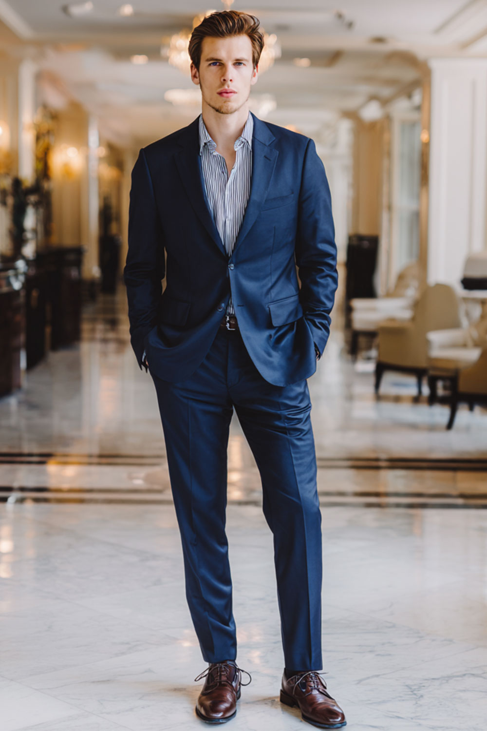
A navy shirt can be the main colour near your face; navy trousers can be the base.
One garment can serve several outfits.
A restrained wardrobe does not require a luxury label, and a high price does not establish quality.
Use seasonal direction without turning it into a uniform
In The VOU’s twelve-season convention, Spring leans warmer and clearer, Summer cooler and softer, Autumn warmer and softer, and Winter cooler and clearer.
Each family has variations in depth and intensity.
For Spring, you might explore ivory with a clearer coral or fresh green accent.
For Summer, try muted navy, blue-grey and dusty rose.
Autumn offers warm brown, olive and terracotta directions; Winter offers cool navy, charcoal and clearer blue or red accents.
These are starting combinations, not a list that every man in a family must wear.
Judge the fabric rather than its retail name.
“Sage” can be grey, yellow-green or comparatively blue-green; “navy” can be almost black or noticeably brighter.
A screen swatch helps you search, but it is not an exact specification of a garment.
Control depth, intensity and contrast separately
Depth concerns light and dark.
Intensity concerns clearer, more vivid colour versus greyed or muted colour.
Contrast is a difference between areas: specify whether you mean light-dark difference, different hues or a conspicuous pattern.
A white shirt under a black jacket has strong light-dark contrast without using a vivid hue.
A cobalt jumper can be intense even when its trousers are similar in depth.
Dark hair beside light skin does not, by itself, tell you which arrangement you should wear.
To soften an outfit’s light-dark jumps, try a mid-blue shirt beneath navy tailoring instead of white.
To keep a vivid colour but make it less prominent, move it from a jumper to a tie.
Both are styling choices; neither changes your personal label.
Four complete outfits to adapt
Business dress with a cooler, softer direction
Wear a muted navy suit, pale blue shirt, dusty burgundy tie, navy socks and black Oxfords.
The pale shirt separates the face from the darker suit; the tie introduces colour without a large vivid panel.
Choose a tie with enough difference from the shirt to remain visible.
A plain white pocket square is optional.
Business casual with a warmer, softer direction
Combine a warm brown unstructured jacket, cream shirt, olive trousers, dark brown loafers, brown socks and a brown belt.
Cream provides the light area, while brown and olive keep the larger garments subdued.
Where the office requires a suit or a tie, use that requirement to choose the outfit before considering the palette.
Casual dressing with a warmer, clearer direction
Try an ivory polo, navy chinos, brown loafers, a brown belt and a coral cotton jumper worn when needed.
The navy grounds the brighter coral and lighter ivory.
If the coral feels too prominent, use the ivory polo alone and introduce a smaller coral detail only if you already own one.
Dinner with a cooler, clearer direction
For an evening where relaxed tailoring is appropriate, wear a cobalt knit, charcoal trousers, a dark navy jacket, charcoal socks and black loafers.
Cobalt supplies the main colour beside the face; the darker garments contain it.
If you prefer a quieter arrangement, substitute a navy knit and keep cobalt to a pocket square.
This is a dinner outfit, not black tie.
Formal invitations take priority
A palette does not change an event’s dress code.
For conventional black tie, a complete starting outfit is a black dinner jacket with matching dinner trousers, a white formal shirt, a black bow tie, black socks and suitable black formal shoes.
Do not introduce a coloured bow tie solely because it appears in your palette.
Emily Post distinguishes black tie, creative black tie and black tie optional; check the invitation and host’s expectations before adapting.
If black or bright white is not your usual preference, concentrate on fit, grooming and the appearance of the complete formal outfit.
You can dress appropriately without requiring every garment to be a favourite palette colour.
Footwear, belts and metals
Choose shoes first for the occasion and their relationship to the trousers.
Brown leather can work with a cooler blue shirt; black shoes can finish an outfit containing warmer colours.
Repeating a leather colour in a belt is a simple way to connect garments, but exact colour matching is not necessary for every accessory.
Compare gold-coloured and silver-coloured metals by size, finish and placement.
A brushed watch case and a large polished chain create different effects.
Keep a sentimental watch or wedding ring even when another metal is suggested by a palette.
For ties and pocket squares, repeat one colour or use related shades without making every accessory identical.
A navy suit with a restrained orange accent contrasts blue and orange in hue; how dramatic it looks also depends on the accent’s intensity, lightness and size.
Make existing clothes work harder
- A coat feels too dark: try a preferred scarf between the coat and your face, then assess the whole arrangement.
- A white shirt feels stark: show less of it under a cardigan or jacket, or try it with a tie whose depth bridges shirt and jacket.
- A bright jumper feels dominant: wear it beneath an open jacket to reduce the visible area, if that combination suits the occasion.
- Trousers fall outside the palette: keep a preferred shirt near the face and check whether the trouser colour connects with your shoes and outer layer.
Sort your wardrobe into clothes you wear, clothes needing a useful combination, and clothes that fail on fit, comfort or practical purpose.
Do not make “outside the palette” a disposal category.
Shop for a missing outfit, not a missing swatch
Before buying, name the gap: perhaps a shirt that works with two existing jackets, or shoes appropriate for a particular occasion.
Compare candidate garments with the clothes you already own in person where possible.
Check fit, fabric feel, construction and care requirements alongside colour.
You can use more than three colours, and you do not need a 60-30-10 formula.
Start with a small set when it makes decisions easier, then add colour where it serves the outfit.
If your palette itself remains uncertain, use the no-purchase exercise to collect useful combinations before extending it.
Related guides on The VOU: personal colour palette, How to know what colours suit me?, How to Tell What Colours Look Best on You, How to know what colours look good on me?, What are the 4 main colour palettes in men’s fashion?, What happens if you wear wrong colours for undertone?
Mandy Meyer’s focus at The VOU is men’s body-shape styling, garment fit and outfit proportions. Her coverage addresses the practical questions behind a wardrobe choice: how a jacket sits across the shoulders, how trousers fall and how different cuts change the silhouette a wearer wants to create.
Her subject areas include the triangle, inverted triangle, rectangle, oval, trapezoid, hourglass and diamond labels used in body-shape styling. These provide starting references for comparing visible proportions; they do not capture every body or prescribe one correct way to dress. The focus connects those observations with garment shape, construction, length and the relationship between the upper and lower parts of an outfit.
Mandy’s editorial coverage combines visual comparisons with fit checks for comfort and movement. Readers can consider whether a cut gives them the room they need, where clothing pulls or gathers and which changes might support their preferred look. The aim is to make menswear choices more understandable while keeping personal preferences and the wearer’s own styling goals central.