
Start here
What’s This About
You can build a working personal colour palette for free by comparing outfits made from clothes you already own.
This guide sets out a simple wardrobe exercise, such as:
choosing one occasion and using what you have
separating colour preference from garment preference
building a small palette of base, near-face and accent colours
a worked wardrobe exercise with three outfits
trying accessories before replacing larger garments
what free online tools can add
and many more!
Your outfit list stays useful whichever seasonal label you eventually adopt.
Key Points
01Keep the trousers and shoes fixed and change only the top, so you can see what the top changes.
02Record colour preference and garment preference separately; a shirt can appeal for its colour, collar or fabric.
03Sort useful colours into base, near-face and accent roles; there is no required percentage for each.
04An app’s seasonal label does not confirm your observations, and you can complete the exercise without uploading a photograph.
You can explore a useful personal colour palette without paying for an app, buying drapes or replacing your clothes.
Start by making and comparing outfits from your wardrobe.
The aim of this exercise is a small selection of colours you enjoy wearing together, even if your seasonal label remains uncertain.
A personal palette can be a practical record of successful combinations.
It need not begin as a complete set of seasonal swatches.
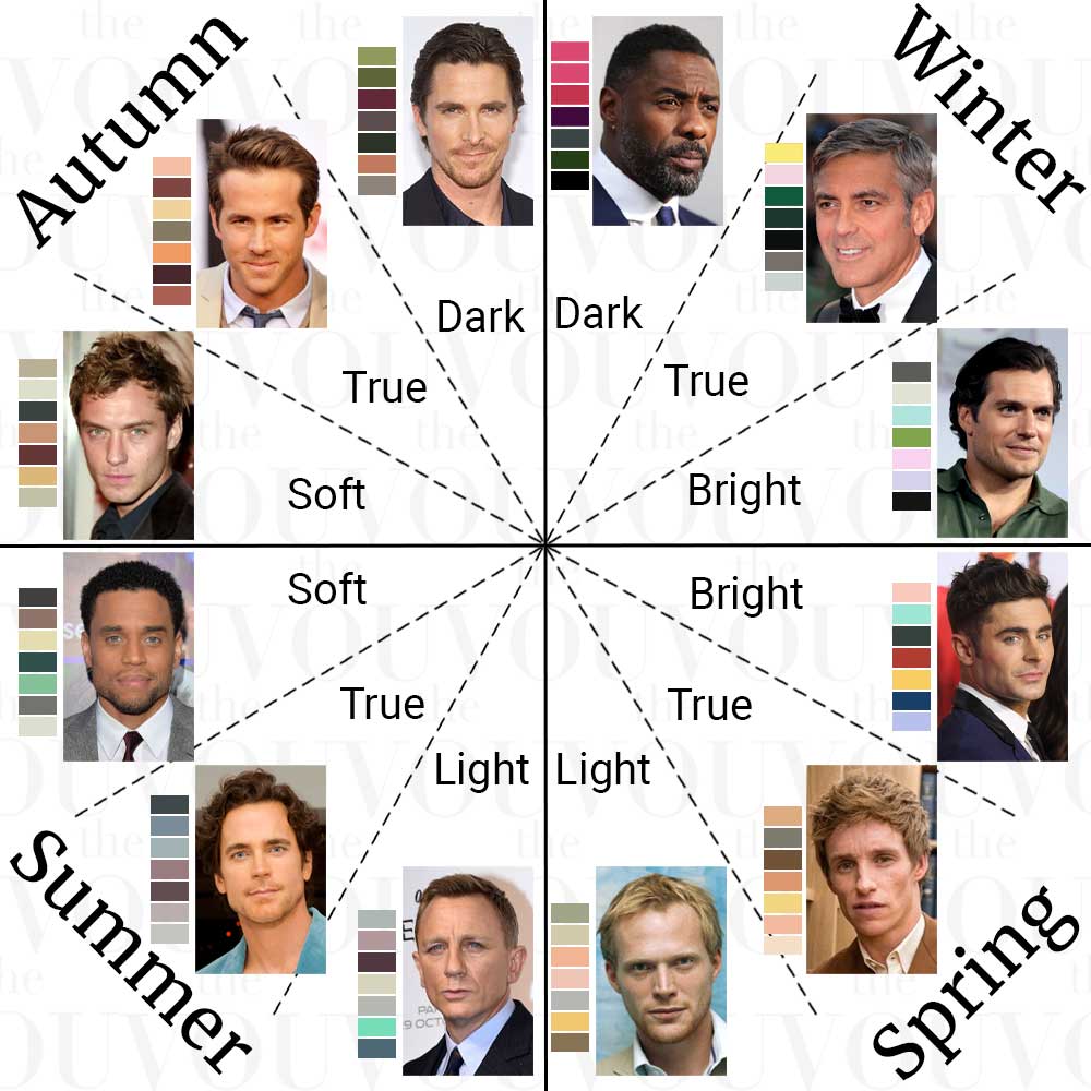
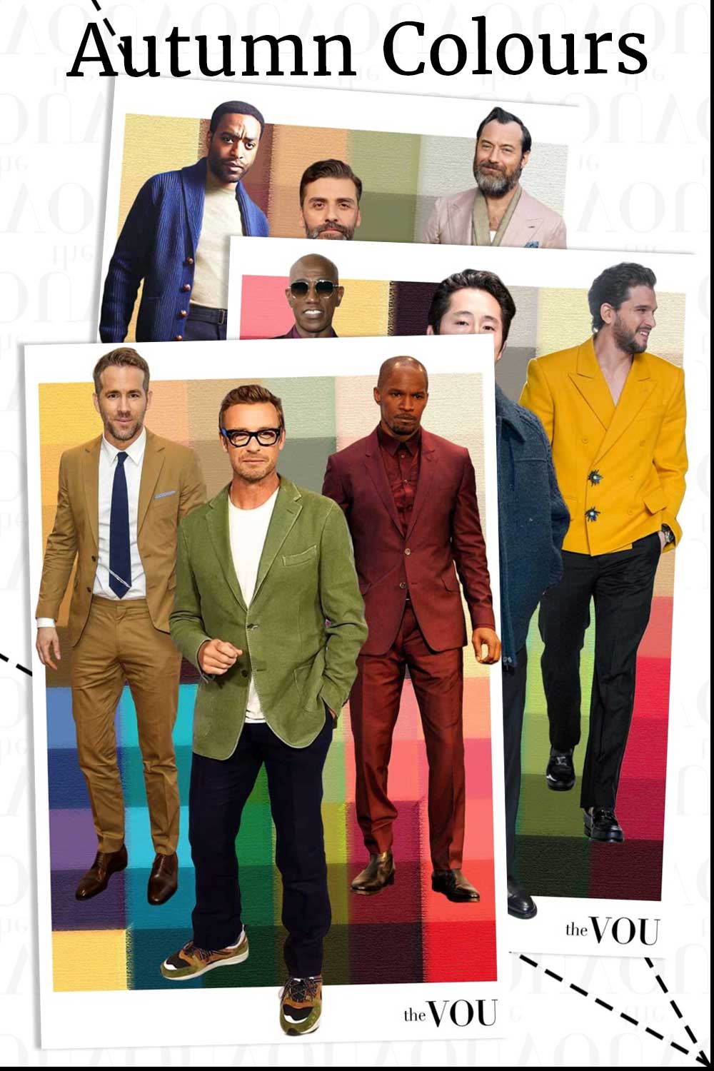
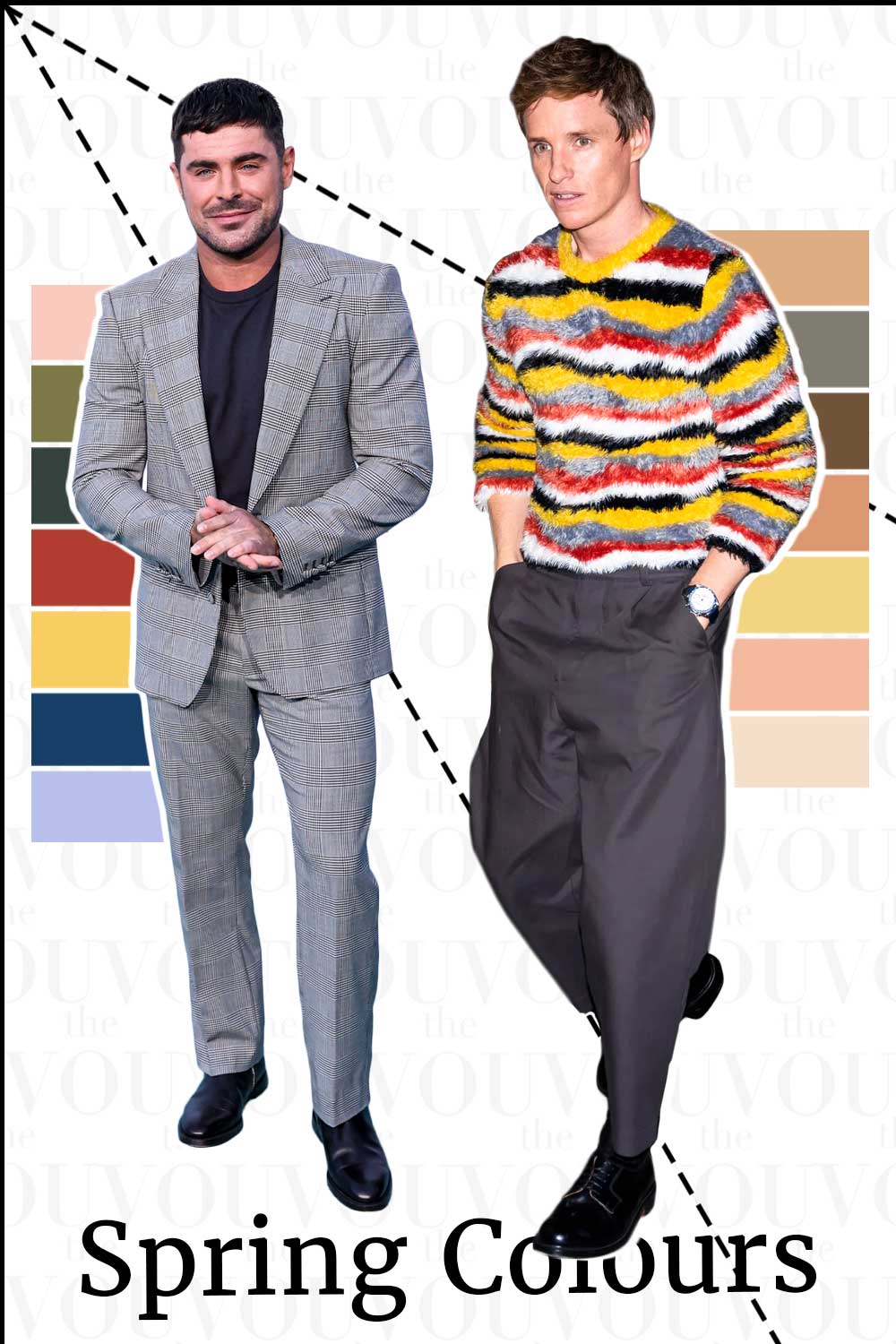
The faces are illustrations only: a photograph cannot confirm anyone’s colour season, so use the swatches as a rough guide to colour families.
Choose one occasion and use what you have
Pick an occasion you dress for regularly: an office day, a relaxed lunch or an evening out.
Take out trousers and shoes that already work for it, then gather several possible tops.
Choose garments that fit and are comfortable enough to wear; a colour you like will not make an unsuitable garment useful.
For the first round, keep the trousers and shoes fixed.
Comparing three shirts with the same grey trousers and brown loafers makes it easier to notice what the shirt changes than comparing three entirely different outfits.
You do not need every colour family.
A wardrobe containing navy, grey and white can still teach you about lighter versus darker combinations, the amount of white you enjoy, or the effect of a tie already in your drawer.
Leave unavailable comparisons open.
Separate colour preference from garment preference
Try the tops beside your face in indirect daylight, then wear each with your chosen base.
Ask two different questions: “What do I notice about this colour beside my face?” and “Would I wear this complete outfit for the occasion?”
You might prefer a blue shirt because of its colour, its collar or its softer fabric.
Record those reasons separately.
To investigate colour more closely, hold similar amounts of plain fabric below your chin in the same light.
Avoid using a shiny patterned shirt against a matte solid knit as if they differed only in colour.
Look for an unwanted cast, changes in visible facial definition, or a top that draws more attention than you want.
If you cannot see a clear difference, write that down.
You can still choose by preference and practicality.
Build a small working palette
Organise the colours that prove useful into three roles.
There is no required percentage for each.
Scroll horizontally to see all columns →
| Role | What it does | Examples to look for |
|---|---|---|
| Base | Connects several outfits | Your navy trousers, grey jacket, brown shoes or olive chinos |
| Near-face colour | Shapes the part of the outfit you see beside your features | A preferred shirt, polo, jumper or scarf |
| Accent | Adds a smaller point of interest | A tie, pocket square, sock or watch strap |
A navy jumper can be both a base colour and the main colour near your face.
You do not need a separate purchase for each role.
Nor do all the colours have to sit inside one named seasonal palette.
A worked wardrobe exercise
This is a hypothetical example, not a customer case.
The available clothes are grey trousers, dark jeans, a navy cardigan, white and dusty blue shirts, a cream polo, brown loafers, brown boots, navy socks and a brown belt.
- Relaxed office: dusty blue shirt, grey trousers, navy cardigan, navy socks and brown loafers. The shirt brings a quieter colour to the face; the cardigan frames it with a darker edge.
- Weekend lunch: cream polo, dark jeans, brown boots and a brown belt. The polo provides a lighter, warmer area above the dark denim. Compare its effect with the dusty blue shirt before deciding which you prefer.
- A sharper casual outfit: white shirt, grey trousers, navy cardigan, navy socks and brown loafers. Opening or fastening the cardigan changes how much white shows. This tests the amount of contrast without buying another shirt.
If the cream polo is a favourite but its warmth seems less useful next to your face, you can still keep it.
It may be comfortable, suit the occasion and give you an effect you enjoy.
A colour framework should help you choose, not require you to reject a useful garment.
Use accessories before replacing larger garments
Try a scarf you own with a coat whose colour feels too dominant.
A preferred shirt collar can also separate a dark jacket from the face.
A tie creates a smaller area of colour than a jumper, so it is a convenient place to try a strong shade already in your wardrobe.
Keep sentimental jewellery and a working watch.
Silver-coloured and gold-coloured metals are options to compare, not compulsory signs of cool or warm colouring.
Finish, size and the surrounding clothes matter to the outfit.
Shoes and belts can connect to each other without matching the colour beside your face.
Familiar brown loafers do not need replacing because you prefer cooler shirts.
What can free online tools add?
A digital palette can suggest another colour to explore or help you remember a combination.
An app’s seasonal label is not confirmation that your observations are correct, and a free download may have paid features.
Our guide to colour-analysis tools distinguishes those uses.
You can complete this exercise without uploading a photograph or opening an account.
A written list of garments is enough.
If you keep your own outfit photographs, use them as reminders rather than exact colour measurements.
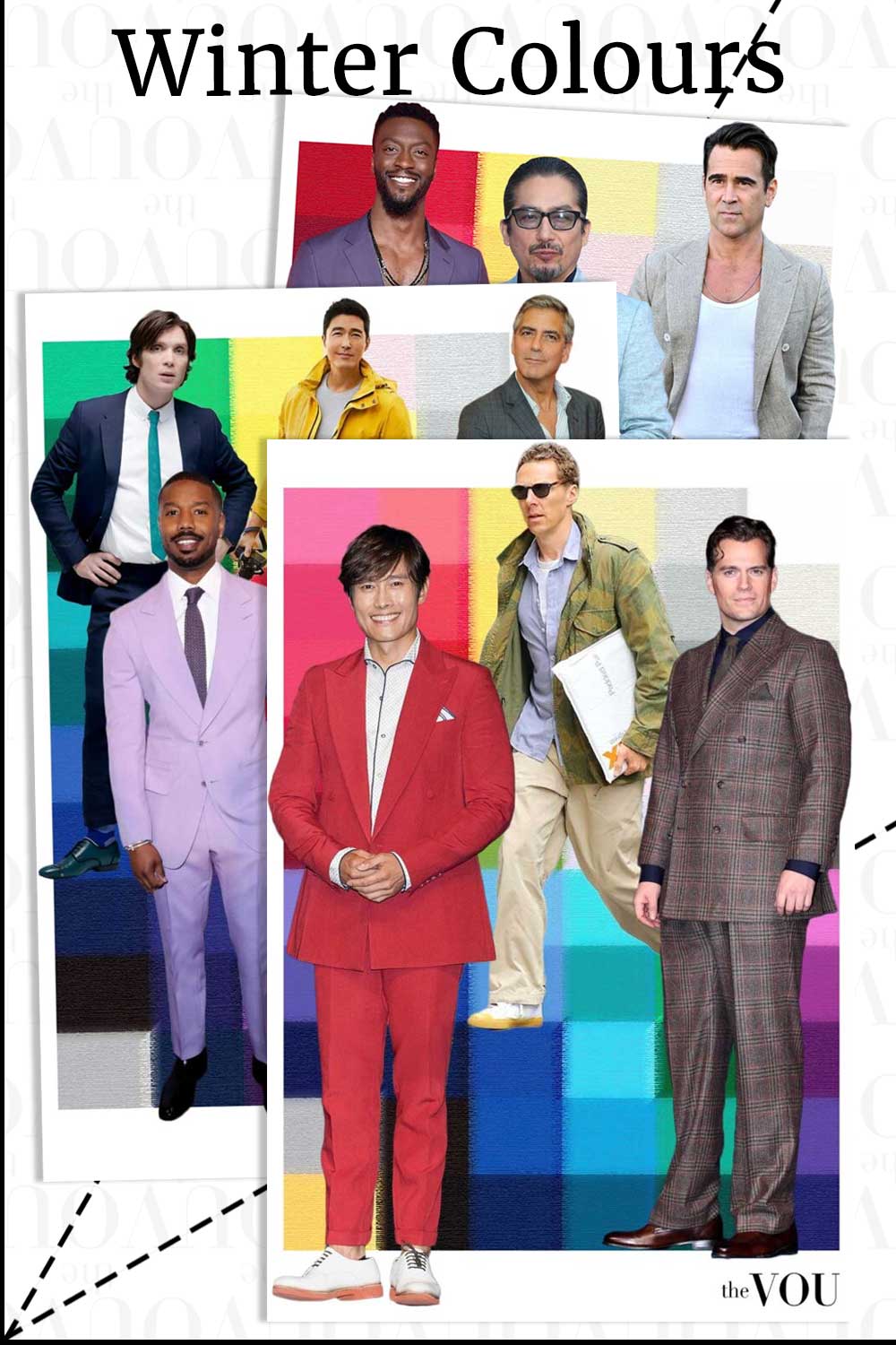
The faces are illustrations only: a photograph cannot confirm anyone’s colour season.
Decide what to repeat
At the end, keep a short list: outfits you will wear again, colours worth comparing, and questions you could not answer with your current clothes.
Try the successful outfits in their intended settings before considering a purchase.
For a seasonal starting point, use the beginner’s guide.
For more systematic comparisons of warmth, depth and intensity, follow the DIY procedure.
Your existing outfit list is useful whichever label you eventually adopt.
Related guides on The VOU: personal colour palette, Winter palette, Summer palette, Autumn palette, Spring palette.
Mandy Meyer’s focus at The VOU is men’s body-shape styling, garment fit and outfit proportions. Her coverage addresses the practical questions behind a wardrobe choice: how a jacket sits across the shoulders, how trousers fall and how different cuts change the silhouette a wearer wants to create.
Her subject areas include the triangle, inverted triangle, rectangle, oval, trapezoid, hourglass and diamond labels used in body-shape styling. These provide starting references for comparing visible proportions; they do not capture every body or prescribe one correct way to dress. The focus connects those observations with garment shape, construction, length and the relationship between the upper and lower parts of an outfit.
Mandy’s editorial coverage combines visual comparisons with fit checks for comfort and movement. Readers can consider whether a cut gives them the room they need, where clothing pulls or gathers and which changes might support their preferred look. The aim is to make menswear choices more understandable while keeping personal preferences and the wearer’s own styling goals central.