Start here
What’s This About
To break up a monochrome outfit, add one second colour, keep it clearly smaller than the base colour, and choose a place where it reads as planned; the shoes and belt, the collar line and the cuff are the usual ones.
This guide gives you the decisions that keep the outfit looking deliberate, such as:
how much of the outfit the second colour should be
where a contrast piece sits so it looks planned rather than stray
the ways a second colour can contrast with the base: warmer or cooler, lighter or darker
which contrast suits a dark base and which suits a light one
how season and formality change the choice
and many more!
It is written for men who already wear one colour and want a way out of it that does not undo the effect. The photographs show each idea on a real outfit.
Key Points
01One main colour and one supplementary colour is the approach Mr Porter’s Adam Welch describes; he warns that an even split “has a bit of a blunt effect”. A small accent is still a second colour, but it is one the eye reads after the base rather than alongside it.
02The accent tends to look planned where the outfit already changes: shoes and belt at the bottom, a collar, scarf or tie at the neck, a shirt cuff or watch at the wrist.
03The accent can contrast by temperature, warm against cool, or by brightness, light against dark, or both. Dark bases take a wide range of accents, from white to cognac; light bases are usually happier with softer or darker accents than with bright ones.
04Suggested starting methods, not conditions: keep leather in one family and metal in one finish, and match the formality of the accent to the outfit, so the break reads as a choice.
A monochrome outfit can look flat on a dull day or in a dull room, and the fix is not to abandon it but to add one second colour on purpose. Done well, the second colour makes the first look more deliberate, not less.
This page assumes you already have the monochrome base right. If you do not, start with the monochrome dressing principles, and for finished one-colour looks see monochrome outfit ideas. What follows is only about the break.
How much
One Main Colour, One Supplementary Colour
The most useful starting point comes from Adam Welch in Mr Porter’s guide to wearing colour: treat one shade as the main colour of the outfit and the other as a supplementary colour. His warning about the alternative is worth keeping in mind, that “a 50/50 split, like an all-over monochrome, has a bit of a blunt effect”. It is an approach to balancing two colours rather than a measured rule, and the 50/50 he mentions is a description of an even split, not a threshold.
In practice that means the second colour lives in one or two pieces and the base colour in everything else. A white rollneck under a black coat, brown shoes and belt with navy, a burgundy knit with grey: each is an accent because the eye still reads the outfit as black, navy or grey first.
The old version of this page put a percentage on it. The sources this page draws on establish no required accent-percentage limit, and none is needed; if you have to ask whether the second colour has become a second half, it probably has.
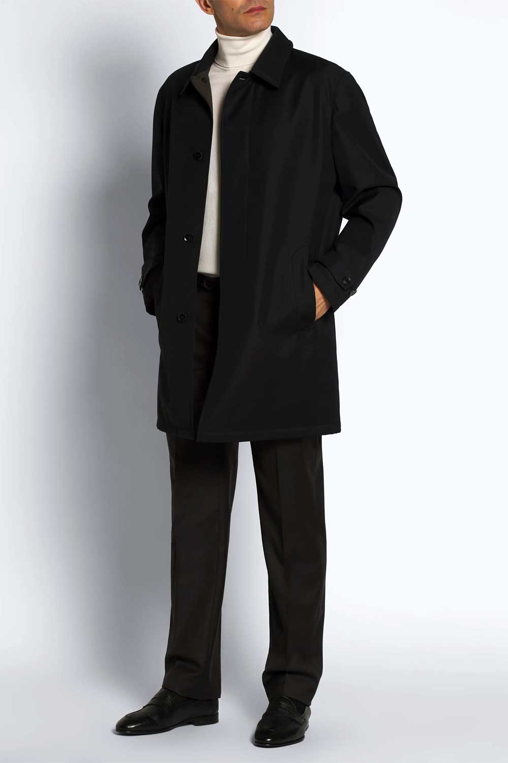
A black outfit broken with white: the rollneck shows at the neck and in a strip down the torso where the coat is open, while the coat, trousers and shoes keep most of the outfit black, so white stays the accent. Photograph credited in the original article to Brioni.
Where
Put the Accent Where the Outfit Already Changes
A second colour usually looks planned when it sits at a place where one garment ends and another begins, and stray when it floats in the middle of a block of the base colour. The three natural places are the feet, the neck and the wrist; they are the suggestions this page works with, not the only places an accent can go.
Feet and waist. Shoes and belt in the second colour are the classic break, because they sit at the two horizontal lines the eye already reads. Brown shoes and a brown belt with an all-white or all-navy outfit are the familiar example; Welch’s own example of a main colour with a supplementary one is “a dark-green suit with a light-brown sweater and some brown brogues”.
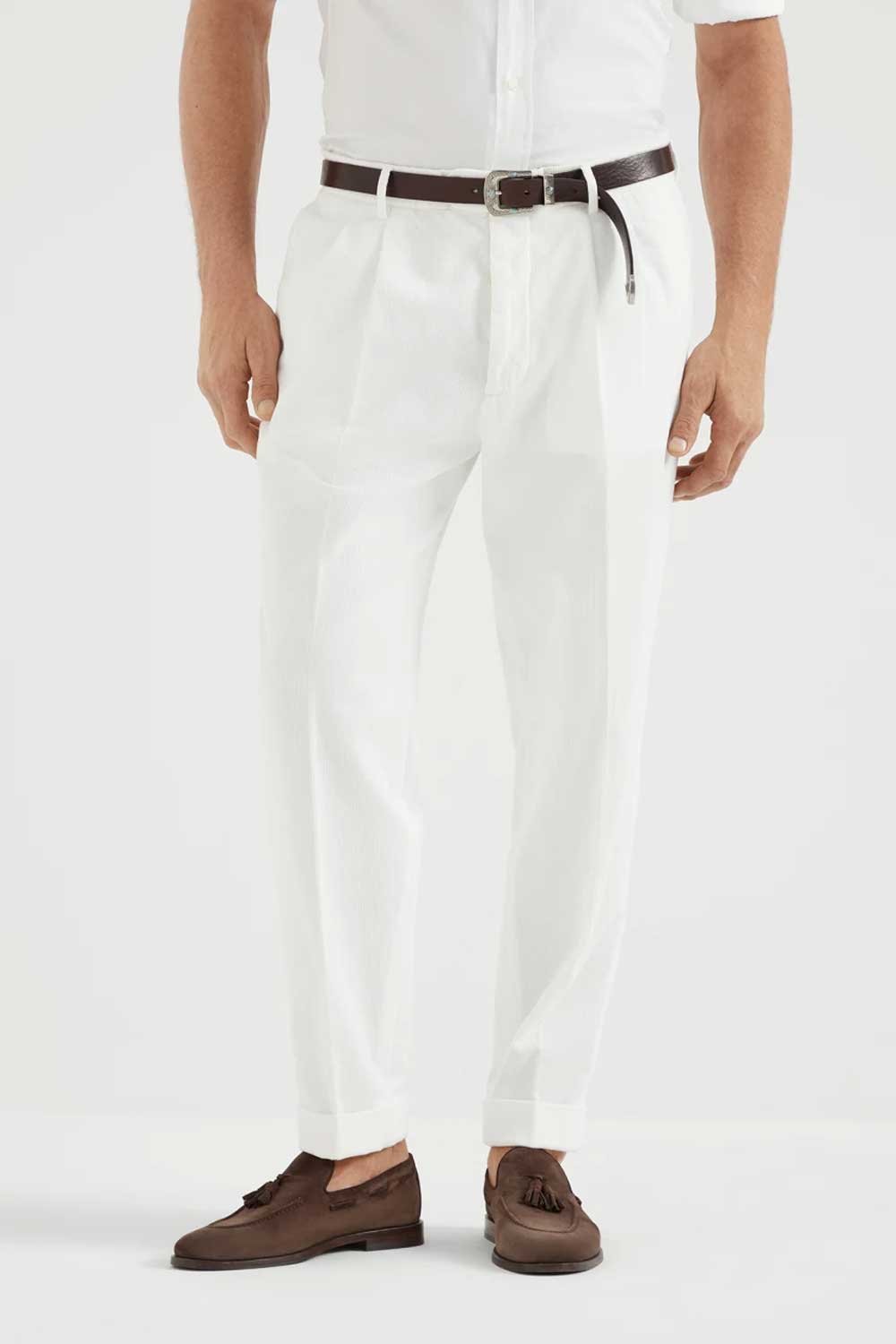
An all-white outfit broken at the two natural lines: a brown belt at the waist and brown suede loafers at the foot. Photograph credited in the original article to Brunello Cucinelli.
Neck. A rollneck, a shirt collar, a scarf or a tie in the second colour puts the accent next to the face, which is where people look first. It is the strongest placement, so it suits a quieter colour or a small area.
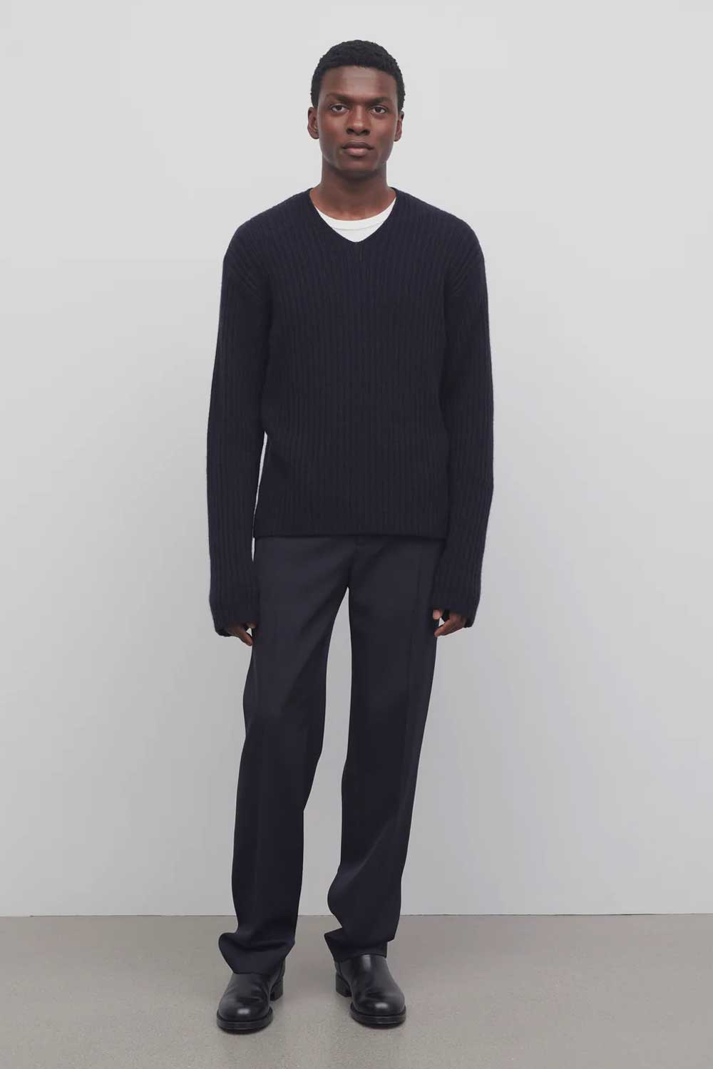
One of the smallest breaks there is: a white T-shirt collar showing in the V of a black jumper. White is still a second colour here, but as a small accent it lifts the face without taking the outfit out of black.
Wrist. A shirt cuff, a watch strap or a bracelet in the second colour is the subtlest placement and the easiest to add to an outfit you already own.
Which colour
Which Second Colour Suits Your Base
Two questions help decide whether an accent looks right: how far it sits from the base in temperature, warmer or cooler, and how far it sits from it in brightness, lighter or darker. Either kind of contrast can carry the break on its own; many of the examples on this page use both.
Warm against cool is one dependable pairing. A navy base takes rust, tobacco, burgundy or cognac; a brown base takes a cool blue. The accent does not need to be the exact opposite on a colour wheel; a clear difference in warmth is enough. It is not the only method, though: a white rollneck with black, or a dark rollneck with grey, contrasts by brightness rather than temperature, and the neutral examples on this page mostly work that way.
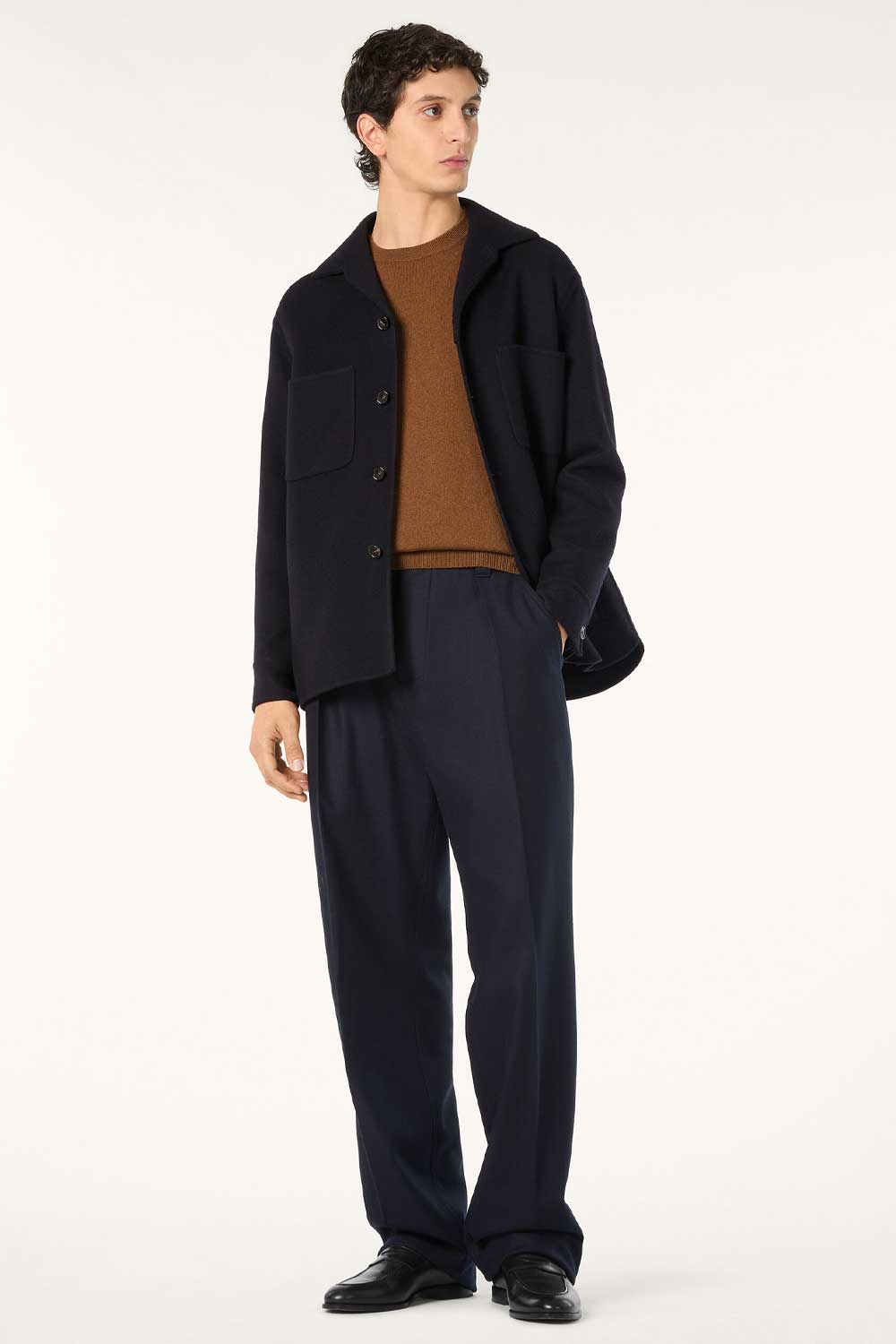
Navy broken with a warm rust knit at the chest and neck; the overshirt keeps most of the outfit navy. Photograph credited in the original article to Loro Piana.
Brightness is the other method. Philipp Fröhlich’s point in Permanent Style is that “different levels of brightness can make colours easier” to combine and that darker or less saturated shades clash less. So a dark base can carry a wide range of accents, from white to mid-tones to cognac, while a light base, cream or stone or pale grey, is usually happier with a softer accent, a dusty blue or a warm tan, or with a small dark one such as a thin brown belt.
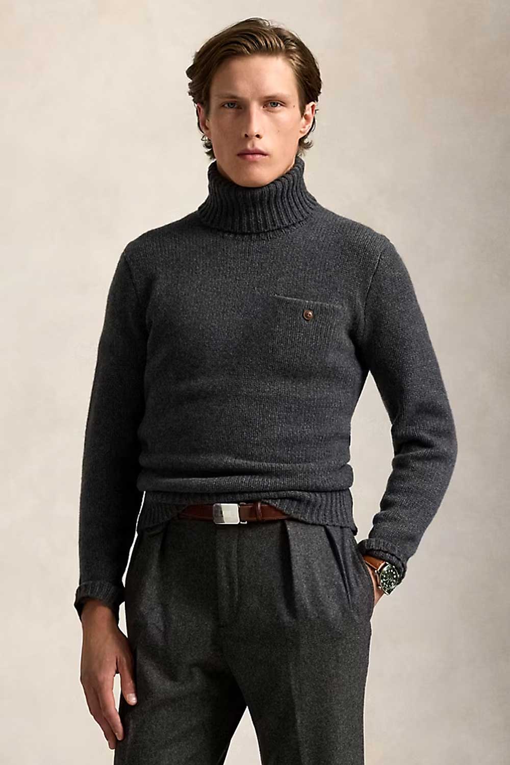
Charcoal broken with cognac leather at the waist. A strong base takes a strong accent. Photograph credited in the original article to Ralph Lauren.
If in doubt, the darker or duller version of the accent is the safer choice. That is this page’s suggestion; the nearest equivalent in the sources is Simon Crompton’s preference for brown shoes with his own dark tonal outfits, “it always helps if the brown is relatively dark”, which is a preference about that one pairing rather than a rule for every accent colour.
Keep it coherent
One Accent, and Usually One Leather and One Metal
One accent. A solid colour for the contrast piece is the easiest starting point: a plain tie, a plain belt, a single-colour knit. A patterned or two-colour accent tends to turn one break into several, and the outfit can stop reading as monochrome plus one.
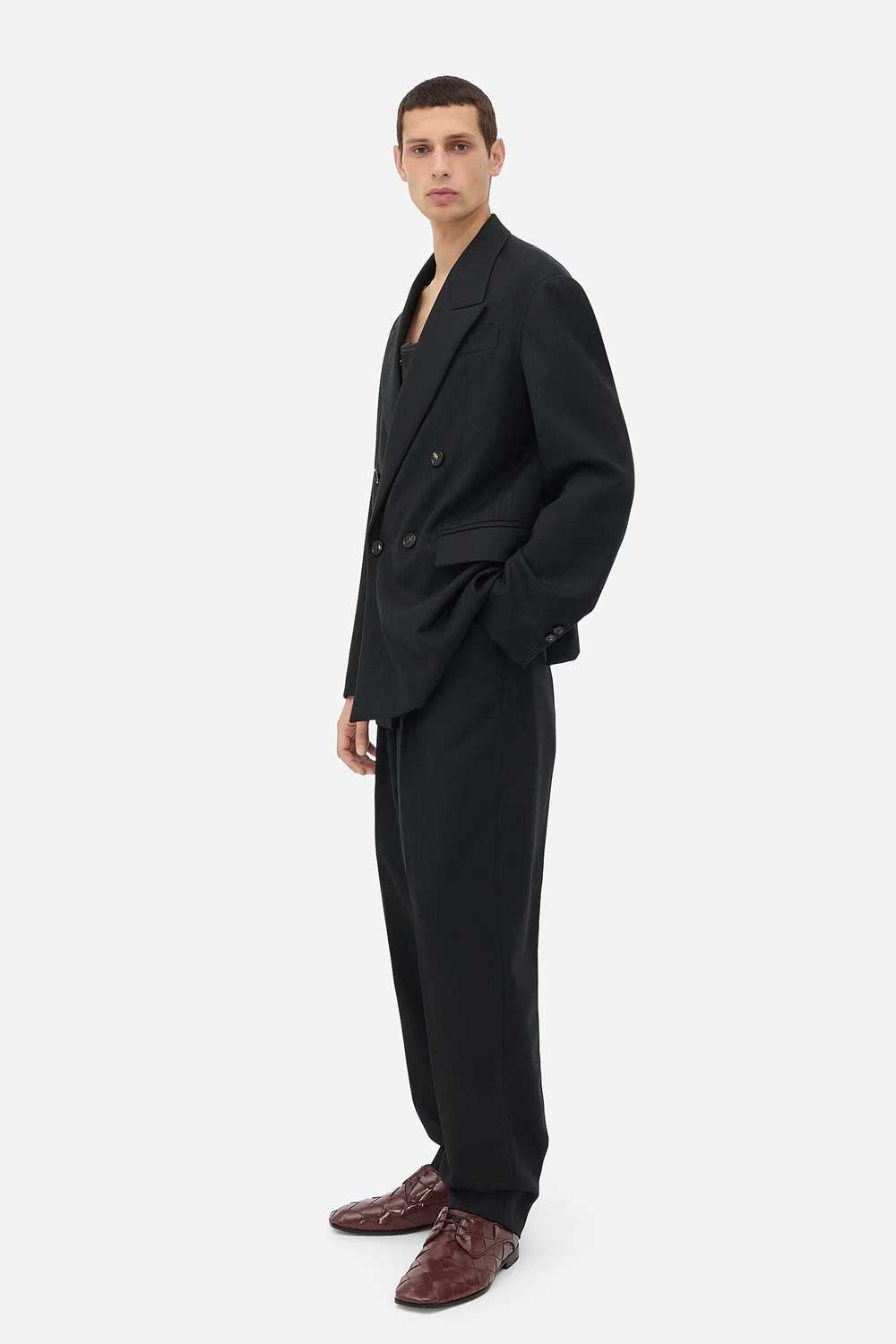
All black with one break: brown shoes in a single colour, with a visible woven texture on the leather. The one colour and the texture are separate observations; the break here is the colour. Photograph credited in the original article to Bottega Veneta.
One leather family. If the accent is leather, keeping belt and shoes in the same family is a sensible default, so the two breaks agree with each other. They do not have to be identical, and across two different hides they will not be; they should read as the same brown. It is a convention, not a condition, and a deliberate mismatch can work when nothing else in the outfit competes.
One metal. Keeping buckle, watch and any pin in one finish, silver-toned or gold-toned, is the simplest way to stop small details competing with the main break. A second metal finish is not a fault in itself; it is one more detail for the eye to reconcile, and on a quiet outfit that is usually a reason to avoid it.
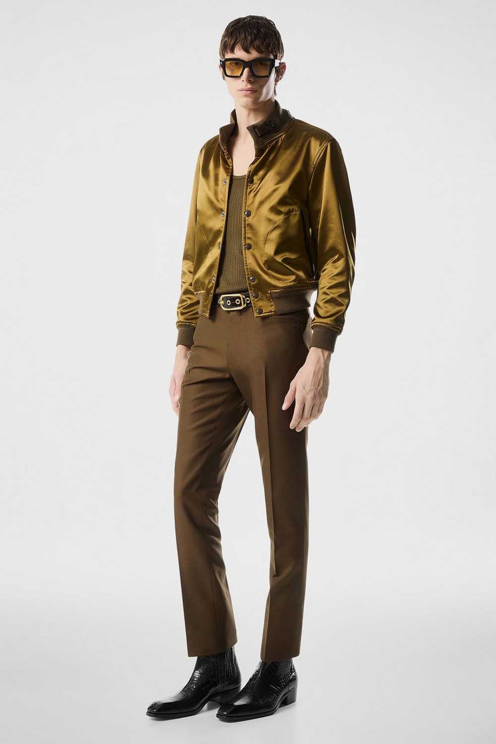
A brown and bronze outfit broken with black leather at the waist and foot, with the hardware in one gold-toned finish. Photograph credited in the original article to Tom Ford.
Season and formality
Adjust the Accent to the Season and the Occasion
As a rule of thumb, the same base takes a deeper accent in winter and a lighter one in summer, because the cloth around it changes. A heavy grey outfit in January can carry dark olive or a lighter grey rollneck; a navy summer suit is usually happier with light tan than with dark brown. It is a suggestion about weight and season, not a requirement that every piece come from one season.
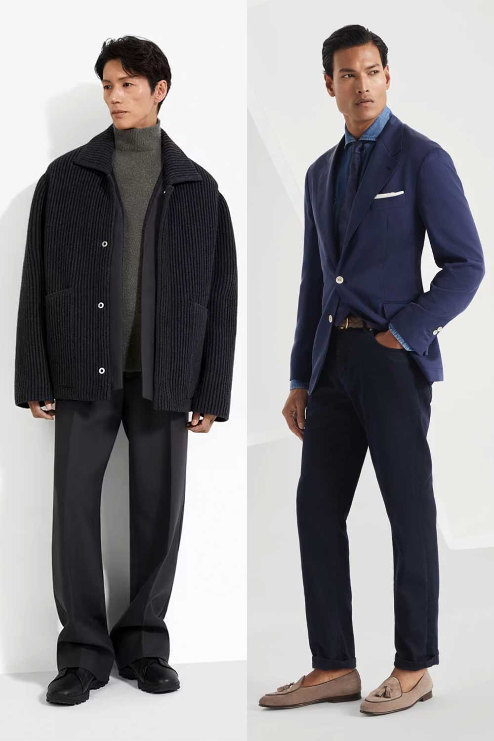
Winter and summer versions of the same idea. Left, a dark outer layer with a lighter grey rollneck showing beneath it, the contrast made by brightness, credited in the original article to Zegna; right, navy broken with light tan loafers, credited to Brunello Cucinelli.
Formality is the other consideration. As a rule of thumb, the accent should be about as dressed as the base: a charcoal suit takes a burgundy silk tie, a charcoal business-casual outfit takes a burgundy knitted polo, and a casual grey outfit takes burgundy canvas shoes. The colour can stay the same across all three; the object changes.
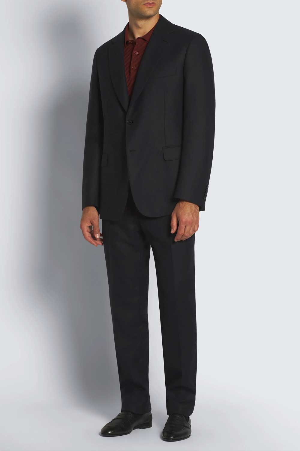
Charcoal broken with burgundy at the neck, and the accent is a knitted polo rather than a tie because the suit is unstructured and the occasion is business casual. Photograph credited in the original article to Brioni.
The VOU’s guides to business casual and formal attire cover the dress codes themselves; the navy blazer guide is the natural home for the navy-and-brown version of everything above.
A working pattern to start from
One base colour in most of the outfit, one accent in one or two pieces, usually at the feet, the neck or the wrist. The accent contrasts by temperature, warm against cool, or by brightness, clearly lighter or darker than the base, or both. As defaults, one leather family and one metal finish, and an accent dressed to about the same level as the rest. These are starting methods; the photographs above show how far they bend.
Avoid
Breaks That Undo the Outfit
A second colour in half the outfit. A white shirt fully open under a black jacket is a black-and-white outfit, which is fine, but it is no longer a monochrome one with a break.
Two accents in two colours, such as brown shoes and a burgundy tie with a grey suit, unless the two are close enough to read as one family; that is a three-colour outfit, which can work but is a different exercise.
An accent that floats: a coloured pocket square is a break at the chest, which is not one of the natural lines, and it usually works best when the rest of the outfit is very quiet.
A bright accent on a light base, which tends to read as the accent wearing the outfit rather than the other way round.
A stray break you did not choose, most often a belt that matches neither the shoes nor the outfit.
Next step
Before You Add One
Which version of an accent colour suits you is a question of your own colouring, whether a rust should lean orange or brown, whether a blue should be dusty or bright. The seasonal colour quiz and the seasonal colour guide are optional starting points for thinking about that; neither replaces trying the piece against your face.
For the base itself, go back to the monochrome dressing principles or the seven monochrome outfit ideas. For a second opinion on your own wardrobe, The VOU’s directory of image consultants and stylists lists people who do this for a living.
Sources
Where This Advice Comes From
The main-colour-and-supplementary-colour approach and the dark-green-suit example are Adam Welch’s in Mr Porter’s guide to wearing colour; it is an approach to balancing two colours, and the placement, warm/cool and light/dark suggestions on this page are its own extension of it. The brightness and saturation points follow Philipp Fröhlich’s colour theory piece on Permanent Style, and the dark-brown shoe preference is Simon Crompton’s own, for his dark tonal looks, in the same site’s tonal exercise. The advice to keep accessories few follows the stylists quoted in FashionBeans’ tonal dressing guide.
The formality rule of thumb, the season note, the one-leather and one-metal defaults and the list of breaks to avoid are this page’s own suggestions, drawn from common menswear practice, and are stated as starting methods rather than as rules. The outfits are described as they appear in the photographs; the brand credits are those given in the original version of this article and have not been independently verified. This advice has not been reviewed by a stylist for your individual wardrobe.
Questions About Breaking Up a Monochrome Outfit
Q. Can I use two shades of the same accent colour?
Two shades of one accent, such as a dark brown belt with mid-brown shoes, read as one family and are fine. Two clearly different accent colours are what to avoid; that is a three-colour outfit, which can also work but is a different exercise.
Q. Do my belt and shoes have to match exactly?
No. Keeping them in the same family of brown or black, close enough that nobody would call them two colours, is the usual default; across two different leathers an exact match is rare and not worth chasing.
Q. Can I break up a patterned monochrome outfit, such as a pinstripe suit?
Yes, and the pattern already counts as some of the variation, so keep the accent smaller and quieter than you would on a plain suit: a tie in one colour, or shoes, rather than both.
Q. What about a small logo or detail in another colour on the accent piece?
A small maker’s mark or a contrast stitch is not a second accent and can be ignored. A large logo in a third colour is a second accent, and the outfit reads better without it.
Q. Should the accent suit my skin tone or the outfit?
Both, and they rarely conflict. Choose a colour that contrasts with the base, by temperature or by brightness, then choose the version of it that suits your colouring; a rust that leans brown for one man and orange for another is still rust against navy.