

Start here
What’s This About:
A monochrome outfit is one colour family worn from collar to shoe; it can be one shade or several, and the usual ways to keep it from reading as a single block are to vary the shade, vary the texture, and decide in advance what the shoes, socks and small details are doing.
This guide gives you the principles the menswear writers and tailors this page draws on use, with their preferences attributed and this page’s own suggestions marked as such, covering:
– how to pick a base colour you can actually find in the shops
– how varying the shade gives the outfit a top and a bottom
– how texture keeps one colour from reading as one flat block
– what to do with shoes, socks, belt and metal
and many more!
It is a principles page. For seven finished looks to copy, go to monochrome outfit ideas, and for adding a second colour on purpose, go to how to break up a monochrome outfit.
Key Points:
01Monochrome means one colour family worn head to toe. That can be one shade, or tints and shades of the colour together; the definition does not require variation, but variation is the most useful tool you have.
02One flat shade with no change in surface can make the body read as a single block. A second shade, a second texture, or both, gives the outfit a top, a middle and a bottom; how many is a matter of taste, not a rule.
03Neutrals are the easiest base to buy and to wear: navy, grey, brown and tan. Black and very dark navy are harder to keep from merging, because so little light comes off them; the writers this page draws on disagree about how far to avoid them.
04Shoes, socks, belt and metal decide whether the outfit looks planned. The suggestions here, leather in one family, metal in one finish, one chosen place for any break, are starting methods, not the only ones that work.
If you want to wear one colour from collar to shoe and not look as though you are in a uniform, the short answer is this: choose one colour family, give the outfit at least one change of shade or surface, and decide in advance what your shoes, socks and belt are doing.
The rest of this page explains each of those decisions, what the menswear writers and tailors it draws on say about them, where they differ, and where the common mistakes are.
What it is
What Monochrome Dressing Actually Means
A monochrome outfit is built from one colour. In the definition used by Gentleman’s Gazette, the garments are “derived from one colour”, which allows tints of the colour, which add white, and shades of it, which add black, to sit together; it does not require them to differ, and an outfit in one shade of navy is still a navy monochrome outfit.
The distinction matters for two practical reasons the same guide gives: exact matching across different fabrics and dyes is close to impossible, so a “matched” outfit usually differs slightly anyway, and a single flat colour with nothing to separate the layers can make the body “recede” and “look like one large mass”. Variation is the tool that guide recommends against the second problem; it is a recommendation, and a well-cut outfit in one shade, such as look six on the ideas page, can work without it.
Menswear writers often use “tonal” for the same idea, and The VOU’s tonal dressing guide covers the tone-on-tone version in its own right. This page is about building an outfit that reads as one colour from a distance and as several shades close up.
Step one
Choose a Base Colour You Can Find in the Shops
Start with a neutral. The stylists quoted in FashionBeans’ tonal dressing guide name tan and navy as the easiest first choices, and Mr Porter’s guide to wearing colour builds its approach on a base of “black, white and all greys in between”, beige and navy. This page adds grey and brown to the same list on the same reasoning.
The reason is practical: neutrals are widely stocked in several depths and many fabrics, so a second shade of one colour is usually easy to find. A bright colour in more than one shade is harder to buy and, for most men, harder to wear.
Very dark colours are where the sources differ. Black and deep navy are the hardest colours to keep from merging, because so little light comes off them that a black knit over black trousers can read as one shape. Gentleman’s Gazette advises against “exceptionally dark colours like black and navy” for that reason. Permanent Style’s Simon Crompton takes the other view and shows an all-black outfit that works; in his example the interest comes from “knits layered on top of knits and matte wool contrasting with shiny belt and shoes”, which is one successful treatment rather than the only one. This page’s suggestion is to treat black as the option that needs the most attention to surface, not as one to avoid.
The version of a colour that sits best against your face depends on your own colouring rather than on monochrome as such. The VOU’s seasonal colour guide explains the seasonal approach to that question, and the free seasonal colour quiz is an optional starting point; neither replaces looking at the colour against your skin in daylight.
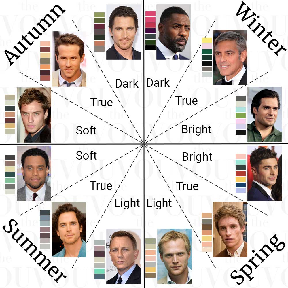
The VOU’s seasonal colour wheel, an overview of the twelve seasonal palettes. It is a reference for the seasonal approach, not a personal assessment, and it does not say which colour to wear head to toe.
Step two
Vary the Shade So the Outfit Has a Top and a Bottom
Once the colour is chosen, you do not have to match it exactly, and most of the writers this page draws on prefer that you do not. Chris Kyvetos, quoted in FashionBeans, puts his preference plainly: “Tonal dressing is best approached with varying shades, that way you avoid looking like you’re wearing a uniform.”
The simplest way to vary the shade is to give the outfit a lighter half and a darker half. A pale grey knit over charcoal trousers, a stone jacket over darker tan chinos, or a navy knit over dark-indigo jeans, which is one of the looks Permanent Style uses to show “graduated shades” in one colour.
Lighter above and darker below is the arrangement seen more often, because it grounds the outfit at the shoes and keeps the eye near the face; the reverse, a darker top over lighter trousers, also works and is worth trying if you want a longer-looking leg. Neither is a ratio. The old version of this page gave a fixed ratio of light to dark; there is no such measurement, and none of the writers this page draws on uses one.
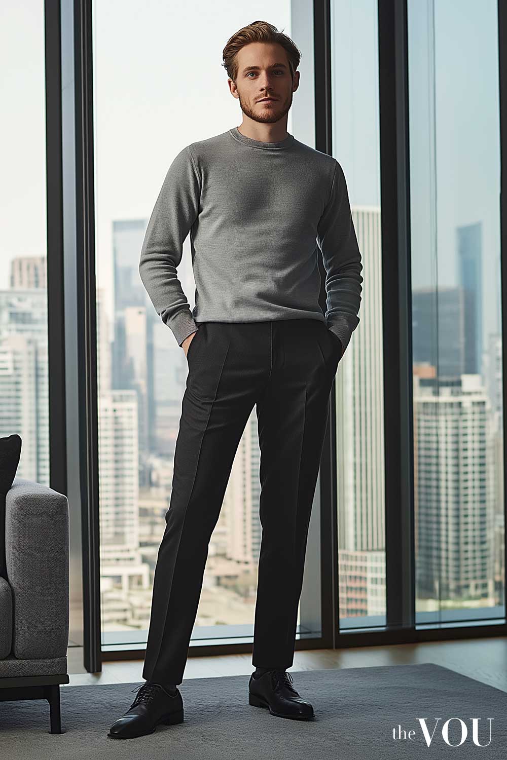
Two shades of one family: a light grey knit above, black trousers and shoes below. The lighter half sits near the face; the darker half grounds the outfit.
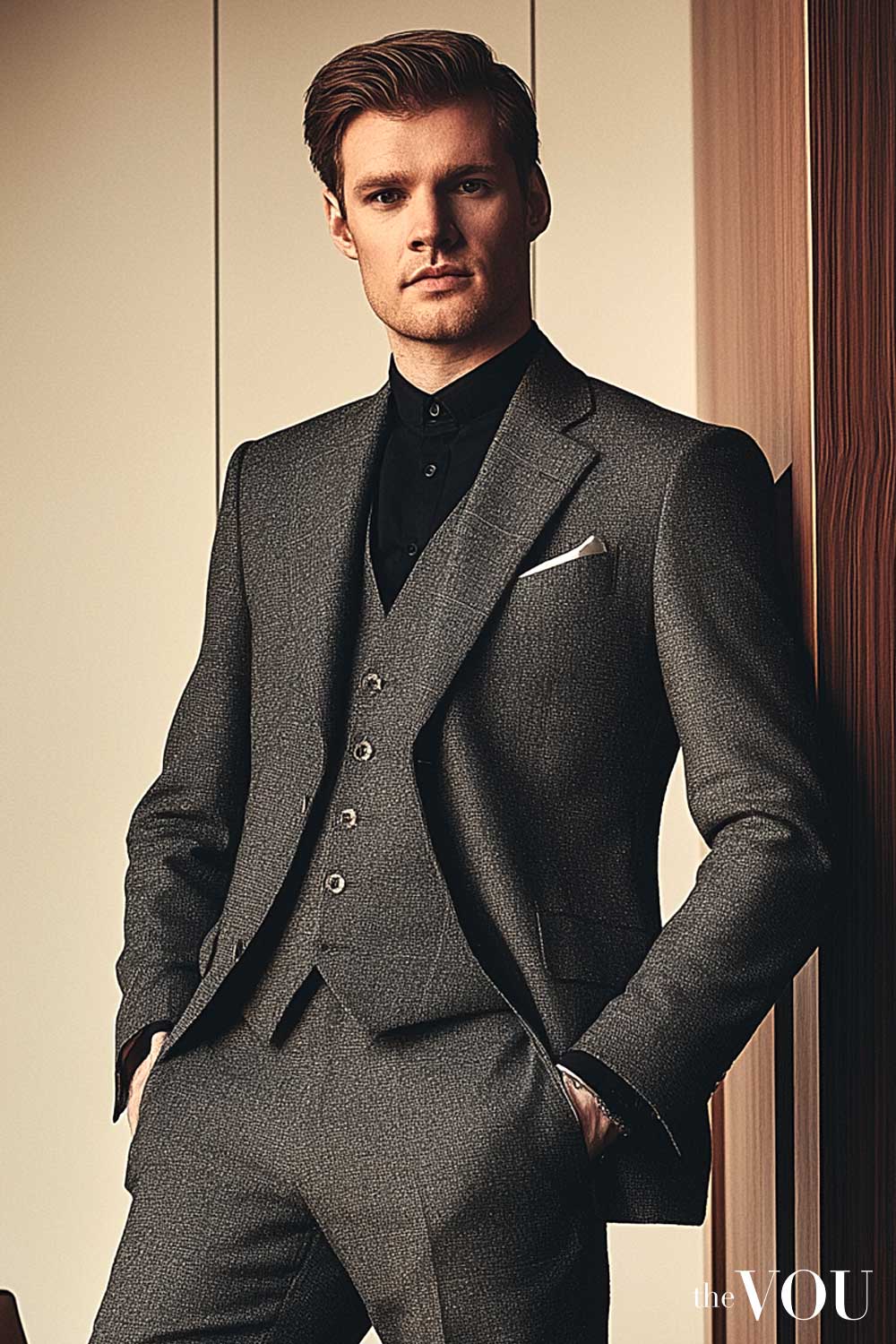
The other way round: a black shirt under a mid-grey three-piece. The darker layer sits closest to the body and the lighter cloth outside, and the outfit still reads as grey.
Philipp Fröhlich, writing on colour theory for Permanent Style, gives the reason this works: “different levels of brightness can make colours easier” to combine, and darker or less saturated versions of a colour clash less with each other. Two greys of different depth sit together more easily than two greys that nearly match and miss.
Step three
Use Texture So One Colour Does Not Read as One Block
Texture is the other tool, and for an outfit in one shade it is the main one. Nick Hammond, head cutter at Norton & Sons, quoted in FashionBeans: “Texture can really heighten the effect and impact of tonal dressing. Using different textures will emphasise contrast and add depth.”
In practice that means avoiding three smooth surfaces in one colour. Put a cable knit or a brushed cloth next to a flat one, or a suede shoe under a smooth trouser, so that light comes off each surface differently and the eye can tell the layers apart.
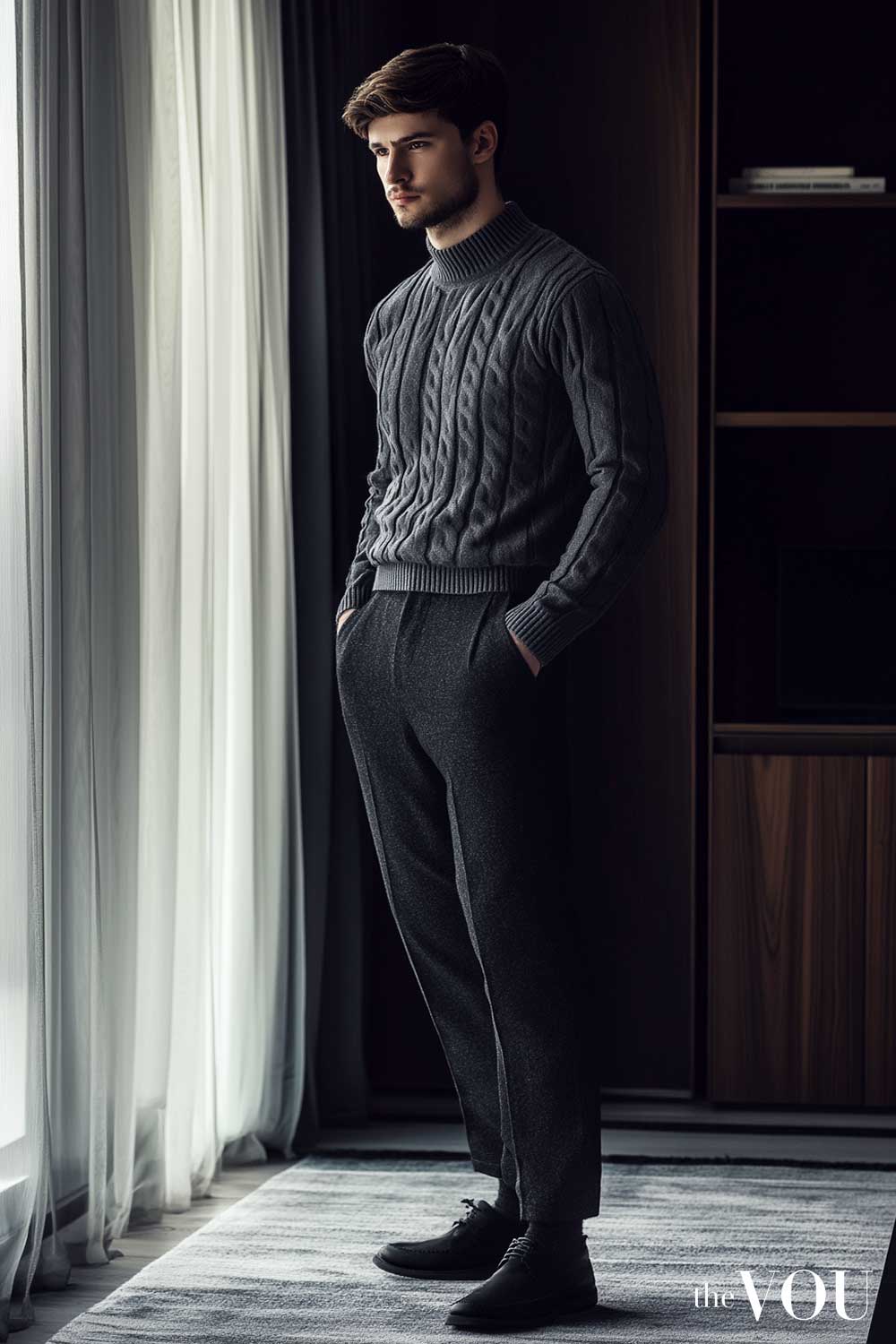
One dark grey family, three visibly different surfaces: the cable of the rollneck, the soft nap of the trousers, and the smooth leather of the shoes.
A useful habit is to keep the fabrics to one season. FashionBeans’ guide gives the failing case, linen with corduroy, and the working one, “linens, cottons and canvas all combine well together”; the same logic pairs wool, flannel and cashmere in winter. It is a guideline rather than a law, and a light knit over a summer trouser can be right on a cool evening.
Do not add layers just to add texture. Gentleman’s Gazette warns against “too many layers”, and one or two changes of surface across the pieces you would wear anyway is usually enough. For the names and behaviour of the common cloths, The VOU’s textiles guide is the reference.
Step four
Shoes, Socks, Belt and Metal
The details are where a monochrome outfit most often looks unplanned, and they are the easiest part to fix. What follows are suggested starting methods with the preferences behind them named.
Shoes and belt. A simple starting method is to keep leather in one family across the outfit, so the belt and the shoes agree with each other even if they are not identical. Shoes do not have to match the clothes head to toe; the FashionBeans stylists recommend neutral-toned shoes, and Gentleman’s Gazette asks only that shoes harmonise with the base family. For the dark tonal outfits in his own exercise, Crompton prefers “brown suede shoes” as “a more subtle option” than black, with a brown suede belt, adding that “it always helps if the brown is relatively dark”; that is his preference for those looks, and black shoes with a black or navy outfit remain the plainer choice.
Socks. Socks usually sit best with the trousers rather than the shoes, so the leg reads as one line when you sit or walk. Gentleman’s Gazette prefers them not to be an exact match, on the grounds that socks identical to the trousers can make the lower half look “muddy and amorphous”, and suggests a sock in the trouser family a step darker or lighter; an exact match is a legitimate choice too, and the plainer one. The old version of this page told readers to match socks to a colour-system code; that advice is withdrawn.
Metal. A common convention is to keep watch, buckle and any pin or bar to one finish, silver-toned or gold-toned, so the small hard details agree with each other; mixing finishes is not wrong, only harder to make look deliberate. One or two small metal details near the face, a collar bar, a tie bar or a lapel pin, are a way to give a dark outfit a point of light; they are an option, not a requirement, and they do not need to sit at any particular distance from anything.
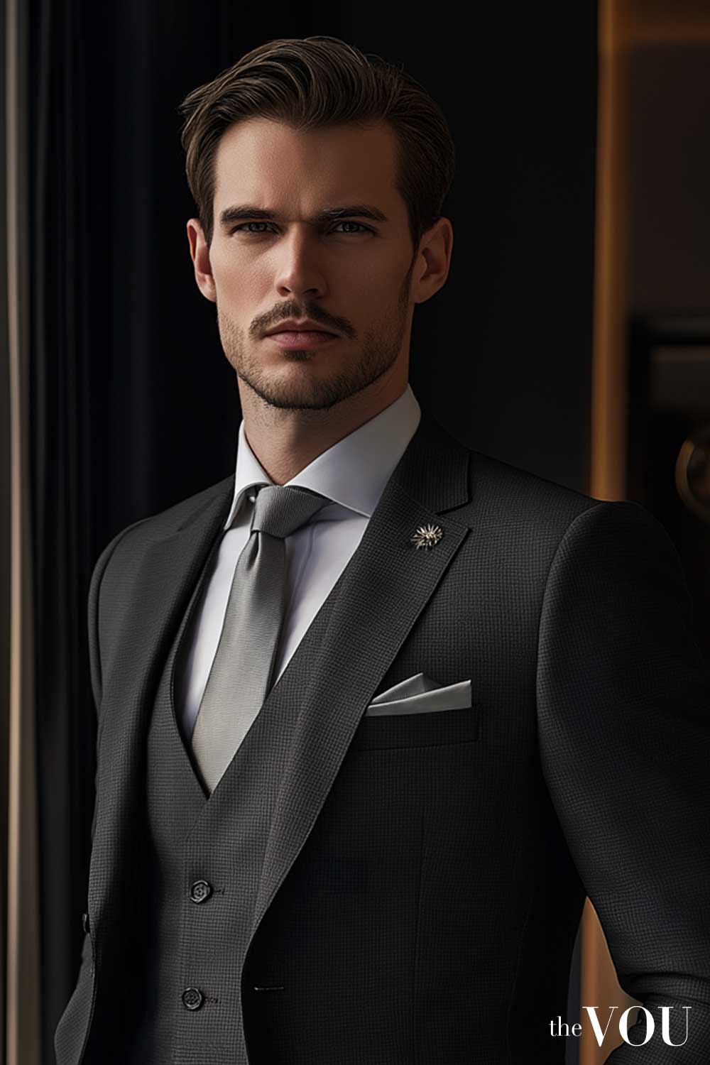
Two small metal details in one finish, a collar bar and a lapel pin, on an otherwise charcoal and grey outfit. They give the eye somewhere to land near the face; the outfit would still work without them.
Accessories in general. Fewer is the preference of the sources here. Hammond again: “Keeping it as simple as possible is key for a tonal look. There aren’t a lot of bells and whistles or accessories involved.” Matching every accessory tonally is listed as a mistake in the same guide; one or two that agree with the outfit are usually enough.
A working pattern to start from
One colour family. At least one change of shade or surface, so the outfit has a top and a bottom. Leather in one family and metal in one finish as the default. Shoes and socks decided in advance. It is a starting pattern this page suggests, not a definition; the ideas page shows it followed and, in one look, deliberately not.
Choosing between them
Which Colour Should You Start With?
The base colour decides how much work the rest of the outfit has to do, so choose by how much variation you can find and how much you want to think about it.
Option one
Navy or grey, the easiest starts
Both are stocked in many depths and fabrics, so a second shade is easy to find, and both take brown leather well. Navy is called “the fail-safe colour” in FashionBeans’ guide because most men already own several pieces of it. For finished looks, see navy monochrome outfit ideas and grey monochrome outfits.
Option two
Brown, tan and cream, the warmest
Brown runs from cream through tan to chocolate, so a brown outfit has plenty of room for variation. It suits autumn cloth (flannel, corduroy, suede) especially well. See brown monochrome outfit ideas.
Option three
Black, the hardest to do well
Black is the colour that most easily ends up as a single block, because so little light comes off it. It benefits most from changes of surface and sheen, and, in Permanent Style’s example, an off-white or ecru piece near the face reads calmer than bright white against it. Treat black as the option that needs the most attention, and see black monochrome outfit ideas for looks that manage it.
Whichever colour you choose, the seven monochrome outfit ideas page shows the principles above applied to real outfits, one colour at a time, with one olive-and-brown variation labelled as such.
Avoid
Mistakes That Make a Monochrome Outfit Look Like a Uniform
One shade head to toe with no change of surface anywhere; this is the single-block problem the sources warn about, and the usual fix is one different texture rather than a new colour.
A bright or novelty colour worn head to toe; the FashionBeans stylists give a canary-yellow suit as the example. Neutrals first.
Summer cloth and winter cloth in one outfit, such as linen with corduroy, which tends to read as two seasons rather than one colour.
Every accessory matched to the outfit, which the same guide lists as a mistake; one or two is usually enough.
A break that has not been decided. Brown shoes with a navy outfit are a choice; a stray tan belt with black shoes is not. If you want a second colour, plan it, and how to break up a monochrome outfit covers where to put it.
Fit
Fit and Silhouette
Monochrome removes colour as a distraction, which means the cut of the clothes is what people see. FashionBeans’ guide describes tonal dressing as a way to “streamline and trick the eye with a continuous line of colour”, and a continuous line only flatters if the line is a good one.
So the usual fit rules matter more, not less: trousers that break cleanly on the shoe, a jacket that closes without pulling, knitwear that skims rather than clings. The VOU’s guide to dressing for your body shape and the free body shape quiz cover that side.
Next step
Where to Go From Here
If you want the principles on this page applied to finished outfits, the seven monochrome outfit ideas page walks through seven looks, six in black, white, navy or brown and one olive-and-brown variation, with what each does and when to wear it.
If you already wear monochrome and want to add one contrasting colour without losing the effect, how to break up a monochrome outfit is the page for that.
For the tone-on-tone version of the idea, see the tonal dressing guide, and for what “monochrome” means on an invitation, the monochrome dress code guide.
If you want a second opinion on your own colouring or wardrobe, The VOU’s directory of image consultants and stylists lists people who do this for a living.
Sources
Where This Advice Comes From
The definition of monochromatic dressing as garments derived from one colour, the warning that one flat shade can make the body read as one mass, and the preference for avoiding very dark bases and too many layers follow Gentleman’s Gazette’s guide to monochromatic outfits by Preston Schlueter. The sock guidance follows the same publication’s guide to combining socks, shoes and trousers.
The stylist quotations on varying shades, texture, fabric seasons, shoes and accessories are from FashionBeans’ tonal dressing guide by Lisa Haynes, quoting Chris Kyvetos of Stylebop and Nick Hammond of Norton & Sons.
The all-black example, the brown suede shoe preference and the ecru note are Simon Crompton’s in his tonal exercise in 14 looks on Permanent Style, and are his treatments of particular looks rather than rules; the brightness and saturation points are from Philipp Fröhlich’s colour theory piece on the same site. The neutral base and the main-colour-and-supplementary-colour approach are from Mr Porter’s guide to wearing colour. Where this page goes beyond those sources, in suggesting leather in one family, metal in one finish and cloth from one season, it is offering starting methods of its own, and says so.
The seasonal colour wheel is The VOU’s own overview. This advice has not been reviewed by a stylist for your individual colouring or wardrobe; that is what the directory above is for.
Questions About Monochrome Dressing
Q. How many pieces should a monochrome outfit have?
There is no right number. A knit, trousers and shoes can do it, and a coat, jacket, knit, trousers and shoes can do it; what helps in either case is at least one change of shade or surface so the layers can be told apart.
Q. Can I mix black and navy in one outfit?
They are two colour families rather than one, so an outfit of both is a two-colour outfit, not a monochrome one. It can look deliberate when the navy and the black are clearly different in depth and texture, a navy wool trouser with a black leather jacket for instance; a navy that is nearly black next to true black tends to look like a mistake.
Q. Should my shoes be the same colour as everything else?
They can be, but they do not have to be. Shoes in the same family are the pure version; a dark brown shoe with navy or grey is a softer version some writers prefer, and it counts as a small deliberate break rather than a failure of the outfit.
Q. Can patterns be part of a monochrome outfit?
Yes, if the pattern stays inside the colour family: a grey herringbone coat over a plain grey knit, or a navy pinstripe with a navy tie. The pattern is doing the same job as texture, giving the eye something to separate the layers by.
Q. Does monochrome make you look taller or slimmer?
A single line of colour from collar to shoe tends to read as longer than an outfit cut in half by a contrasting belt or shirt, which is the “continuous line” the FashionBeans guide describes. That is a visual effect, not a change in you, and it is the honest limit of what an outfit can do.
Q. What is the difference between monochrome and tonal?
In everyday menswear use they overlap. Monochrome means one colour worn head to toe, in one shade or several; “tonal” usually describes the version that varies among related shades of that colour, often softer and closer together. The VOU keeps a separate tonal dressing guide for the latter.
With years of expertise in high-end fashion collabs and a PhD in Sustainable Fashion, Ru specialises in eco-luxe wardrobes for the modern gentleman seeking understated refinement.
After years of managing hundreds of fashion brands from London's office of a global retailer, Mandy has ventured into freelancing. Connected with several fashion retailers and media platforms in the US, Australia, and the UK, Mandy uses her expertise to consult for emerging fashion brands create top-notch content as an editorial strategist for several online publications.
With over twenty years of front-row fashion and styling events, collabs with haute-couture houses, and a PhD in Luxury Fashion, Laurenti is an expert in crafting personalised looks that depict old-money sophistication.
Currently, the community manager of Platini Jeans - Los Angeles, Betzaida Ruiz is a seasoned fashion, beauty, and lifestyle author with expertise as a personal shopper for 'Personaling' Spain and 'Personaling' Venezuela, and editorial contributions for L'Oréal, Escales Paris, Origins, AVA9 Australia, Beauty Blender, Rosegal, Dresslily, Germaine de Capuccini, Stileo, Beauty Check, Ollia Tzarina, Herbolario Rosana, Perfumerias Laguna, GoldSea Swimwear, and of course, The VOU.