
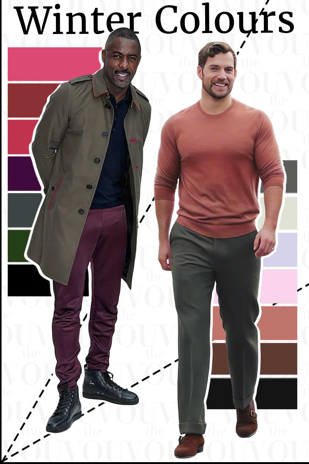
What’s This About
The Winter family is the cool, clear quarter of the twelve-palette system, and it holds three palettes: Bright/Clear Winter, True/Cool Winter and Deep/Dark Winter.
This guide compares the three so that you can tell which one to read in full, such as:
what the three Winter palettes share, and what separates them from each other
the three outward borders: Bright Spring, True/Cool Summer and Deep/Dark Autumn
approximate trials you can run with clothes you already own, before you buy anything
black, navy and white, which the Winter palettes are often described with
which of the three detailed guides to read first
and many more!
The main guide to seasonal colour analysis for men gives an overview of all twelve palettes; this page is the Winter family detail, and each palette has a full guide of its own.
Key Points
- Coolness is what the three Winter palettes share, and they do not share it equally: True/Cool Winter is cool-led and the coolest of the three, while Bright/Clear and Deep/Dark Winter are described as neutral-cool because each sits at a border with a neighbouring season.
- Each palette is named for the quality that leads it: brightness in Bright/Clear Winter, temperature in True/Cool Winter, depth in Deep/Dark Winter.
- Black and pure white are named for the Winter palettes, which is why a plain dark suit with a white shirt suits them rather than compromising them. Neither colour belongs to one family alone.
- Dark hair appears in the descriptions of the Winter palettes and of Deep/Dark Autumn alike, so a feature checklist cannot settle the question. What helps is an approximate trial beside your own face, repeated.
- An earlier version of this page said that the skin’s undertone “remains constant regardless of tanning”, prescribed fragrance notes by palette, and offered celebrity typings as statements of fact. None of that is supported, and all of it has been removed or reframed.
How Colour Analysis Reads Your Features
Seasonal colour analysis is a working method used by image consultants. It looks at three things about your natural colouring, and describes each one on its own scale:
Depth, meaning how light or dark your colouring is overall, taken from hair, skin and eyes together rather than from any one of them.
Temperature, meaning whether your colouring is described as leaning cool or warm. This is the quality the Winter family is named for.
Intensity, sometimes called clarity or chroma, meaning whether your colouring is described as clear and defined or soft and blended.
A fourth observation, contrast, describes how far apart your features sit from each other: dark hair against light skin is described as high contrast, and mid-brown hair against mid-toned skin as lower. Contrast is a difference between areas, so it is read by looking at hair against skin and brow against forehead, not at one feature alone.
Those four readings place you in one of twelve palettes. They are descriptions rather than measurements, different providers use different numbers of palettes and different names for them, and two competent analysts can place the same man in neighbouring palettes. That is why every comparison in this guide is something you try beside your own face rather than a verdict handed to you, and why no feature on its own rules a palette in or out.
Three things decide nothing, whatever you have read elsewhere: a tan, the colour of the veins at your wrist, and whether you burn or go brown in the sun. A tan changes the surface of the skin for a while; it changes what you see in the mirror today rather than telling you which palette you are, so compare colours beside your face as it looks now, and compare again when the tan has faded. The vein test has no evidence behind it. How your skin behaves in sun is a matter of sun sensitivity, which the American Academy of Dermatology describes in its own words; do not seek a tan out to find your colours, and do not read one as a result.
If you would rather start with a suggestion than with a comparison, the seasonal colour quiz for men is one optional route to a first answer you can then test.
What Makes a Palette Winter
A Winter palette is described as cool and clear: blue-based rather than golden, and unmuted rather than greyed. That is the direction the three share, and they do not share it to the same degree. True/Cool Winter is the one where coolness leads and goes furthest. Bright/Clear Winter and Deep/Dark Winter each sit at a border with a neighbouring season, and The Concept Wardrobe, whose conventions this page follows for the Winter definitions, describes both of them as neutral-cool: still cool in direction, with a little more warmth in the mix than True/Cool Winter carries.
Those are that provider’s conventions rather than a measurement, and other providers describe the same three palettes differently. The guides this page follows for them are Bright Winter, True Winter and Dark Winter.
Three consequences follow, and they are what make the Winter family distinctive to dress from.
Black is named for these palettes. In several of the twelve palettes black near the face is something a reader works around; in the Winter family it is a neutral often recommended, most readily for True/Cool and Deep/Dark Winter. That is a preference practitioners describe, not a rule, and plenty of men wear black whatever their colouring.
Pure white is the light neutral usually named, where the warm families are usually given cream and ivory. Some men find an ivory shirt reads slightly yellow beside a Winter face and a pure white one does not; others see little difference. The comparison is worth running rather than assuming, and neither white belongs exclusively to any family.
Contrast is the tool these palettes are often described with. A Winter outfit frequently holds a clear light and a clear dark, which is one of the things they do well. An outfit built entirely from mid-tones, or entirely from dark colours, is a different effect rather than a mistake.
The three Winter palettes then split according to which quality leads.
Scroll horizontally to see all columns →
| Colour family | Bright/Clear Winter | True/Cool Winter | Deep/Dark Winter |
|---|---|---|---|
| Blue | Electric blue | Clear royal blue | Midnight navy |
| Red | Clear cherry | True blue-red | Deep burgundy |
| Green | Bright emerald | Clear pine | Deep forest green |
| Purple | Vivid fuchsia | Royal purple | Deep aubergine |
| Neutral | Pure white | Charcoal | Black-brown |
These are example colours chosen to show the direction of each palette, not a complete list and not exact specifications. Read across a row and the coolness is shared; what changes is intensity from Bright to True, and depth from True to Deep. Each palette guide repeats this table with its own palette in the first column.
The names differ between providers. Bright Winter and Clear Winter are the same palette here; True Winter and Cool Winter are the same palette here; Deep Winter and Dark Winter are the same palette here. Some systems also treat “Clear” as a category that straddles Winter and Spring. This site uses the paired names throughout so that a reader moving between guides is never in doubt about which palette is meant.
1) Bright/Clear Winter
Bright/Clear Winter is the Winter palette where intensity leads and coolness follows. Its colours are among the most saturated in the twelve-season system, and a greyed version of the same colour is usually placed elsewhere. It is described as neutral-cool, a little brighter and lighter than True/Cool Winter.
It sits at the Spring end of the family, next to Bright Spring, which shares its clarity and leans warm.
The palette in short: electric blue, bright emerald, clear cherry red and vivid fuchsia as the main colours; pure white, jet black, cool navy and charcoal as the neutrals; clear lemon, bright turquoise and icy pink as accents. A prepared Bright/Clear Winter palette reference is listed in the shop, marked unavailable at the time of writing.
Men Often Described as Bright/Clear Winter
Henry Cavill, Tom Hiddleston and Benedict Cumberbatch were listed as Bright/Clear Winters on the earlier version of this page. Lists like that differ between sites, and this article cites no verified assessment of any of them, so their names are kept as a pointer to outfits rather than as evidence about anyone’s colouring.
Styling Suggestions for Bright/Clear Winter Men
The vivid colours do the most work near the face: an electric blue knit, an emerald shirt, a clear cherry tie. Suits in cool navy or charcoal let the shirt and tie carry the colour.
Black and white on their own can look flat against this particular palette, because that pair gives a strong difference in lightness with no colour in it; a vivid accent somewhere in the outfit usually suits it better.
A smooth, lustrous cloth keeps a clear colour looking clear, while a brushed or marled surface softens it. That is about the finish rather than the fibre.
Outfit Ideas for Bright/Clear Winter Men
Smart casual: white trousers, an electric blue shirt, a cool navy blazer and white trainers.
Business: a charcoal suit, a pure white shirt and a tie with small clear figures in fuchsia or electric blue.
Weekend: an emerald knit, dark indigo jeans and black boots.
The full detail, including the Bright Spring comparison, the palette lists and what to consider buying first, is in the Bright/Clear Winter guide.
2) True/Cool Winter
True/Cool Winter is the Winter palette where temperature leads and clarity follows. It is the coolest of the three, blue-based throughout, clear but not pushed to the saturation of Bright/Clear Winter.
It sits at the centre of the family, and its nearest outward border is True/Cool Summer, which shares its coolness and is softer and lighter.
The palette in short: clear royal blue, true blue-red, clear pine and royal purple as the main colours; pure white, jet black, cool navy and charcoal as the neutrals; cool teal, a blue-based burgundy and icy pastels as accents. A prepared True/Cool Winter palette reference is listed in the shop, marked unavailable at the time of writing.
Men Often Described as True/Cool Winter
George Clooney, Cillian Murphy and Mahershala Ali were listed as True/Cool Winters on the earlier version of this page. Lists like that differ between sites, and this article cites no verified assessment of any of them, so their names are kept as a pointer to outfits rather than as evidence about anyone’s colouring.
Styling Suggestions for True/Cool Winter Men
Black and white together are both named for this palette, which is why a plain dark suit with a white shirt suits it rather than compromising it.
A cool navy suit is one option if your dress code calls for tailoring, and a fine black knit is another way to wear black near the face.
Clear colour rather than its dusty relative: a true red, a royal purple or a clear royal blue.
Outfit Ideas for True/Cool Winter Men
Formal: where an invitation asks for black tie, a black dinner suit with a white shirt sits comfortably with this palette. The invitation, not the palette, decides what is required.
Business: a cool navy suit, a white shirt and a true red tie.
Weekend: a black rollneck, charcoal trousers and black boots, with an icy blue shirt underneath when you want a lighter note.
The full detail, including the True/Cool Summer comparison, the palette lists and what to consider buying first, is in the True/Cool Winter guide.
3) Deep/Dark Winter
Deep/Dark Winter is the Winter palette where depth leads and coolness follows. Most of its colours are dark, and the lighter ones are there to sit against them. It is described as neutral-cool and comparatively soft, a little warmer and darker than True/Cool Winter.
It sits at the Autumn end of the family, next to Deep/Dark Autumn, which shares its depth and leans warm. A few names, deep teal, dark olive and charcoal, appear on both sides of that border in warmer and cooler versions.
The palette in short: midnight navy, deep forest green, deep burgundy and deep aubergine as the main colours; black, black-brown, charcoal and pure white as the neutrals; deep teal, deep magenta and icy blue as accents. A prepared Deep/Dark Winter palette reference is listed in the shop, marked unavailable at the time of writing.
Men Often Described as Deep/Dark Winter
Idris Elba, Adam Driver and Rami Malek were listed as Deep/Dark Winters on the earlier version of this page. Lists like that differ between sites, and this article cites no verified assessment of any of them, so their names are kept as a pointer to outfits rather than as evidence about anyone’s colouring.
Styling Suggestions for Deep/Dark Winter Men
Build from the dark neutrals: midnight navy, charcoal and black-brown, with a white or icy blue shirt when you want the outfit to open up.
An outfit that is all dark is one of the things this palette does well, and texture does the work a lighter colour would otherwise do: a cable knit, a flannel, a grenadine tie. A navy blazer over dark trousers is the same idea in tailoring.
Compare pure white against ivory before buying shirts in quantity; it is one of the observations that helps on the Autumn border.
Outfit Ideas for Deep/Dark Winter Men
Business: a midnight navy suit, a white shirt and a deep burgundy tie.
Evening: a black rollneck under a black-brown overcoat with charcoal trousers, which needs no lighter colour in it.
Weekend: a deep forest green jumper, dark indigo jeans and black boots.
The full detail, including the Deep/Dark Autumn comparison, the palette lists and what to consider buying first, is in the Deep/Dark Winter guide.
The Three Borders Out of the Winter Family
Each Winter palette has one neighbouring season next to it, and all three borders are worth knowing before you read a full guide. What follows are approximate trials rather than tests: two garments from your own wardrobe differ in more than one way, so use daylight, keep the light the same, choose the plainest and most comparable garments you own, watch your face rather than the cloth, and repeat on another day.
Bright/Clear Winter against Bright Spring. Keep both colours vivid and change the temperature: a clear cool red against a clear warm red, in two plain knits. Bright Spring is described as warm and golden where Bright/Clear Winter is neutral-cool.
True/Cool Winter against True/Cool Summer. Keep both cool and change how clear or softened the colour is: a clear royal blue against a soft cornflower blue. The Summer family guide describes the Summer side.
Deep/Dark Winter against Deep/Dark Autumn. Keep both deep and change the temperature: a midnight navy against a dark chocolate brown. The Deep/Dark Autumn guide runs the same comparison from the other direction, and the light neutral, pure white against ivory, is a second observation worth collecting.
In every case, treat a close result as a result: keep both palettes in your shortlist and buy from the colours the two have in common while you keep comparing. No trial here is a classifier, and which border matters most depends on which Winter palette you are testing rather than on any claim about what most readers get wrong.
Black, Navy and White for Winter Men
Black. The Winter palettes are the ones black is most often named for, most readily in True/Cool and Deep/Dark Winter. It is not compulsory, and an all-black outfit can stand on its own or take a lighter note at the collar, depending on the effect you want.
Navy. A cool, clear navy is the everyday alternative to black across all three palettes, and it is usually an easier first suit: it covers the same ground in an office and looks less severe in daylight.
White. A true, optical white rather than ivory or cream is the light neutral usually named. The pure-white-against-ivory comparison is a quick observation to collect, not a decider, and both whites appear in other palettes too.
Grey. Cool greys are the ones usually named: charcoal, a cool mid-grey, a clear silver-grey. Warm greige and taupe are usually placed with the warm palettes.
Where This Guide Stops
This page compares the three Winter palettes so that you can choose which full guide to read. It does not settle which one is yours, and it is not a substitute for the comparisons in those guides.
Seasonal colour analysis is a method, not a measurement, and a palette does not guarantee how you will be treated, paid or perceived. What it does is narrow the shopping and make the garments nearest your face easier to choose.
A professional draping appointment is one way to take a close call further; it does not promise a settled answer or a quicker one. The guides to what an image consultant does and how to choose one explain what an appointment involves. The VOU’s image consultants and fashion stylists offer colour consultations, listed on the shop page, and you can contact us to ask how an assessment is run.
Related Guides
The three Winter guides in full: Bright/Clear Winter, True/Cool Winter and Deep/Dark Winter.
The other family guides: Autumn, Summer and Spring, with the main seasonal colour guide covering all twelve palettes in one place. The palette across the Autumn border is Deep/Dark Autumn.
For dressing from a palette once you have one, the guides to business attire and smart casual cover two dress codes many men meet, styling by occasion, location and season covers the rest, the step-by-step capsule wardrobe method explains how to build from a short list of garments, and the Old Money capsule wardrobe applies that method to one particular style. The Old Money style guide covers the wider look those pieces belong to.
Colour is one of three decisions, and the other two are cut and occasion. The body shape guide and the body shape quiz cover the first, the fitting guide covers what fit does that colour cannot, and the fashion style guide and the fashion style quiz for men cover the third. The guides to garments and accessories define the terms used above, and the guide to heritage brands helps with shopping. Expensive clothes prove nothing on their own; what makes an outfit work is choosing colour, cut and occasion well.
Raf Adams’s focus at The VOU is luxury menswear, brand analysis and quiet-luxury styling. His coverage addresses men who want to understand the difference between a recognisable label, a documented garment feature and a buying choice that makes sense for their wardrobe.
His subject areas include materials, construction details, brand positioning and the understated clothing references associated with quiet luxury. This focus examines what can be established from product information and what remains a matter of appearance or preference. Price and reputation provide context, but neither replaces attention to fit, intended use and the details of the item being considered.
Raf’s editorial coverage connects those comparisons with complete outfits and repeat wear. Readers exploring premium clothing can consider how a purchase works with existing pieces, which features matter to them and whether a less conspicuous look suits their needs. The aim is to make luxury menswear easier to assess without turning a brand name into a promise of quality or personal style.
Mandy Meyer’s focus at The VOU is men’s body-shape styling, garment fit and outfit proportions. Her coverage addresses the practical questions behind a wardrobe choice: how a jacket sits across the shoulders, how trousers fall and how different cuts change the silhouette a wearer wants to create.
Her subject areas include the triangle, inverted triangle, rectangle, oval, trapezoid, hourglass and diamond labels used in body-shape styling. These provide starting references for comparing visible proportions; they do not capture every body or prescribe one correct way to dress. The focus connects those observations with garment shape, construction, length and the relationship between the upper and lower parts of an outfit.
Mandy’s editorial coverage combines visual comparisons with fit checks for comfort and movement. Readers can consider whether a cut gives them the room they need, where clothing pulls or gathers and which changes might support their preferred look. The aim is to make menswear choices more understandable while keeping personal preferences and the wearer’s own styling goals central.
Lawrence Anderson’s focus at The VOU is old-money style, British heritage menswear and the wider strategy behind a man’s wardrobe. His coverage addresses readers who want a composed, consistent style but need practical guidance on where to begin, what to keep and which pieces deserve a place in their wardrobe.
His subject areas connect classic tailoring, knitwear, footwear and accessories with the proportions and formality of a complete outfit. British countryside clothing, preppy dressing and Ivy-inspired references provide context for understanding different versions of the look. The emphasis is on recognising the relevant details and adapting them to the wearer’s life, rather than treating an aesthetic as a requirement to buy particular labels.
Lawrence’s editorial coverage brings wardrobe planning back to the reader’s needs: everyday clothing, professional presentation, occasion dressing and a workable budget. It considers existing pieces, outfit coordination and repeat use, giving men a basis for building personal style over time. A coherent wardrobe should reflect the person wearing it and the situations they actually need to dress for.