
Start here
What’s This About:
The colours that look best on you are found by comparing garments next to your face in good daylight, using your skin, hair and eyes as observations rather than as tests with fixed answers.
This guide walks through the method, such as:
– what undertone, cast and contrast mean, and what they cannot prove
– quick checks such as veins, white paper and metals, and their limits
– starting colours for warmer, cooler and neutral-looking colouring
– how contrast and the seasonal system refine the result
and many more!
Keep the colours you enjoy and the dress code in view; a palette is a guide, not a rule.
Key Points:
01Compare garments of similar lightness and intensity in warmer and cooler versions next to your face
02Vein, paper and jewellery checks can hint at a direction but do not settle it
03Contrast between your hair, skin and eyes helps decide how bold your combinations can be
04The seasonal system adds a second question, clear versus muted, to warm versus cool
The colours you wear deserve some thought, because they sit right next to your face.
Colours that suit your skin, eyes and hair can make you look fresher and more put-together.
Colours that suit you less well can draw attention away from your face or make you look tired.
Finding your personal colour profile is a useful skill, and you can start with clothes you already own.
This guide explains a practical method for finding colours that suit you.
The Foundations of Colour Theory in Men’s Style
A good personal style benefits from a system rather than guesswork.
The Seasonal colour theory provides the framework for understanding how hues interact with your natural colouring.
The aim is a versatile wardrobe of colours that work well on you, not chasing trends.
Two useful ideas are undertone and natural contrast.
Understanding Your Skin’s Undertone
Your skin tone is the surface colour you see and changes with sun exposure, season, and even age.
Undertone is a styling term for the warm, cool or neutral impression your colouring gives once surface redness or tan is set aside; it is an interpretation formed from several observations, not a measured pigment.
Most guides group undertones into three broad impressions:
cool (blue, pink, or red undertones)
warm (yellow, peach, or golden undertones)
neutral (a balanced mix of cool and warm)
The Role of Contrast
Contrast refers to the degree of difference between your skin tone, hair colour, and eye colour.
Understanding your natural contrast level is essential for creating visual harmony in your outfits.
A man with black hair and fair skin has high contrast, while a man with blond hair and fair skin has low contrast.
Light-dark contrast helps guide how strong your combinations can be; whether clear or muted colours suit you is a separate question.
A Practical Guide to Discovering Your Best Colours
These three quick checks can suggest a direction; none gives a certain answer, so treat them as a starting point for garment comparisons.
Use natural daylight where possible.
The Vein Check: A Rough Indicator
Examine the veins on the inside of your wrist.
Many guides say that veins looking mostly blue or purple suggest a cool impression.
Veins that look greener are often read as warm.
Vein appearance is affected by skin depth, lighting and how deep the veins sit, so it does not establish a season on its own.
If you cannot tell, the check is simply inconclusive; that does not prove a neutral undertone.
The White Paper Check
Hold a sheet of pure white paper next to your clean, makeup-free face.
Compare how your skin looks against the white.
A pinkish or rosy look is often read as cool.
A more golden or peach look is often read as warm.
If you see no clear cast, record that as uncertain rather than as a neutral result.
The Metal Check: Gold vs. Silver
Comparing gold and silver near your face is another quick check, though personal preference often colours the result.
Many people with a cool impression find silver and white metals look better.
Many with a warm impression prefer gold.
If both look similar, the check is inconclusive, and you can wear either.
The Garment Comparison
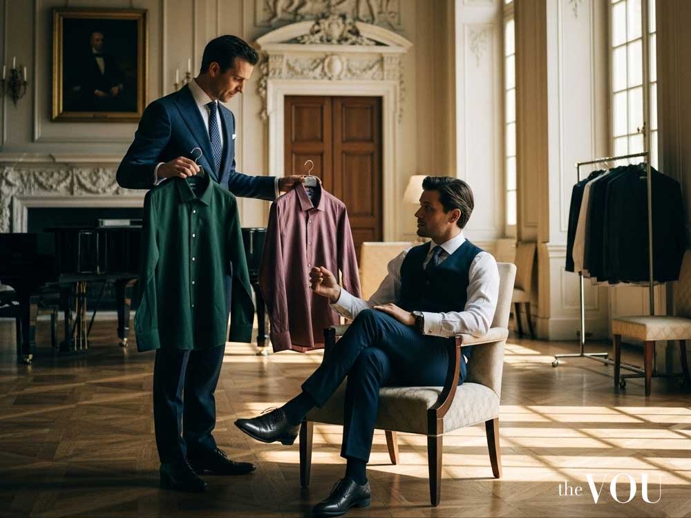
The garment comparison is the most useful check, and you can run it with clothes you already own.
Stand by a window in daylight, with plain surroundings and a neutral top or bare neck, and keep the light the same for every comparison.
Hold pairs of garments of similar lightness that differ in one quality under your chin: first warm against cool, such as camel against cool grey or coral against a blue-pink, then clear against muted, such as a vivid blue against a greyed blue.
Look at your face, not the garment: notice which version keeps attention on your eyes, leaves fewer shadows around the mouth and nose, and makes your skin look more even.
Repeat the comparison on another day, and take a photo in the same light if you find it hard to judge in a mirror; treat the result as provisional, and keep neighbouring options open when results conflict.
Translating Your Colour Profile into a Personalised Wardrobe
Once you have a likely direction, test it with garments before buying anything new.
The goal is colours that harmonise with your colouring and make you look put-together.
Colours for the Cool-Toned Man

Men with cool undertones thrive in colours with a blue base.
Focus your wardrobe on a spectrum of blues, purples, and certain greens.
Your key colours are: bright white, jewel tones like sapphire and emerald, purples from lavender to deep plum, and blue-based reds such as cherry or ruby.
Navy and charcoal make easy neutrals, and blue-based reds usually sit better than orange-reds.
Orange and bright yellow are often harder to wear near the face for a cool impression; try them away from the face first.
Colours for the Warm-Toned Man
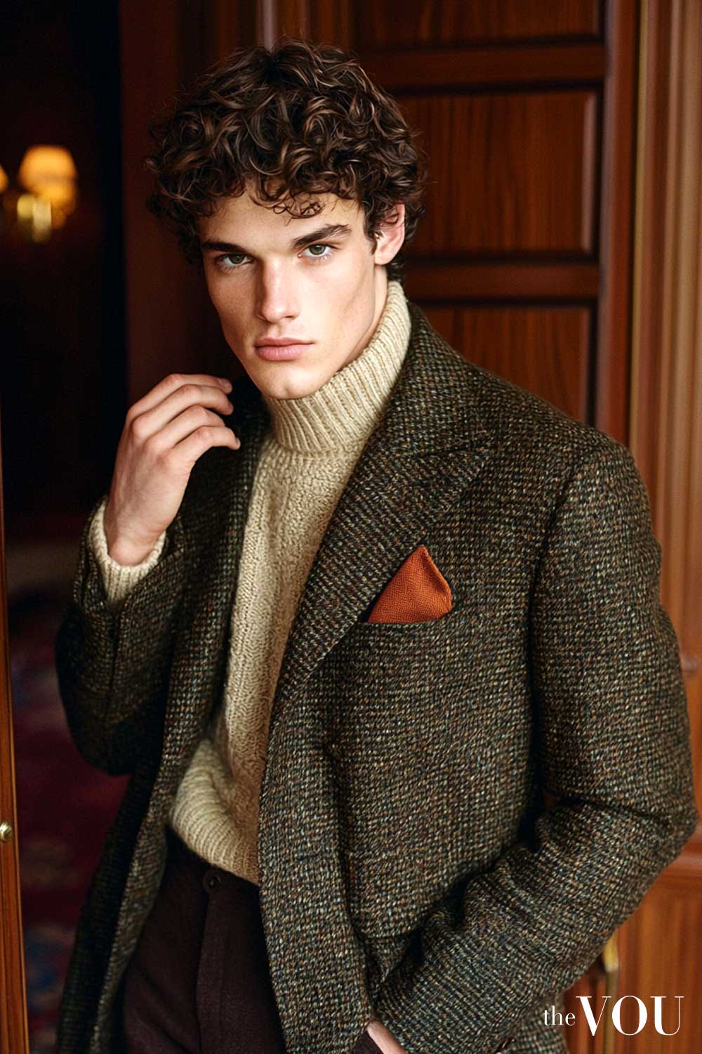
A warm impression often suits rich, earthy, old money style colours.
Your strength lies in shades that contain yellow or golden notes.
Build your wardrobe with: off-whites and cream, earthy greens like olive and moss, browns, terracotta, mustard yellow, and burnt orange.
Cream, beige, khaki, taupe, brown and warm greys make easy neutrals, and for reds, brick or terracotta usually sit better than berry tones; white and black remain fine where a dress code calls for them.
Icy blues and very cool jewel tones can be harder to wear near the face for a warm impression.
Colours for the Neutral-Toned Man
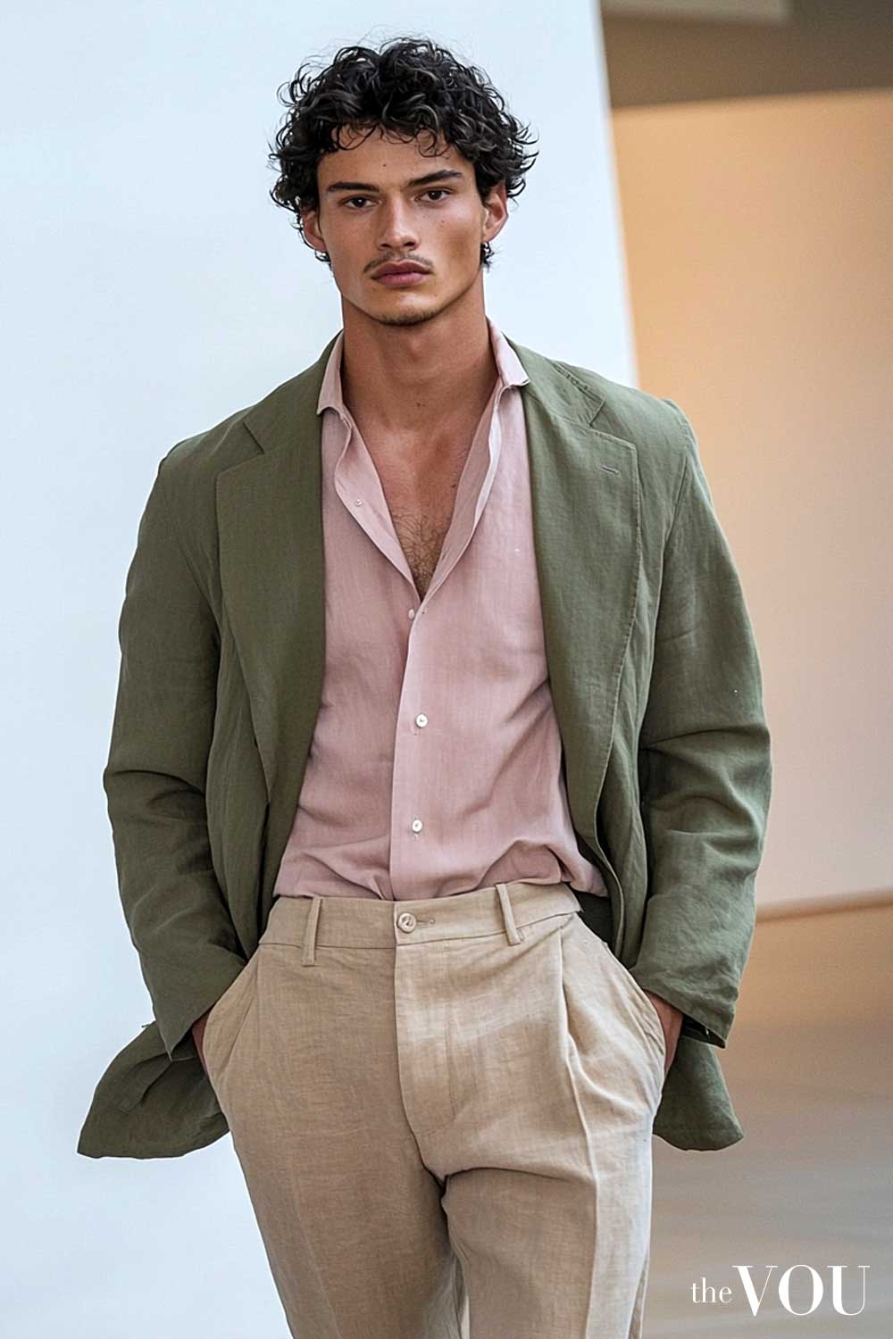
If your colouring reads as neutral, you may find colours from both sides work.
You can wear colours from across the spectrum.
Test intensity separately: a neutral-looking cast does not mean you need muted colours.
Colours worth testing in both clearer and softer versions include jade or a softer sage, cornflower or a dustier blue, and coral or a dusty pink; let the comparison decide how vivid to go.
You have the freedom to experiment, but balance is key.
Mastering Contrast and Seasonal Palettes
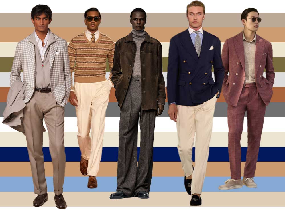
Understanding your undertone is the foundation.
The next level of mastery involves integrating contrast and exploring the more nuanced system of seasonal colour analysis.
Aligning Your Outfit with Your Natural Contrast
A useful starting point is to match the contrast in your outfit to the contrast in your features.
If you are high-contrast, such as dark hair with fair skin or very light hair with deep skin, high-contrast pairings often work well.
A black jacket with a crisp white shirt is a classic example that leverages your natural colouring.
If you are low-contrast, such as fair hair with fair skin, or deep skin with dark hair and dark eyes, tonal or monochromatic outfits are an easy starting point; a mid-blue jacket with a lighter blue shirt is one example, though a white shirt remains correct for formal dress codes.
See our guide to colour schemes for analogous options.
Medium-contrast men have more flexibility and can experiment with a wide range of pairings.
An Introduction to Seasonal Colour Analysis
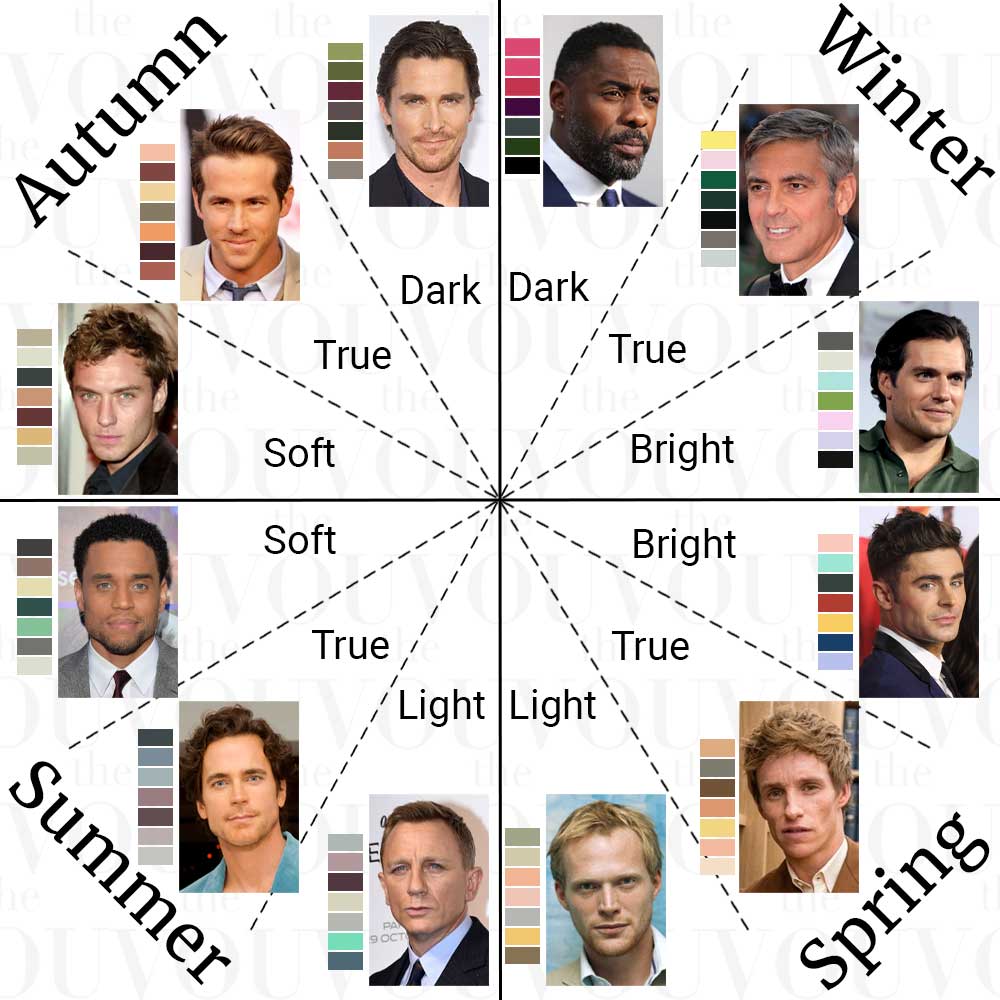
Seasonal analysis is a fuller system that adds a second question, whether clearer or more muted colours suit you, to warm versus cool.
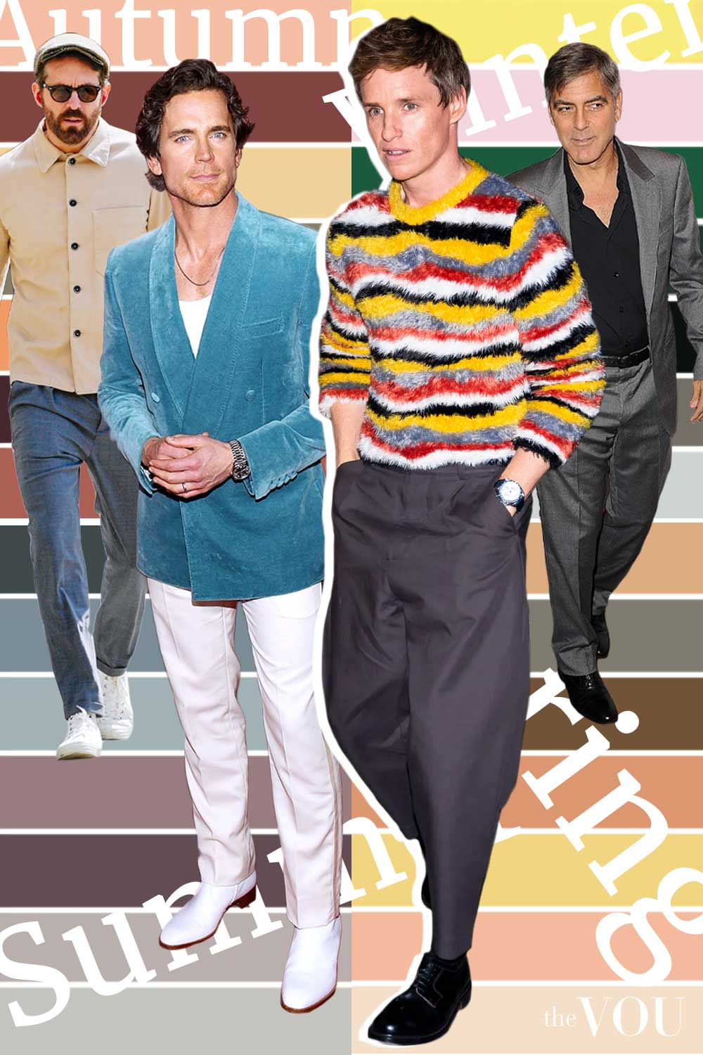
It divides palettes into four families: Winter (cool-leaning, clearer colours), Summer (cool-leaning, softer colours), Autumn (warm-leaning, softer colours) and Spring (warm-leaning, clearer colours), each split into three subseasons.
A Winter palette features bold, sharp colours like black, white, and royal blue.
A Summer palette is softer, with muted pastels like sky blue and rose.
Autumn thrives in rich, earthy tones like mustard and terracotta.
Spring’s colours are clear and bright, like coral and lime green.
A season gives you a detailed palette to shop from, though it remains a guide rather than a measurement.
Using Your Colours in a Wardrobe
Start with neutrals that suit you for tailoring, outerwear and trousers, then use shirts, knitwear, ties and pocket squares for the colours you compare best in, because those garments sit closest to your face.
A well-chosen shirt in a shade that suits you can do more for your face than a whole suit in a colour that suits you less well.
Three classic colour harmonies help with combinations:
- Monochromatic: shades and tints of one colour, an easy approach for lower contrast.
- Analogous: neighbours on the colour wheel, such as blue and green, which look related without matching.
- Complementary: opposites on the wheel, such as blue and orange, which are easiest to wear with one colour as a small accent.
Some men like lighter versions of their colours in warmer months and deeper ones in colder months; that is a preference, not a requirement of the system.
Common Mistakes to Avoid
Ignoring the comparison: a colour that works against your colouring can make you look tired, so wearing the wrong colours for your undertone is worth checking before you buy.
Over-relying on black: many men default to black, believing it suits everyone, but it does not always; for men who suit softer palettes, charcoal, navy or deep brown are softer alternatives near the face, while black remains correct where the dress code calls for it.
Following trends blindly: a “colour of the season” is optional; build the core of the wardrobe on what you compare best in, with trends as extras.
Final Considerations for the Discerning Gentleman
View these principles as a strategic framework, not a restrictive set of rules.
Begin by adding a few garments in your best colours, such as a navy blazer for a cool impression or an olive field jacket for a warm one.
Pay attention to how these colours make you look and feel.
The objective is to build an intuitive understanding of what works for you.
Knowing your colours makes shopping easier; our guide to finding your personal colour palette takes the next step.
Mandy Meyer’s focus at The VOU is men’s body-shape styling, garment fit and outfit proportions. Her coverage addresses the practical questions behind a wardrobe choice: how a jacket sits across the shoulders, how trousers fall and how different cuts change the silhouette a wearer wants to create.
Her subject areas include the triangle, inverted triangle, rectangle, oval, trapezoid, hourglass and diamond labels used in body-shape styling. These provide starting references for comparing visible proportions; they do not capture every body or prescribe one correct way to dress. The focus connects those observations with garment shape, construction, length and the relationship between the upper and lower parts of an outfit.
Mandy’s editorial coverage combines visual comparisons with fit checks for comfort and movement. Readers can consider whether a cut gives them the room they need, where clothing pulls or gathers and which changes might support their preferred look. The aim is to make menswear choices more understandable while keeping personal preferences and the wearer’s own styling goals central.