
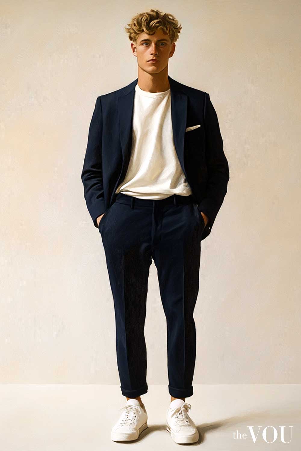
Navigating the world of men’s fashion can feel daunting, especially when bombarded with ever-changing trends.
However, true style transcends trends; it’s about understanding and embracing what truly complements your natural features.
For men with True/Warm Spring colouring, this means harnessing the power of a cool, refreshing palette that mirrors the vibrancy of a summer’s day.
This comprehensive guide delves into the nuances of the True/Warm Spring colour palette for men, providing insightful tips and advice to help you make informed fashion choices and enhance your natural features.
What is True/Warm Spring Colour Palette?
Part of the Seasonal Colour Palette, True/Warm Spring is one of the Spring colours, together with Bright/Clear Spring and Light Spring subseasons.
True/Warm Spring seasonal colour occupies a unique position in the seasonal colour theory and is characterised by warm, clear, and bright colours that evoke the essence of early spring.
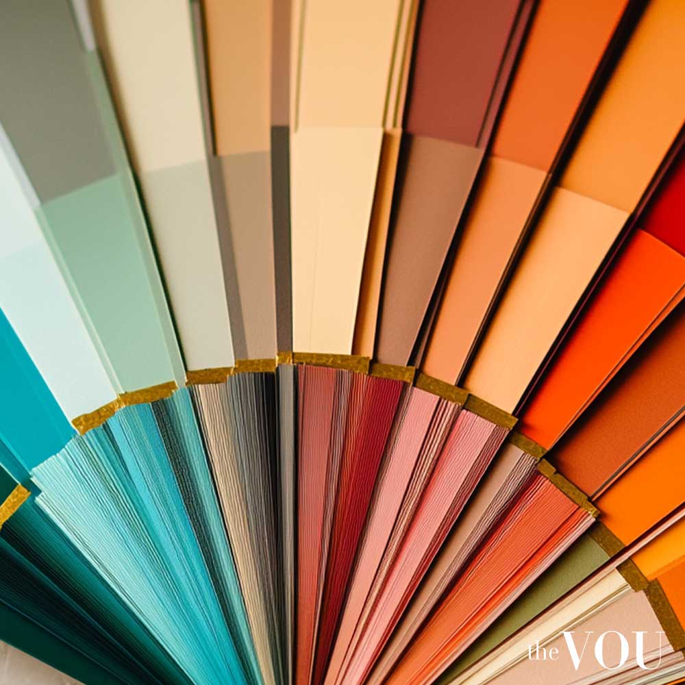
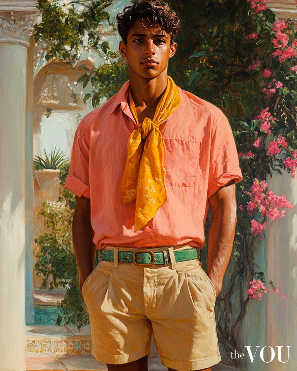
True/Warm Spring seasonal colour men exhibit a golden warmth with a notable brightness and clarity to the overall appearance, resulting in a radiant and energetic look.
The True/Warm Spring palette is distinguished by several key characteristics:
Warmth – Colours are warm, evoking the golden glow of spring sunshine at its peak. This warmth is more pronounced than in Bright Spring but not as deep or rich as the Autumn palettes.
Clarity – Colours are clear and bright, never muted or dusty. Think of the vivid hues of spring flowers in full bloom.
Brightness – High chroma colours that are energetic and life-affirming, reminiscent of a meadow on a sunny spring day.
Contrast – Medium contrast between facial features, creating a harmonious and fresh appearance.
The True/Warm Spring palette for men includes a range of warm, clear, and bright colours:
Yellows – Golden yellow, buttercup, and sunshine yellow
Greens – Fresh grass green, apple green, and spring leaf
Blues – Turquoise, clear sky blue, and warm aqua
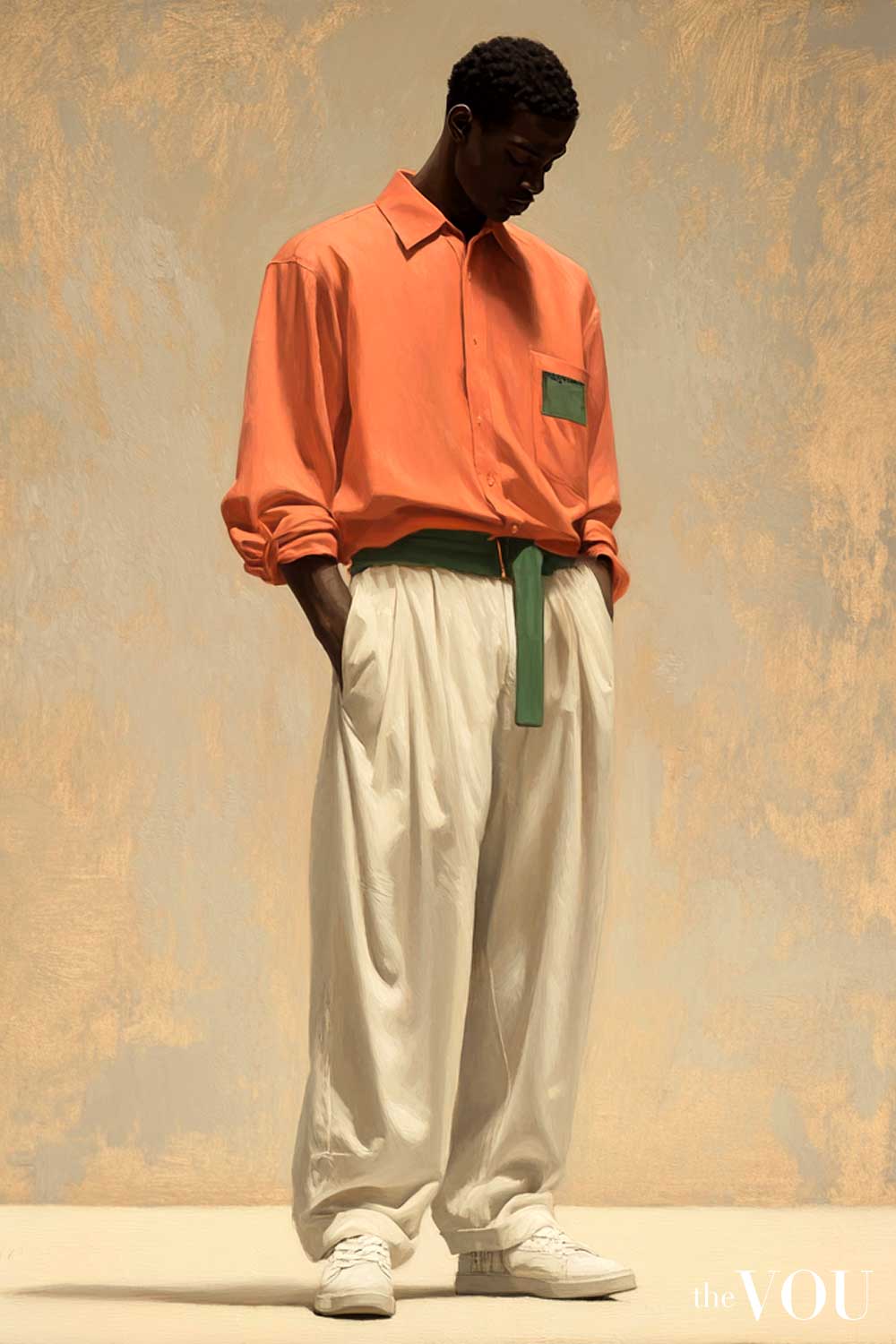
Reds – Coral red, poppy red, and warm tomato red
Oranges – Peach, apricot, and warm tangerine
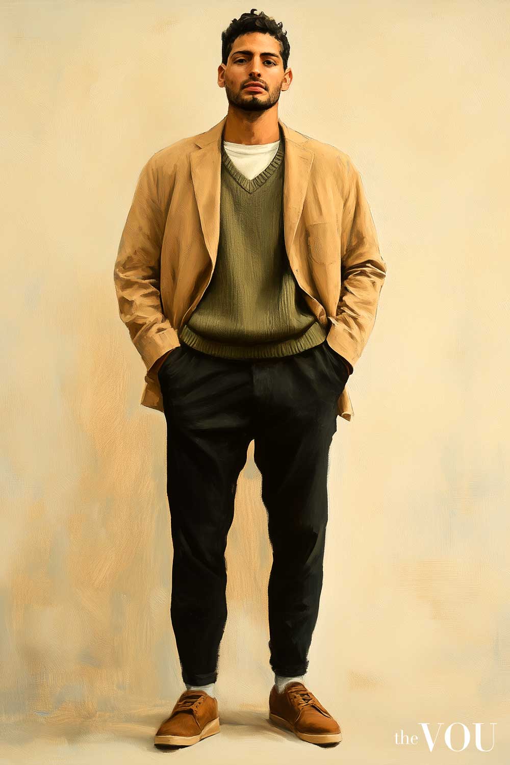
Neutrals – Warm ivory, light camel, and golden brown
Primary Colours
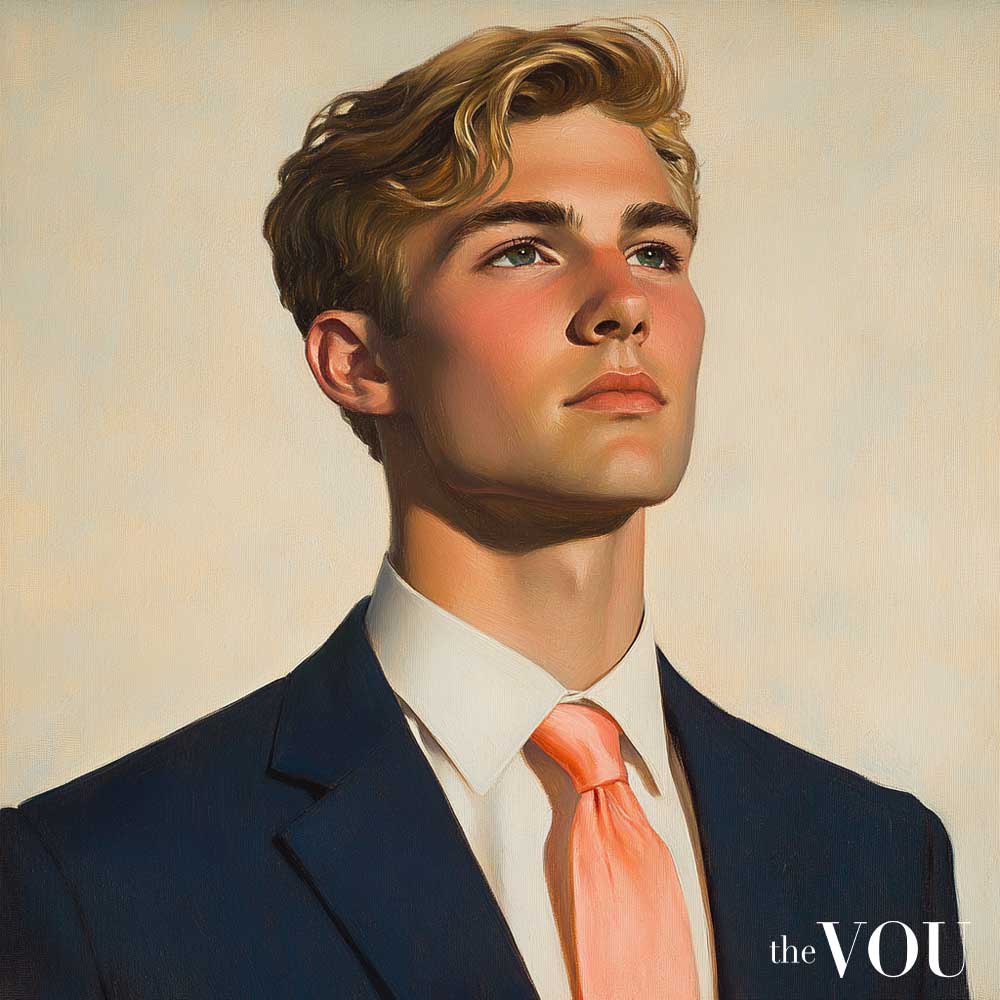
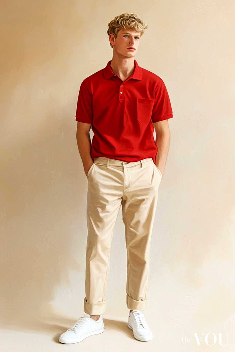
Reds in the True/Warm Spring palette are warm and clear, ranging from a vibrant coral to a bright tomato red.
These reds possess a certain zest that distinguishes them from the deeper, more muted reds of autumn or the cool, blue-based reds of winter.
[color_spectrum color1=”#FF7F6B” color2=”#FF6B5B” color3=”#FF5747″ color4=”#FF4433″ color5=”#FF3621″ color6=”#FF2911″]
A True/Warm Spring man will shine in a coral tie to add a punch of colour to a business ensemble…
…or a tomato-red polo shirt for a casual weekend look.
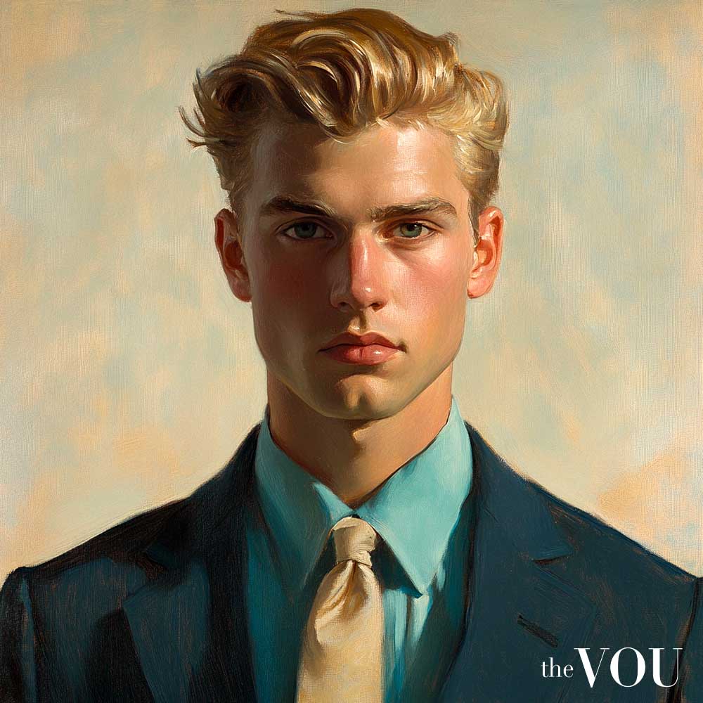
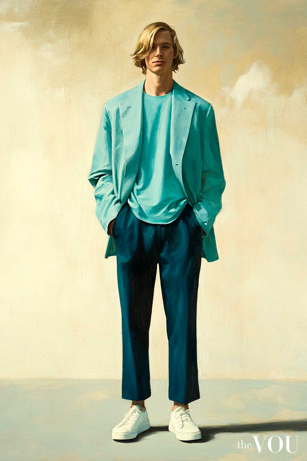
Blues in this palette are warm and clear, like the vibrant turquoise of tropical waters or the clear sky blue of a perfect spring day.
[color_spectrum color1=”#45C6D8″ color2=”#30B8CE” color3=”#20AAC4″ color4=”#14A0BC” color5=”#0896B4″ color6=”#008BAA”]
These blues are neither as deep as navy nor as icy as winter blues; a turquoise dress shirt can be a refreshing alternative to traditional light blue.
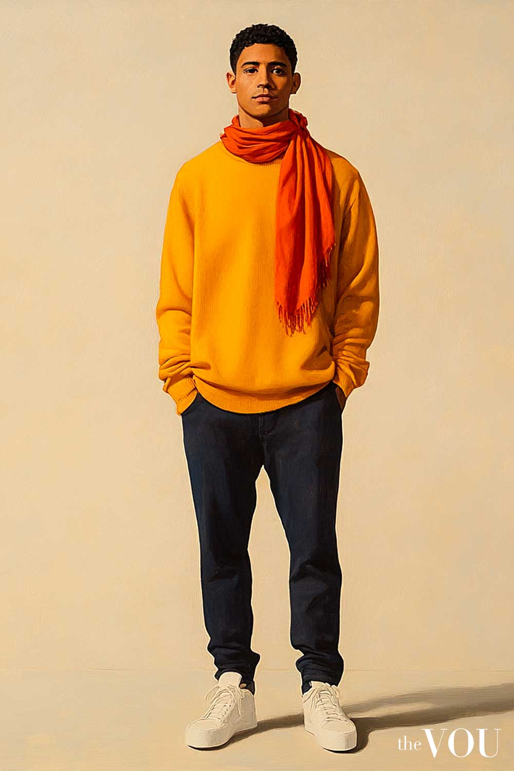
Yellows in the True/Warm Spring palette range from a clear butter yellow to a warm, golden daffodil.
These yellows are vibrant and energetic, without the mustard or amber undertones found in autumn palettes.
[color_spectrum color1=”#FFF59D” color2=”#FFE57F” color3=”#FFD54F” color4=”#FFC933″ color5=”#FFB300″ color6=”#FFA000″]
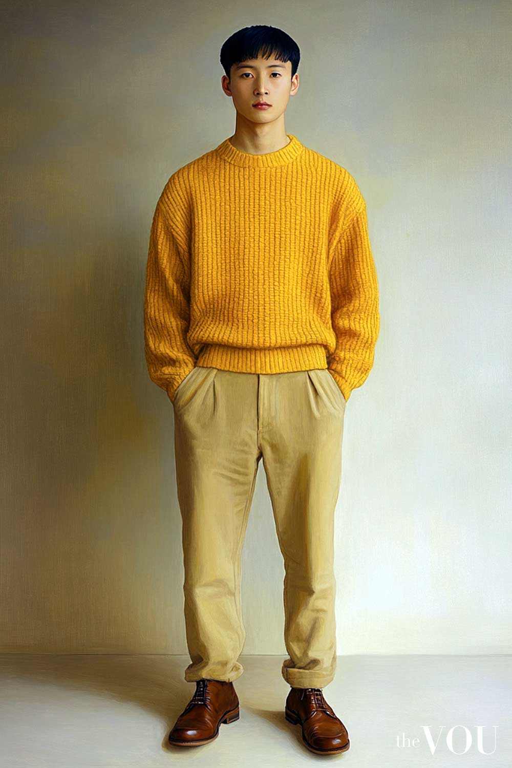
A sunshine yellow jumper can be a cheerful addition to a True/Warm Spring man’s casual wardrobe, brightening his appearance.
Greens in this palette are fresh and vibrant, reminiscent of new spring growth. From an apple green to a warm grass green, these greens are clear and bright rather than deep or muted.
[color_spectrum color1=”#9CDE70″ color2=”#8CD35B” color3=”#7CC946″ color4=”#6CBF31″ color5=”#5CB526″ color6=”#4CAB1B”]
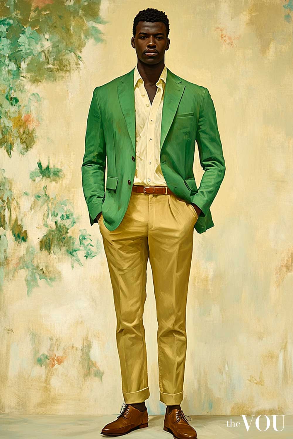
A grass green sport coat, while bold, can be a striking choice for a True/Warm Spring man at a summer event.
Neutrals
While vibrant hues are the hallmark of the True/Warm Spring palette, neutrals play a crucial role in creating a balanced and versatile wardrobe.
The neutrals in this palette maintain the characteristics of warmth and clarity.
Whites for True/Warm Spring men are warm and clear. Warm ivory is excellent, as is a soft white with a hint of yellow. These whites never appear stark or blue-toned.
[color_spectrum color1=”#FFFFF0″ color2=”#FFFCE8″ color3=”#FFF8DC” color4=”#FFF5D6″ color5=”#FFF2CC” color6=”#FFEDC2″]
A warm ivory shirt is a wardrobe staple for True/Warm Spring men, providing a perfect backdrop for more vibrant colours.
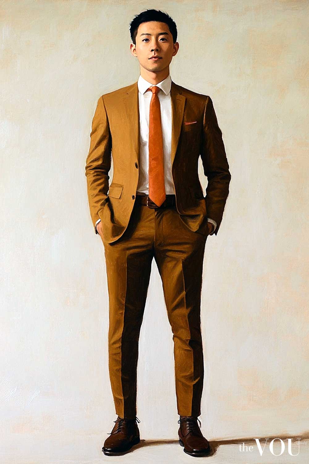
Browns in this palette range from light camel to warm cognac. These browns are warm and clear, never appearing muddy or too dark.
[color_spectrum color1=”#DEB887″ color2=”#D4A76A” color3=”#C99B4E” color4=”#BE8B38″ color5=”#B37C24″ color6=”#A86E15″]
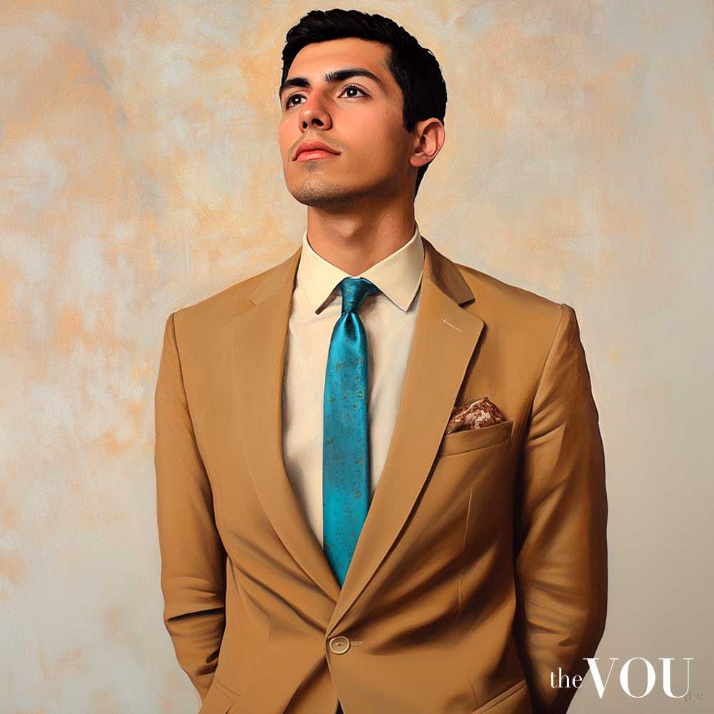
A camel blazer can be a versatile addition to a True/Warm Spring man’s wardrobe, complementing both casual and formal outfits.
Beige for True/Warm Spring is warm and golden, from light sand to a richer golden khaki.
[color_spectrum color1=”#F3E5AB” color2=”#E8D699″ color3=”#DDC788″ color4=”#D2B877″ color5=”#C7A966″ color6=”#BC9B55″]
These shades serve as excellent neutrals that harmonise with the more vibrant colours in the palette.
Navy, while still a blue colour, serves as a neutral in many wardrobes. For True/Warm Spring men, the ideal navy is clear and has a warm undertone, never appearing too dark or muted.
[color_spectrum color1=”#234B82″ color2=”#1D4275″ color3=”#173968″ color4=”#11305B” color5=”#0B274E” color6=”#051E41″]
A warm navy suit is a wardrobe essential, offering depth while still harmonising with True/Warm Spring’s natural colouring.
Accent Colours
The True/Warm Spring palette includes a range of accent colours that add depth and variety. These colours are effective in accessories or as statement pieces.
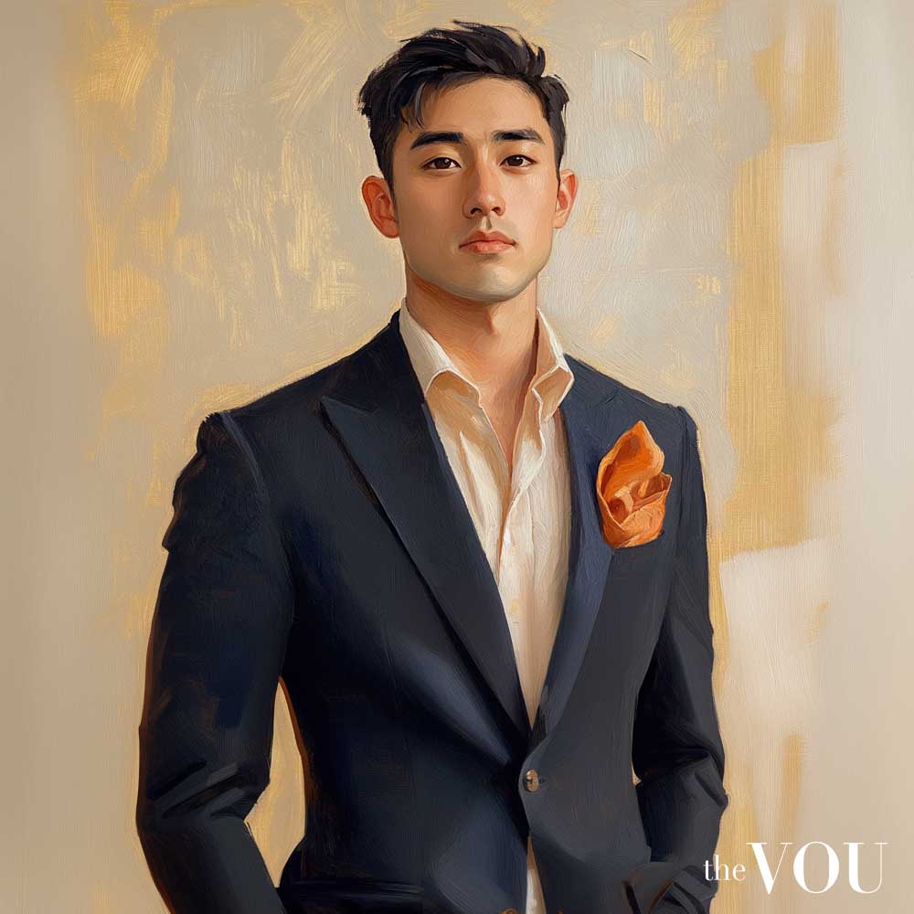
Oranges in this palette are warm and clear, from a bright tangerine to a soft peach. These oranges are vibrant and fresh, without the burnished quality of autumn oranges.
[color_spectrum color1=”#FFE0B2″ color2=”#FFB74D” color3=”#FFA726″ color4=”#FF9800″ color5=”#FB8C00″ color6=”#F57C00″]
A tangerine pocket square can add a fresh touch to a True/Warm Spring man’s suit.
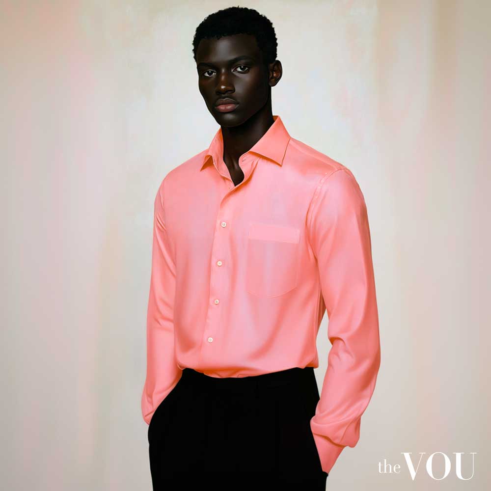
Pinks in the True/Warm Spring palette are warm and clear, from a bright coral pink to a warm salmon. These pinks are neither pastel nor dusty.
[color_spectrum color1=”#FF9E9E” color2=”#FF8B8B” color3=”#FF7878″ color4=”#FF6666″ color5=”#FF5252″ color6=”#FF4040″]
A coral pink dress shirt can be a confident choice for a True/Warm Spring man, letting his natural colouring harmonise with the vibrant hue.
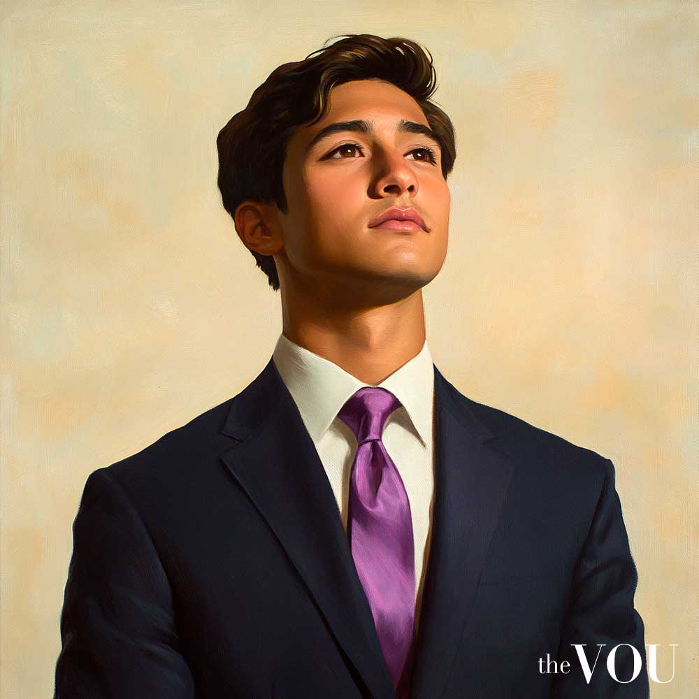
Purples in this palette are warm and bright, leaning more towards the red-violet end of the spectrum.
From a warm lavender to a clear magenta, these purples add an unexpected pop of colour to a True/Warm Spring man’s wardrobe.
[color_spectrum color1=”#E085C8″ color2=”#D670B8″ color3=”#CC5BA8″ color4=”#C24698″ color5=”#B83288″ color6=”#AE1D78″]
A magenta tie can be a bold and stylish choice for formal events.
Ideal Colour Combinations
Your warm, clear colouring allows you to wear harmonious colour combinations with confidence. Don’t be afraid to pair colours that might seem unconventional to others.
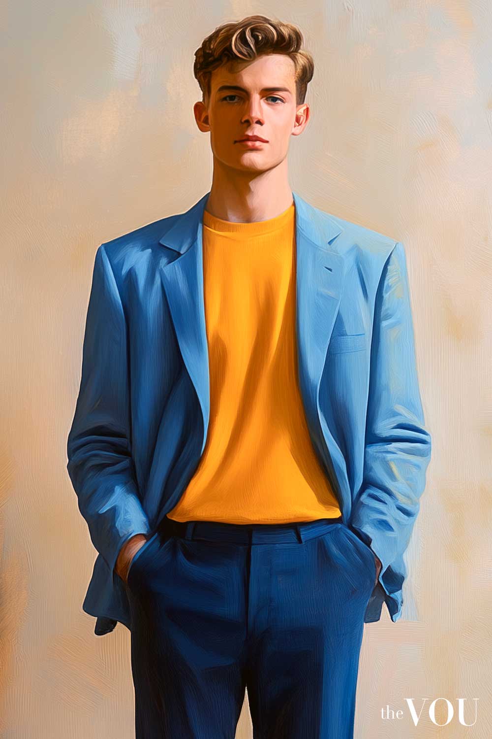
A golden yellow t-shirt under a warm blue blazer, for instance, can look stunning on you.
When layering, try to incorporate at least two or three colours from your palette. You might wear a warm ivory top, an apple green jumper, and a camel blazer.
This combination of neutral and bright colours creates a balanced yet vibrant look that complements your natural colouring.
Remember, your neutrals are warm and clear. A golden brown suit, warm ivory shirt, and coral tie can create a professional look that’s far from boring.
The key is to maintain the warmth and clarity that characterises your True/Warm Spring palette in all your colour combinations.
The ideal monochromatic colour combination is warm blue, turquoise, and warm navy; a light warm blue blazer, a turquoise t-shirt, and a warm navy trousers.
The ideal complementary colour combination is coral, warm green, and warm ivory; a coral shirt, a warm green accessories, and a warm ivory trousers.
The ideal analogous colour combination is golden yellow, warm orange, and coral; a golden yellow jumper, a warm orange t-shirt, and a coral scarf.
The ideal triadic colour combination is warm green, coral, and golden yellow; a warm green shirt, coral tie, golden yellow pocket square.
The ideal neutral colour combination is camel, warm ivory, and warm navy; camel coat, warm ivory shirt, warm navy scarf
When using these colour combinations, keep the following guidelines in mind:
- Monochromatic combinations use different shades of the same colour family. They’re easy to put together and create a sleek, cohesive look.
- Complementary colours are opposite each other on the colour wheel. They create a vibrant, high-contrast look that suits the True/Warm Spring palette well.
- Analogous colours are next to each other on the colour wheel. They create a harmonious, coordinated look.
- Triadic colour schemes use three colours spaced around the colour wheel. They offer bold, balanced combinations.
- Using neutral colours as a base allows you to incorporate brighter hues without overwhelming your outfit.
Remember, these are suggestions to inspire you and as you become comfortable with your True/Warm Spring palette, experiment with unique colour combinations.
The key is to maintain the warm, clear quality that characterises True/Warm Spring colours.
When putting together outfits, consider the occasion, location, body shape, and your desired fashion style.
Use bolder combinations for casual events or creative work environments, and opt for more subdued combinations (with neutrals) in conservative professional settings.
Seasonal Adjustments
While your True/Warm Spring colours are suitable year-round, some adjustments can be made for different seasons to keep your look fresh and appropriate.
In spring and summer, embrace the vibrant warmth of your palette. Incorporate your brightest hues like coral, golden yellow, and apple green.
Use lighter neutrals such as warm ivory and light golden khaki to balance your outfits.
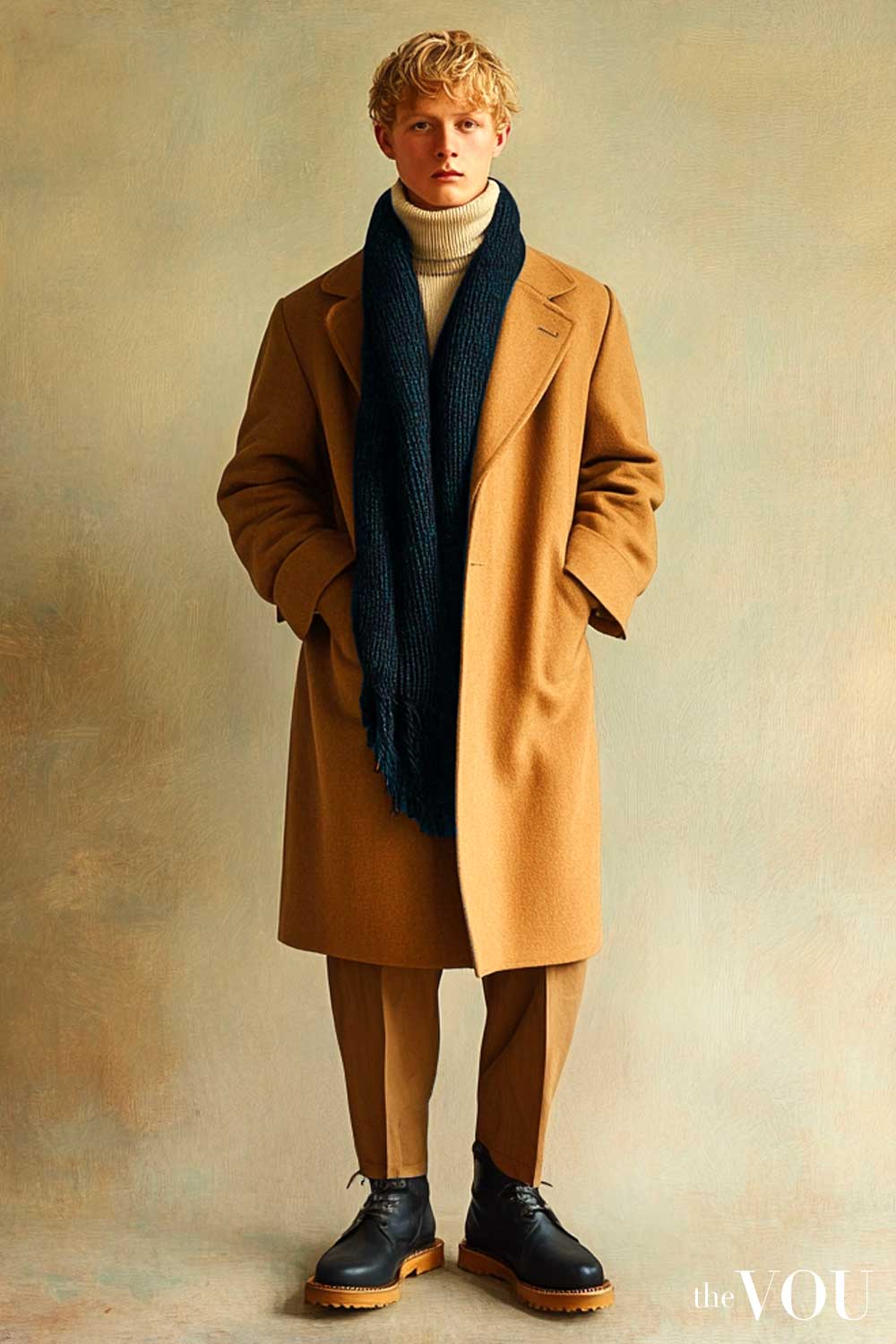
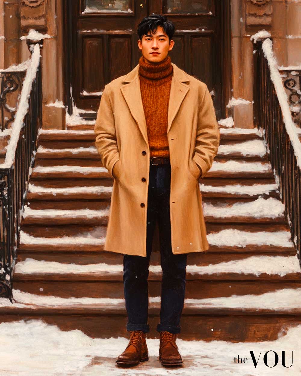
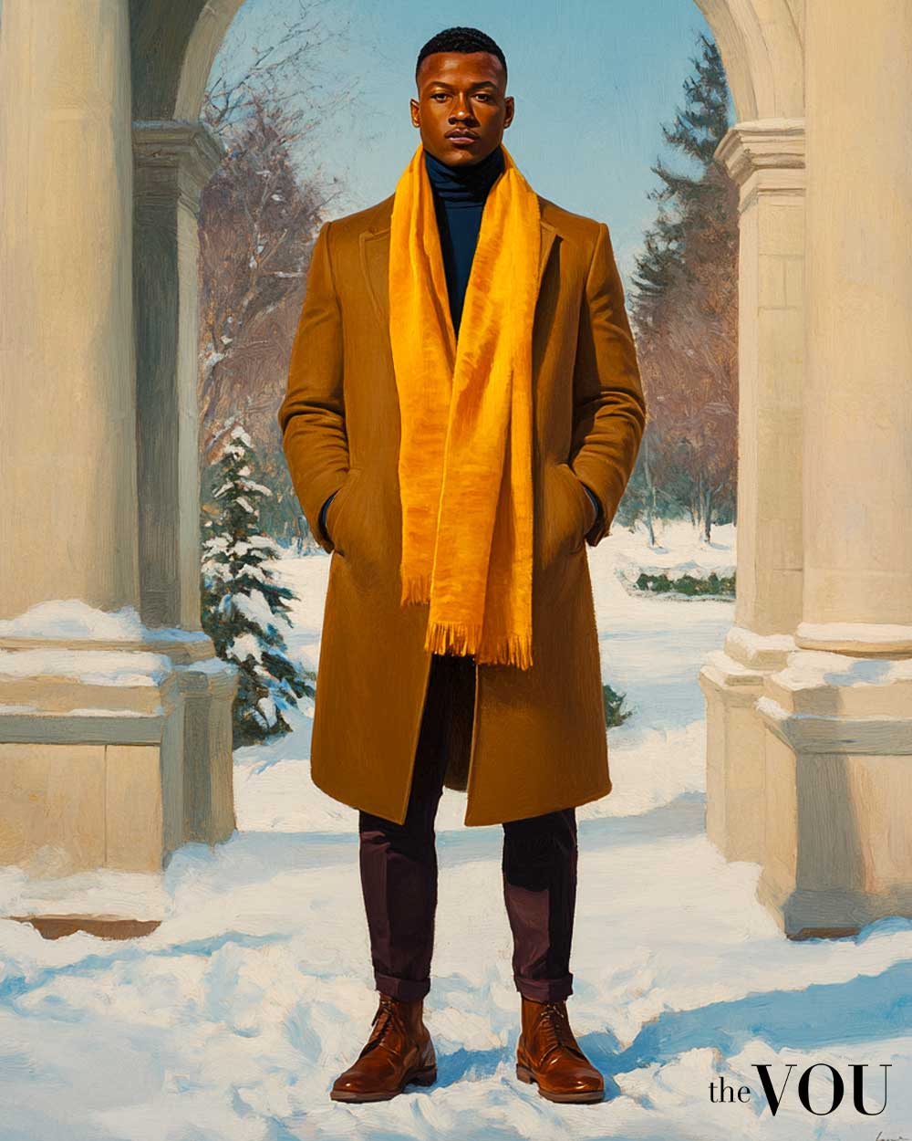
In autumn and winter, lean towards the deeper end of the True/Warm Spring palette. Incorporate more warm cognac, golden brown, and deep coral as your main colours.
Use camel and warm navy as your primary neutrals during the cooler months.
However, don’t hesitate to wear your brighter colours year-round – a pop of warm, clear colour can be uplifting during the darker months.
For example, a golden yellow scarf can add a cheerful touch to a camel coat in winter.
Remember, as a True/Warm Spring, your best looks will always incorporate the warm, clear, and fresh qualities of your palette.
The key is to maintain the golden undertone and clarity that characterises your season, regardless of the time of year.
True Spring vs Bright and Light Spring
To better understand how True/Warm Spring colours differ from similar seasons, consider the following comparison:
| Colour Family | True/Warm Spring | Bright Spring | Light Spring |
|---|---|---|---|
| Blue | Sky Blue [color_spectrum color1=”#87CEEB” color2=”#6CA6BC” color3=”#517E8D” color4=”#36565E” color5=”#1B2E2F” color6=”#004C69″] |
Electric Blue [color_spectrum color1=”#00BFFF” color2=”#00AAE6″ color3=”#0095CC” color4=”#0080B3″ color5=”#006B99″ color6=”#005680″] |
Aqua Blue [color_spectrum color1=”#00FFFF” color2=”#00E6E6″ color3=”#00CCCC” color4=”#00B3B3″ color5=”#009999″ color6=”#008080″] |
| Red | Tomato Red [color_spectrum color1=”#FF6347″ color2=”#F25039″ color3=”#E53D2B” color4=”#D82A1D” color5=”#CB170F” color6=”#CF0000″] |
Coral Red [color_spectrum color1=”#FF7F50″ color2=”#FF6B3C” color3=”#FF5728″ color4=”#FF4314″ color5=”#FF2F00″ color6=”#FF1B00″] |
Peachy Pink [color_spectrum color1=”#FFCBA4″ color2=”#FFB690″ color3=”#FFA17C” color4=”#FF8C68″ color5=”#FF7754″ color6=”#FF6240″] |
| Yellow | Golden Yellow [color_spectrum color1=”#FFD700″ color2=”#EACC00″ color3=”#D5C100″ color4=”#C0B600″ color5=”#ABAB00″ color6=”#998F00″] |
Lemon Yellow [color_spectrum color1=”#FFFF00″ color2=”#E6E600″ color3=”#CCCC00″ color4=”#B3B300″ color5=”#999900″ color6=”#808000″] |
Buttercup Yellow [color_spectrum color1=”#FAF884″ color2=”#F0EE7A” color3=”#E6E470″ color4=”#DCDA66″ color5=”#D2D05C” color6=”#C8C652″] |
| Green | Apple Green [color_spectrum color1=”#8DB600″ color2=”#7EA300″ color3=”#6F9000″ color4=”#607D00″ color5=”#516A00″ color6=”#3D4D00″] |
Bright Green [color_spectrum color1=”#39FF14″ color2=”#32E612″ color3=”#2BCC10″ color4=”#24B30E” color5=”#1D990C” color6=”#16800A”] |
Mint Green [color_spectrum color1=”#98FF98″ color2=”#89E689″ color3=”#7ACC7A” color4=”#6BB36B” color5=”#5C995C” color6=”#4D804D”] |
| Purple | Warm Lavender [color_spectrum color1=”#E6E6FA” color2=”#D1D1F0″ color3=”#BCBCE6″ color4=”#A7A7DC” color5=”#9292D2″ color6=”#7D7DC8″] |
Vibrant Violet [color_spectrum color1=”#8F00FF” color2=”#7F00E6″ color3=”#6F00CC” color4=”#5F00B3″ color5=”#4F0099″ color6=”#400080″] |
Lilac [color_spectrum color1=”#C8A2C8″ color2=”#B992B9″ color3=”#AA82AA” color4=”#9B729B” color5=”#8C628C” color6=”#7D527D”] |
As you can see from this table, True/Warm Spring colours are characterised by warmth and clarity, with a golden undertone.
They are warmer and softer than Bright Spring colours, but more vibrant and clear than Light Spring hues.
This subtle difference can impact how colours interact with your skin tone and overall appearance.
True/Warm Spring colours enhance the natural warmth and freshness of your complexion, creating a harmonious and vibrant look.
Colours True/Warm Spring Men Should Avoid
Avoid cool, muted, very deep, or too pastelated colours as they can clash with your True/Warm Spring warm and clear, natural colouring.
Cool tones like icy blue, cool lavender, or blue-based reds can create disharmony with your warm undertones.
[color_spectrum color1=”#E0FFFF” color2=”#CCE5E5″ color3=”#B8CCCC” color4=”#A4B2B2″ color5=”#909999″ color6=”#7C7F7F”]
[color_spectrum color1=”#E6E6FA” color2=”#D2D2E6″ color3=”#BEBFD2″ color4=”#AAABBD” color5=”#9697A9″ color6=”#828395″]
[color_spectrum color1=”#FF0033″ color2=”#E6002E” color3=”#CC0029″ color4=”#B30024″ color5=”#99001F” color6=”#80001A”]
Very deep colours such as burgundy, forest green, or midnight blue can overwhelm your natural brightness.
[color_spectrum color1=”#800020″ color2=”#73001D” color3=”#66001A” color4=”#590017″ color5=”#4C0014″ color6=”#3F0011″]
[color_spectrum color1=”#228B22″ color2=”#1E7B1E” color3=”#1A6C1A” color4=”#165C16″ color5=”#124D12″ color6=”#0E3D0E”]
[color_spectrum color1=”#191970″ color2=”#161664″ color3=”#131358″ color4=”#10104C” color5=”#0D0D40″ color6=”#0A0A34″]
Muted tones like mauve, sage green, or dusty blue can dull a True/Warm Spring man’s natural vibrancy.
[color_spectrum color1=”#E0B0FF” color2=”#CCA0E6″ color3=”#B890CC” color4=”#A480B3″ color5=”#907099″ color6=”#7C6080″]
[color_spectrum color1=”#BCB88A” color2=”#A9A67C” color3=”#96936E” color4=”#838160″ color5=”#706E52″ color6=”#5D5B44″]
[color_spectrum color1=”#8BA9CA” color2=”#7D98B6″ color3=”#6F87A2″ color4=”#61768E” color5=”#53657A” color6=”#455466″]
Overly pastel colours, while light, can lack the clarity and warmth that True/Warm Springs needs.
[color_spectrum color1=”#FFE5E5″ color2=”#FFE5F0″ color3=”#FFE5FF” color4=”#F0E5FF” color5=”#E5E5FF” color6=”#E5F0FF”]
Dos and Don’ts of True/Warm Spring Colour Palette
As a True/Warm Spring man, understanding the specific dos and don’ts of your colour palette is the fastest way to enhance your look.
| Do | Don’t |
|---|---|
| Wear warm, clear colours like coral, turquoise, and golden yellow | Choose cool or muted tones like mauve, slate blue, or burgundy |
| Opt for warm ivory shirts to brighten your complexion | Wear stark white or cool-toned shirts that can clash with your warm undertones |
| Choose suits in warm navy or golden brown for a powerful look | Select suits in charcoal grey or black, which can overwhelm your warm colouring |
| Incorporate medium contrast in your outfits, like a warm ivory shirt with a clear blue tie | Wear very high-contrast outfits that can appear too stark against your harmonious colouring |
| Use camel and golden brown as warm neutrals in your wardrobe | Rely on cool-toned greys or blacks as your primary neutrals |
| Experiment with warm colour combinations, like coral and turquoise | Stick to monochromatic or neutral colour pairings |
| Choose patterns with clear, warm colours and distinct shapes | Opt for patterns with cool or muted colours, or busy designs |
| Wear gold or rose gold jewellery with a warm, polished finish | Choose silver or platinum jewellery, with a cool or antiqued finish |
| Use warm, clear colours in your ties and pocket squares | Select ties in dark, cool colours like navy or forest green |
| Opt for shoes in warm brown tones | Wear very dark brown or black shoes, which can look heavy on your palette |
| Choose casual wear in warm, clear colours like a golden yellow polo shirt | Wear distressed or faded casual clothing that lacks warmth and clarity |
| Select outerwear in camel or warm, clear colours | Choose coats in very dark or cool colours like charcoal or cool navy |
| Wear sunglasses with warm-toned frames like tortoiseshell or gold | Wear very dark or cool-toned sunglass frames |
| Choose workout gear in warm, energising colours | Wear gym clothes in cool or muted shades |
| Maintain a fresh, warm-toned grooming style | Go for a cool-toned or bronzed look which can clash with your clear, warm colouring |
True/Warm Spring Colour Psychology
Understanding the psychological effects of colours can help you leverage your True/Warm Spring palette in various situations.
The warm, clear nature of True/Warm Spring colours tends to evoke positive, energetic responses, but each hue has its specific impact.
| Colour | Psychological Effect | Strategic Use |
|---|---|---|
| Warm Blue | Conveys trust, optimism, and clarity | Ideal for important meetings or presentations |
| Coral | Evokes energy, enthusiasm, and warmth | Great for social events or creative environments |
| Golden Yellow | Promotes optimism, confidence, and creativity | Use for brainstorming sessions or to boost mood |
| Warm Green | Suggests growth, balance, and harmony | Effective for negotiations or teambuilding events |
| Warm Navy | Implies authority, stability, and professionalism | Excellent for formal business settings or interviews |
| Warm Purple | Associated with creativity, luxury, and wisdom | Use for making a strong impression or in artistic contexts |
| Turquoise | Invokes calmness, clarity, and communication | Great for public speaking or teaching environments |
| Camel (Neutral) | Suggests reliability, comfort, and approachability | Use as a base colour to balance brighter hues |
By understanding colours’ psychological effects, you can use your True/Warm Spring palette to influence perceptions and set the right tone for different occasions.
Here is how you can use your True/Warm Spring palette to your advantage:
- For job interviews or important business meetings, consider wearing warm navy or warm blue to convey professionalism and trustworthiness.
- When giving presentations or public speeches, turquoise or golden yellow can help you appear confident and engaging.
- For creative brainstorming sessions or artistic endeavours, incorporate warm purple or coral to stimulate creativity and enthusiasm.
- In situations requiring diplomacy or teamwork, warm green can create an atmosphere of balance and harmony.
Reference Guide for True/Warm Spring Men
For a quick overview of the key points to remember about True Spring colouring for men, refer to this handy guide:
| Aspect | Characteristics |
|---|---|
| Dominant Traits |
|
| Best Colours |
|
| Colours to Avoid |
|
| Metals and Accessories |
|
| Styling Tips |
|
| Wardrobe Staples |
|
Keep this quick reference guide handy when shopping or putting together outfits as it summarises the key aspects of True Spring colouring and can help you choose colours that enhance your appearance.
Whenever in doubt about a colour, refer back to the core principles of True/Warm Spring colouring: warm, clear, and sunshine-inspired hues that make you look vibrant and alive.
With practice, identifying and wearing your best colours will become second nature, allowing you to create flattering and harmonious outfits in any situation.
With years of expertise in high-end fashion collabs and a PhD in Sustainable Fashion, Ru specialises in eco-luxe wardrobes for the modern gentleman seeking understated refinement.
With over twenty years of front-row fashion and styling events, collabs with haute-couture houses, and a PhD in Luxury Fashion, Laurenti is an expert in crafting personalised looks that depict old-money sophistication.
After years of managing hundreds of fashion brands from London's office of a global retailer, Mandy has ventured into freelancing. Connected with several fashion retailers and media platforms in the US, Australia, and the UK, Mandy uses her expertise to consult for emerging fashion brands create top-notch content as an editorial strategist for several online publications.
A passionate advocate for inclusivity and diversity, Aidan is the driving force behind The VOU as its Editorial Manager. With a unique blend of editorial acumen and project management prowess, Aidan's insightful articles have graced the pages of The Verge, WWD, Forbes, and WTVOX, reflecting his deep interest in the dynamic intersection of styling with grooming for men and beyond.