Start here
What’s This About
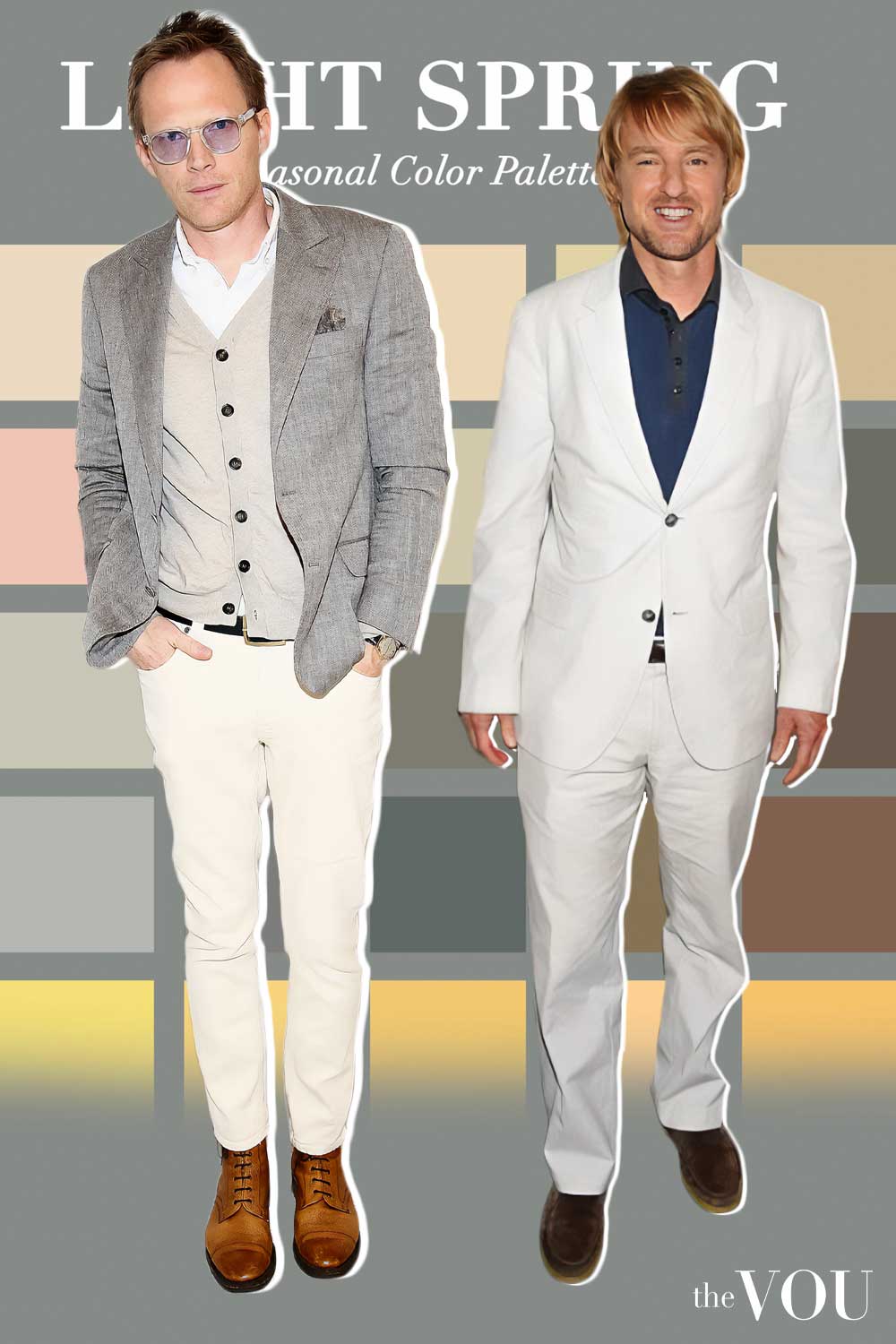
Light Spring is the lightest of the three Spring palettes in the twelve-season convention, with light colours first, a gentle warm lean second, and a clearer finish than its cool neighbour, Light Summer.
This guide shows you how to check whether the palette suits you with clothes you already own, then how to use it, such as
the two comparisons that separate Light Spring from Light Summer and from True/Warm Spring
the neutrals, main colours and accents, with the swatch sheets
which suits, shirts and knitwear to buy first, and a small capsule to build from
outfit formulas for each season of the year and colour combinations that stay light
what to do about black tie, a white shirt and a conservative office
and many more!
The main guide to seasonal colour analysis for men gives an overview of all twelve palettes; this page adds the Light Spring detail and explains the terms it uses.
Key Points
01Light Spring is a warm-leaning palette. Its colours are light and fresh, which is why people confuse it with Summer, but the lean is towards peach, gold and aqua rather than rose, blue and grey.
02The useful test is a comparison, not a checklist of features. Hold a peach or pale aqua garment beside a powder blue or pale rose one of similar lightness, in daylight, and watch your face and neck rather than the garment.
03Light hair, light skin and light eyes are common clues, not entry requirements. Dark hair does not rule Spring out, and a tan, wrist-vein colour or sun response do not establish a confirmed seasonal result in the evidence reviewed.
04Nothing in your wardrobe is banned. Dark or vivid colours simply sit better away from the face, as trousers, shoes or a coat worn over a lighter collar.
05If the comparisons keep coming out close, keep both Light Spring and Light Summer in play and dress from the colours the two palettes share.
Light Spring is one of the twelve palettes used in seasonal colour analysis, and this guide is written for men who have been told they are a Light Spring, suspect they might be, or want to know how the palette differs from the ones next to it.
It sits inside the Spring family with True/Warm Spring and Bright/Clear Spring, and it shares a border with Light Summer, a useful neighbouring palette to compare.
The main seasonal colour guide for men gives an overview of all twelve palettes.
The terms used on this page (lightness, warmth, intensity and contrast) are explained in the next two sections, so you can read it on its own.
The optional seasonal colour quiz is a separate tool on this site; it does not replace the garment comparisons described below.
What Light Spring Means
This guide uses The Concept Wardrobe’s twelve-season palette descriptions as its named reference, specifically Light Spring.
Feature patterns are comparison clues here, not eligibility rules.
The clothing and outfit suggestions are The VOU’s practical applications; other providers may use the same names differently.
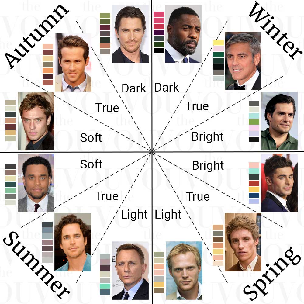
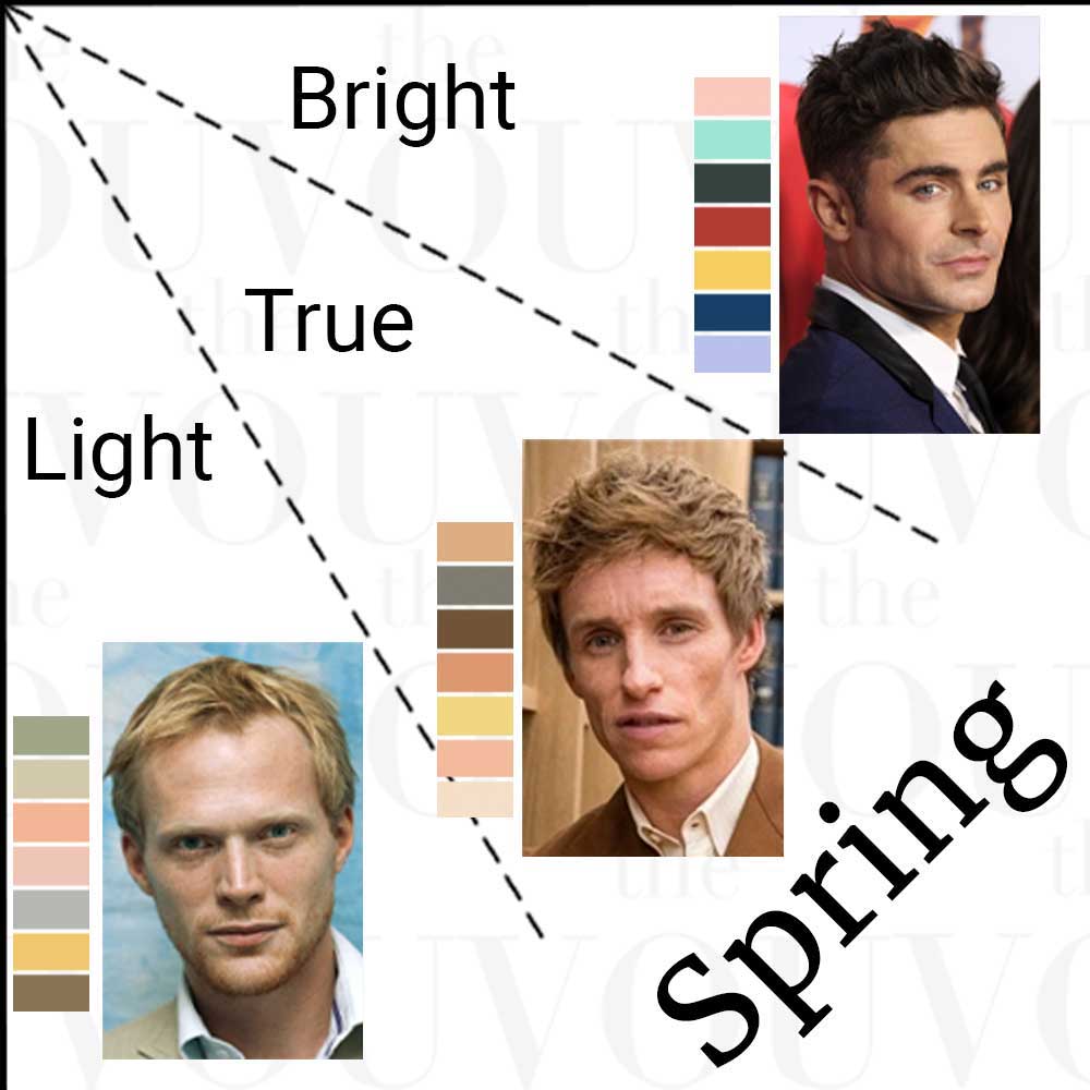
In the twelve-season convention every palette is described by three separate qualities, namely how light or deep its colours are, whether they lean warm or cool, and whether they are clear or muted.
Light Spring is defined by lightness first.
Its colours are light and airy rather than deep, and there are very few dark colours in the palette at all.
Its temperature is a gentle warm lean.
There is a golden or peach quality to the colours, but it is softer than the warmth of True/Warm Spring and much softer than Autumn.
Its intensity is fresh and fairly clear.
The colours are not vivid in the way Bright/Clear Spring colours are, but they are not greyed or dusty either; think of the difference between a fresh pale aqua and a greyed sage.
Within the Spring family, Light Spring is the lightest of the three palettes, and its warmth is a lean rather than the leading quality, which is why it sits at the Spring end of the border with Summer rather than deep inside Spring.
The table below shows the same five colour families in Light Spring and in its two closest neighbours, so you can see what changes and what stays the same.
Scroll horizontally to see all columns →
| Colour family | Light Spring | True/Warm Spring | Light Summer |
|---|---|---|---|
| Blue | Powder blue, pale aqua | Turquoise | Periwinkle, powder blue |
| Green | Soft mint | Grass green | Seafoam |
| Yellow | Buttercup | Sunny yellow | Lemon chiffon |
| Pink and red | Peach blossom, soft coral | Coral | Baby pink, cool rose |
| Purple | Lilac | Orchid | Lavender |
Read down the Light Spring column and the True/Warm Spring column and the change is intensity and depth, as Light Spring is lighter and softer.
Read across from Light Spring to Light Summer and the change is temperature. The lightness is the same, but the Summer versions lean rose, blue and grey where the Spring versions lean peach, gold and aqua.
Those are this guide’s two starting comparisons, and the section on checking with your own clothes turns them into something you can do in front of a mirror.
What You Might Notice in Your Own Features
Professional colour analysts describe the natural colouring that tends to go with each palette, and it helps to know what those descriptions are, provided you read them as clues rather than as a gate you have to pass.
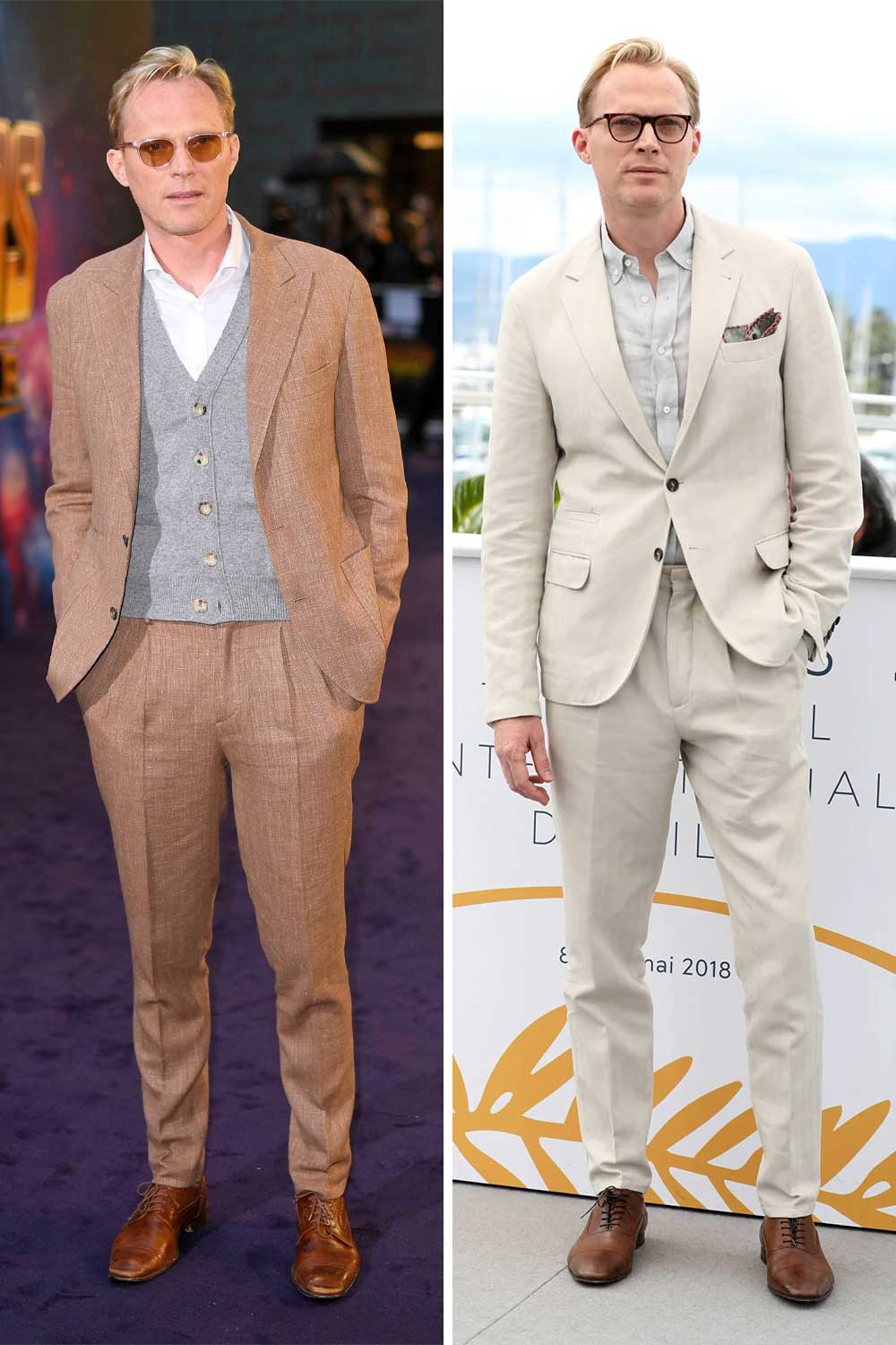
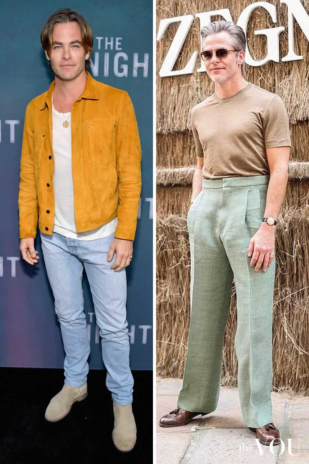
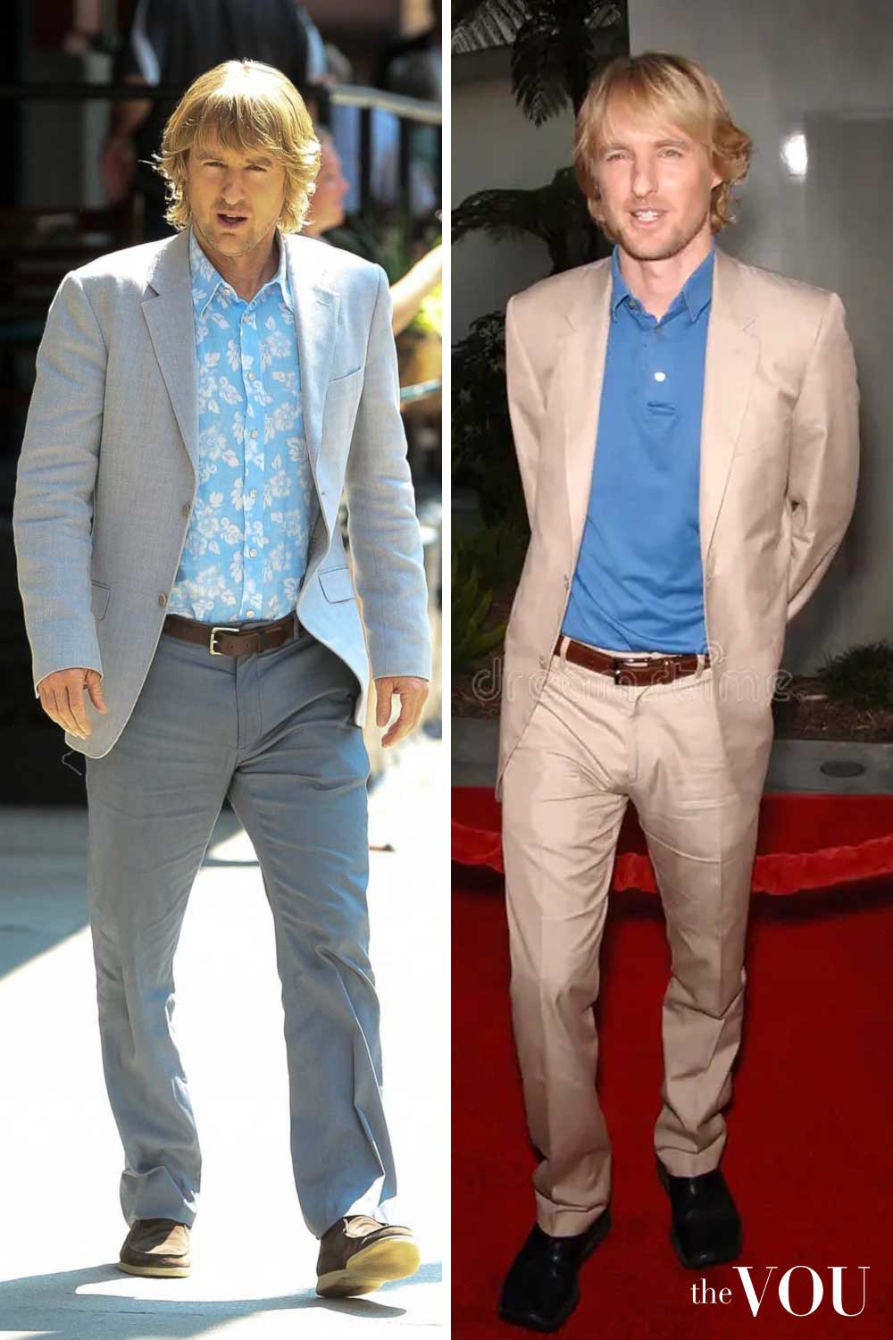
Skin. Light Spring skin is described in the professional guides as light to medium in depth with a neutral to warm cast, a peach or golden quality rather than a rosy one, sometimes with freckles.
You can observe depth and a visible cast in a mirror; you cannot see an “undertone” as such, so record what you actually see across the face and neck together.
Hair. The colours most often listed are light to medium golden blonde, strawberry blonde, light copper and light golden brown.
If your hair is coloured, check the roots.
If it is grey or white, record the colour and contrast you have now rather than guessing at what you had at twenty.
Eyes. Light blue, blue-green, green, light hazel and light brown are the usual examples, often with a clear rather than blended look.
Record the main colour and any secondary colour around the pupil.
Contrast. Light Spring colouring is usually low in contrast. Hair, brows and skin are fairly close in depth, so no single feature stands out sharply.
Contrast is a difference between areas, which is why it is worth looking at hair against skin and brow against forehead rather than at any one feature alone.
Reading them as clues has three consequences.
First, none of them is mandatory.
Plenty of men with medium brown hair or brown eyes compare well with Spring colours; the same comparison works for every skin depth, and the palette is not a category you qualify for by being fair.
Second, what changes with time changes the picture.
If your hair has gone grey or your beard has come in darker, compare the colours beside your face as it is today and note the change in contrast; do not assume that hair darkens while keeping its warmth.
Third, tanning, wrist-vein colour, sun response and jewellery preference do not establish a confirmed palette on their own.
A tan is the skin’s response to ultraviolet damage, as the American Academy of Dermatology puts it, and it changes the surface colour you see for a while; it does not identify a palette, and you should not seek one out to find your colours.
How to Check Light Spring With Clothes You Own
You do not need drapes or a kit.
Two shirts, a scarf or even two towels will do, as long as they are plain and you can compare them in the same light.
Set up. Stand in indirect daylight near a window, with no strong colour behind you and no tinted lighting.
Push your hair back, and if you wear glasses take them off for the comparison.
Look at your face and neck, not at the cloth.
Keep the garment area, position, finish and lighting similar.
When comparing temperature or intensity, keep lightness reasonably close.
When comparing depth, deliberately change lightness while keeping the other qualities as similar as you can.
If a pair changes several qualities, treat it as a rough comparison and record that limit.
Comparison one, Light Spring against Light Summer. Hold a peach, soft coral or pale aqua garment under your chin, then swap it for a powder blue, pale rose or lavender garment of similar lightness.
Watch for a colour cast appearing across the face or neck, for shadows under the eyes or beside the nose looking heavier, and for whether your features stay easy to see.
Swap back and forth at least twice.
Comparison two, Light Spring against True/Warm Spring. Now keep the warmth and change the intensity.
Compare a pale buttercup or soft mint with a sunny yellow or grass green.
This pair changes intensity and a little lightness at once, which is what separates the two palettes, so it is a rougher check than the first comparison.
If the stronger colour pulls attention away from your face and the lighter one leaves your features easier to notice, that supports the Light end of Spring.
Read the result carefully. A useful result is a difference you can see again when you repeat the swap, ideally on another day.
“I prefer this one” is a separate note from “this one leaves my face clearer”; write both down, because the first is about taste and the second is what the palette is describing.
If it stays close. Keep both palettes in your shortlist; a close result is a result, not a failure to try hard enough.
Light Spring and Light Summer share a lot of ground, and a wardrobe built from colour names that appear in both palettes’ lists (pale aqua, powder blue, light grey, cream and light camel) will serve you while you keep comparing, provided you remember that each of those names covers warmer and cooler shades and the garment beside your face decides.
A professional analyst uses a larger set of controlled drapes and a trained eye, and may work in a different framework or reach a different reading from yours.
An appointment is a possible next step for a close call, not a guaranteed answer.
The Light Spring Palette
The swatch sheets below are references drawn for this site.
Fabric, lighting and your screen all shift what you see, so treat them as a direction to shop in and judge the real garment beside your face.
Main Colours
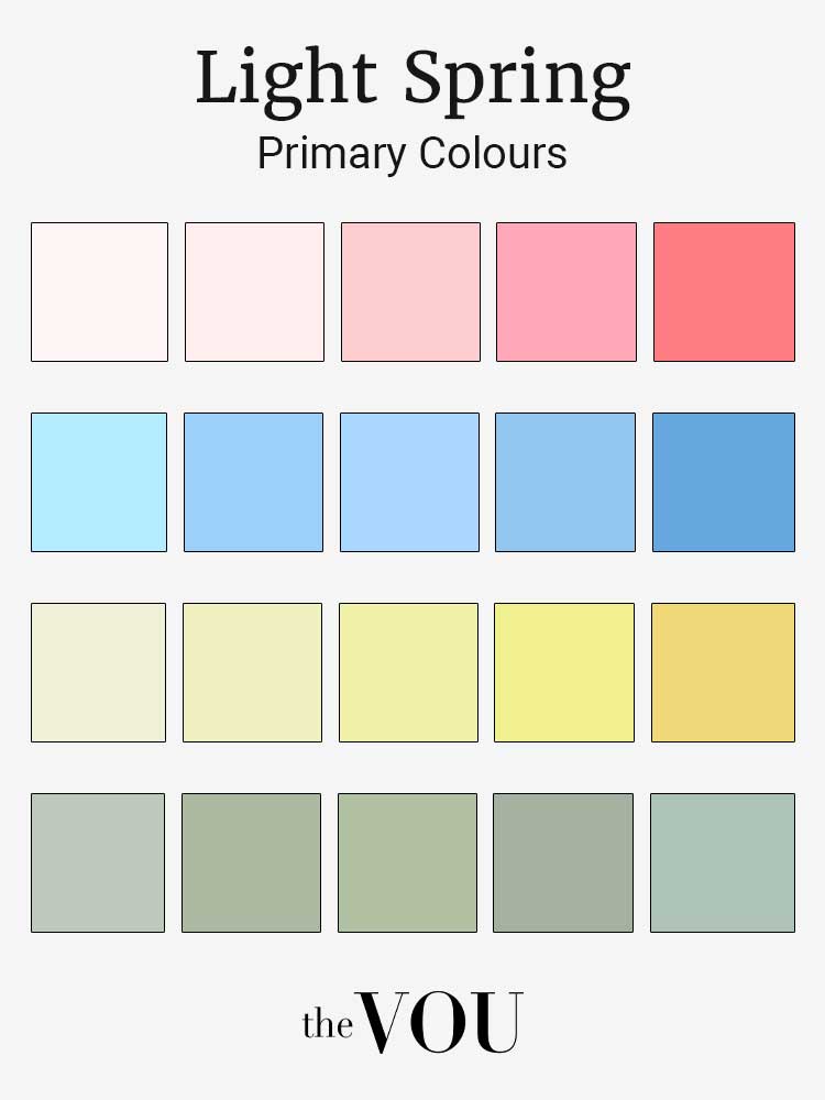
Reds and pinks run from a soft coral to a light watermelon pink.
They are warm and fresh, unlike the deeper reds of Autumn or the blue-based reds of Winter.
A soft coral tie against a light grey suit, or a light pink polo shirt at the weekend, are typical uses.
Blues are clear and light, like the blue of a robin’s egg or a pale spring sky, never as deep as navy nor as icy as a Winter blue.
A powder blue shirt is a good alternative to white in a professional setting.
Yellows run from buttercup to a gentle daffodil, light and fresh without the mustard cast of Autumn yellows.
A pale yellow knit is the easiest way to wear one.
Greens include light mint and fresh yellow-green.
Sage varies. The chart’s greyed examples are softer than a clear mint, so compare the actual garment rather than relying on its colour name.
A mint green sports jacket is an option for a summer event where the dress code permits it.
Neutrals
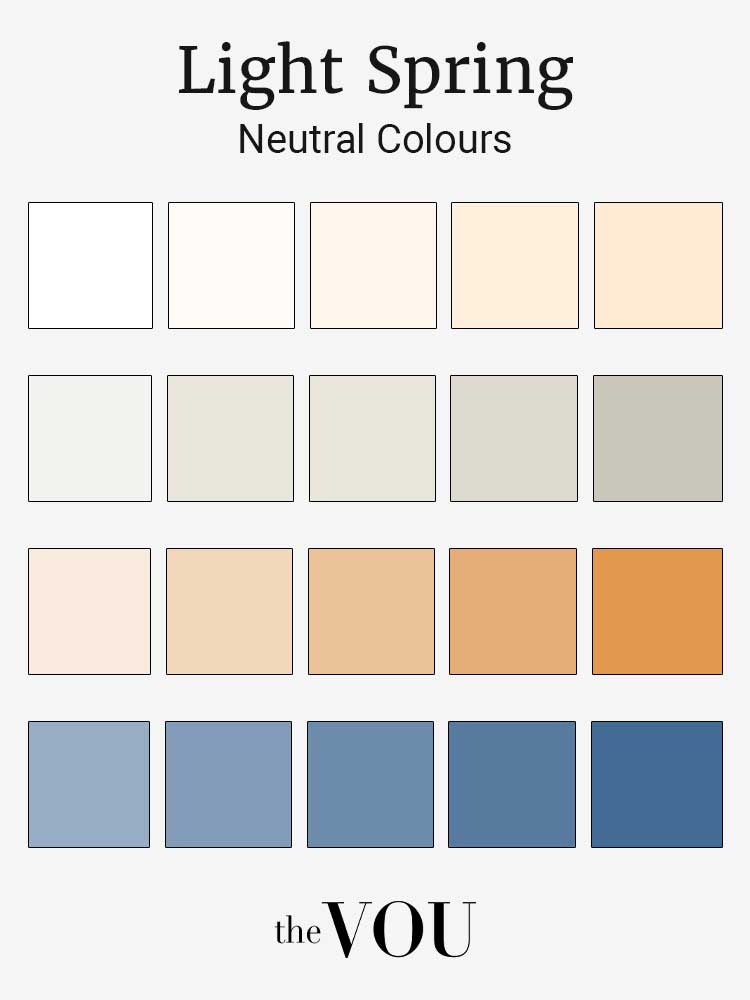
Neutrals are what most of a wardrobe is made of, and Light Spring neutrals keep the same lightness and gentle warmth as the accents.
Whites are soft and warm, meaning cream and a clear ivory rather than a stark, blue-white.
Greys run from pale dove grey to a light pewter, kept soft even at the darker end.
A light grey suit is the most useful tailored garment in this palette.
Browns and camels are light and warm, from a soft camel to a light golden brown.
Navy serves as a neutral in most wardrobes.
The version that works best here is a lighter, softer navy rather than a dense midnight; when you need a dark navy for a dress code, wear it with a cream or pale blue shirt so that the light colour sits next to your face.
Accent Colours
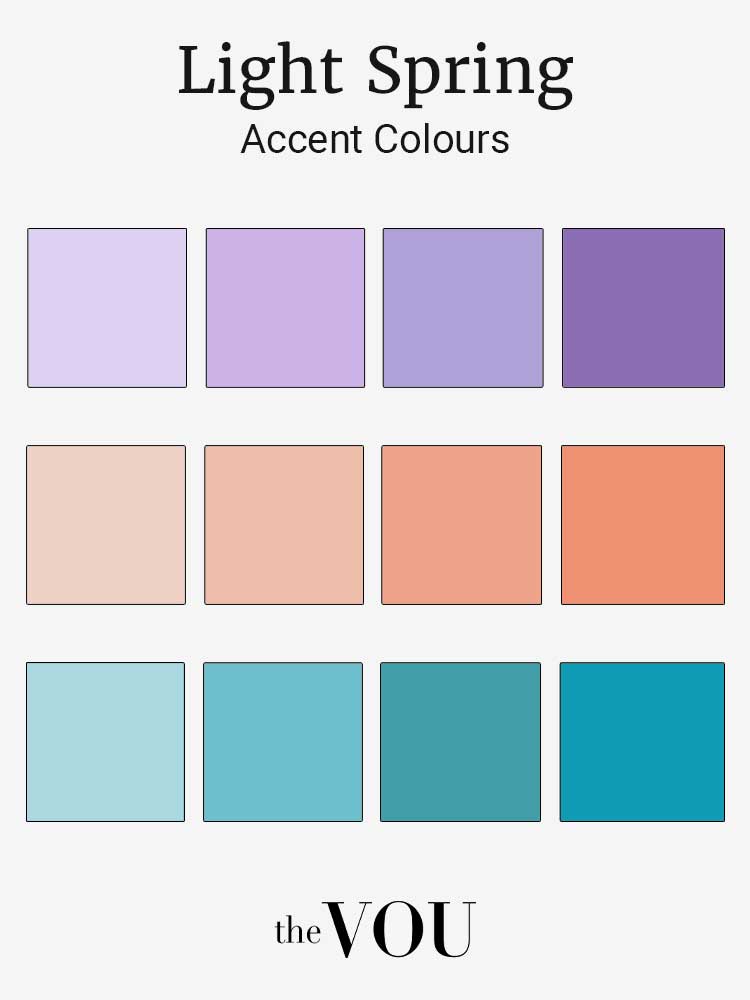
Purples are light lilac and periwinkle rather than the deep purples of Winter or the muted mauves of Autumn.
Oranges are soft peach and light apricot, gentle rather than vivid.
Teals and aquas bridge the blues and greens, from a gentle aqua to a soft seafoam, and are among the most flattering accents for this palette in a scarf, a pocket square or a polo shirt.
Colours Often Listed to Avoid, and What to Do Instead
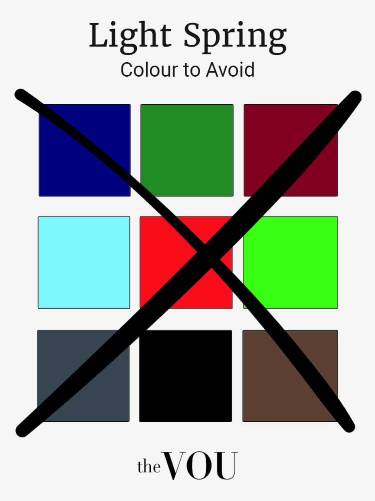
The very deep, very dark or very vivid colours that most Light Spring guides list as ones to avoid are burgundy, forest green, deep navy, charcoal, black, electric blue and neon shades.
The reason is sound, since those colours are the opposite of light and fresh and tend to dominate a low-contrast face.
The conclusion that you must never wear them is not.
Colour analysis describes what happens next to your face; it says nothing about your trousers, your shoes or a coat worn open over a lighter collar.
Use position. Dark navy trousers with a pale blue shirt, charcoal chinos with a cream knit, or a black overcoat over a cream scarf all keep the dark colour away from the face while the light colour does the work.
Use amount. A vivid colour that is too much as a shirt can be right as a stripe in a tie or the trim of a trainer.
Use a warmer version. Where a garment has to be dark, choose the softer or warmer version, for example a soft navy rather than an inky one, a warm dark brown rather than black, a mid-grey rather than charcoal.
Black tie. A black tie dress code takes priority over any palette.
The Debrett’s dress codes guide describes a black dinner jacket, a white evening shirt and a black hand-tied bow tie, and says a velvet smoking jacket is for a man at home or at a country dinner with neighbours, not for a guest at an event where black tie is stated on the invitation.
That is British convention; other countries and hosts vary.
Within the code, the useful move is the shirt. Debrett’s separate dress-code article allows a white or cream shirt, and cream sits more easily beside Light Spring colouring, so choose cream where you can and keep the grooming impeccable.
The white shirt. When you can choose, an off-white, cream or ivory shirt sits more comfortably beside Light Spring colouring than an optic white.
Hold the two up in daylight and the difference is usually visible.
What to Buy First
A wardrobe in this palette is built from light neutrals, with the accents carried by shirts, knitwear and accessories.
Suits and jackets. Start from what your office expects and meet the required suit colour and depth first.
If dark navy or charcoal is required, keep it and use a permitted light shirt or tie near the face.
A lighter, softer navy is an option only where the code permits it.
A light grey suit is this guide’s choice for a second suit.
For summer occasions, a suit in pale blue, sand or soft sage is a memorable option when the dress code allows it.
A light blue or soft camel blazer covers smart-casual days.
Shirts. Cream and ivory shirts rather than stark white; then pale blue, and, for variety, light peach, soft yellow or mint.
Knitwear and casual tops. Polo shirts and t-shirts in sage, powder blue, coral and pale yellow; knitwear in pale blue, light peach or soft camel.
Trousers. Light beige and soft grey chinos; jeans in a light to medium wash, which read lighter and fresher than a raw or black denim beside this colouring.
Outerwear. A camel overcoat, chosen light rather than dark, is this guide’s first choice of coat for the palette; a soft navy pea coat covers more conservative settings.
Shoes and leather. Light to medium brown leather for the office, tan loafers and white or off-white trainers for the weekend, with belts and straps to match.
Sportswear and swimwear. The palette works well here, with pale blue, soft green or light coral kit, and swim shorts in aqua, coral or pale yellow with a white or cream linen shirt.
The table below is a small capsule to build from, offered as an example rather than a rule.
The counts are example quantities, not minimums, and the colours were chosen so that most of the garments combine with most of the others; check your own combinations in a mirror, and start from the clothes you already own, the dress codes you meet and how often you wear each category.
Scroll horizontally to see all columns →
| Category | Example count | Example |
|---|---|---|
| Suits | 2 | 1 light grey wool suit, 1 soft navy wool suit |
| Blazers | 2 | 1 light blue wool-blend blazer, 1 soft camel blazer |
| Trousers | 3 | light khaki chinos, soft grey wool trousers, light-wash jeans |
| Shirts | 5 | 2 cream dress shirts, 1 pale blue Oxford, 1 soft coral linen shirt, 1 mint cotton shirt |
| T-shirts | 5 | cream, pale yellow, soft aqua, light peach, light grey |
| Knitwear | 3 | light blue cashmere, soft sage cotton, pale camel merino |
| Outerwear | 2 | light camel overcoat, soft navy pea coat |
| Shoes | 3 | light brown brogues, white leather trainers, soft navy suede loafers |
| Accessories | 5 | light blue tie, soft coral tie, pale yellow pocket square, mint pocket square, light brown belt |
The guide to building a capsule wardrobe explains how to audit what you own and decide a build order before you buy any of this.
Outfit Formulas Through the Year
The palette does not change with the calendar, but the weight of the fabric and the balance between the lightest colours and the deeper neutrals can.
Scroll horizontally to see all columns →
| Season | Casual | Business | Evening |
|---|---|---|---|
| Spring | Soft coral polo, light khaki chinos, white trainers | Light grey suit, pale blue shirt, soft yellow tie | Cream shirt, light blue blazer, sand trousers |
| Summer | Pale yellow t-shirt, light-wash denim shorts, tan sandals | Soft navy suit, cream shirt, mint pocket square | Pale pink linen shirt, light beige chinos, soft blue suede loafers |
| Autumn | Soft sage jumper, light grey chinos, light brown boots | Light camel suit, pale blue shirt, soft coral tie | Pale lavender shirt, light grey blazer, soft navy trousers |
| Winter | Light blue jumper, sand corduroys, white trainers | Soft navy suit, cream shirt, pale pink tie | Ivory rollneck, light camel blazer, light grey trousers |
In spring and summer, linen and light cotton in the palest colours are at home.
In autumn, light tweed, flannel and corduroy in sage, camel and pale gold keep the softness while adding weight.
In winter, cashmere and wool in soft navy and camel carry the outfit, with a pale blue or coral scarf doing the work near the face.
If you find the palette hard to shop for in autumn and winter collections, look for the lighter, clearer version of each seasonal colour, such as soft coral instead of burgundy, light sage instead of forest green, camel instead of chocolate.
Spring and summer collections are the easier hunting ground, so buy the light knitwear when it appears.
Colour Combinations That Stay Light
Low-contrast colouring generally looks its best in low- to medium-contrast outfits, which is why a pale blue shirt with sand trousers looks so settled on a Light Spring man.
A black jacket over a white shirt puts a hard, high-contrast frame around low-contrast colouring; that can be a deliberate effect, but it is the opposite of what the palette describes.
Scroll horizontally to see all columns →
| Type | Colour 1 | Colour 2 | Colour 3 | Outfit |
|---|---|---|---|---|
| One colour family | Pale blue | Sky blue | Soft navy | Pale blue shirt, sky blue tie, soft navy blazer |
| Opposites | Soft coral | Light aqua | Cream | Soft coral shirt, aqua accessories, cream trousers |
| Neighbours | Soft sage | Pale yellow | Light aqua | Sage jumper, pale yellow t-shirt, aqua scarf |
| Three spaced colours | Lilac | Pale peach | Mint | Lilac shirt, peach tie, mint pocket square |
| Neutral base | Light camel | Cream | Soft coral | Camel coat, cream shirt, coral scarf |
Combining several light colours without looking washed out is the one skill this palette asks of you.
The reliable way is a column of colour, which means one light colour on top and bottom, a pale blue shirt with pale blue trousers for instance, under a deeper neutral jacket.
The other is to let one light colour sit against a neutral, so that texture (a cable knit, a linen weave, a suede shoe) supplies the interest that contrast would otherwise provide.
The guide to one-colour outfits covers the first approach in detail.
Keep patterns soft and fairly small, as in a subtle geometric tie in blues and greens, a fine stripe in cream and pale blue, a light check in palette colours.
Larger prints work when their colours stay light and clear.
Metals, Glasses and Small Details
Light Spring guides usually recommend gold, and particularly a light, polished gold, over heavy silver or oxidised finishes.
Treat that as a comparison to make rather than a rule. Hold a gold-toned and a silver-toned watch or ring against the inside of your wrist and the side of your face in daylight, and keep the one that blends rather than glares.
Mixed metals can be deliberate.
For glasses and sunglasses, honey, light tortoiseshell, clear acetate and light gold frames tend to sit more quietly than heavy black or dark tortoise.
Fit, lens quality and a frame shape you like come before frame colour; the face-shape guide covers frame shape and proportion, which are separate from colour.
Leather goods in tan and light brown, watch straps in the same family, and socks in palette colours are the easiest ways to keep the palette consistent below the waist without wearing pale trousers every day.
Where Light Spring Gets Confused
With Light Summer. Both are light and low in contrast.
Light Spring is warm-leaning; Light Summer is cool-leaning.
A Light Spring man compares well with soft coral where a Light Summer man does better with a cooler, more muted pink.
This is the comparison to repeat on another day if it stays close; if it still does, both palettes stay in play.
With True/Warm Spring. Both are warm.
Light Spring is lighter and softer.
A True/Warm Spring man looks right in a clear, sunny yellow; a Light Spring man does better in the paler buttercup.
With Soft Summer. Both are gentle, but Light Spring is warmer and clearer while Soft Summer is cool and muted.
If a greyed blue looks better on you than a fresh aqua, look at the Soft palettes before settling on Light Spring.
If you have grey hair, do not assume what it has done to the picture; compare the colours beside your face as it is now, including the Light Summer colours, rather than relying on the palette you were once told.
Where This Guide Stops
A palette is a description of colours that tend to sit well beside a particular kind of natural colouring.
It is not a diagnosis, it does not change who you are, and it does not guarantee confidence, status or a younger appearance.
Professional analysts differ on whether a palette is for life.
Some describe the label as permanent; others offer reassessment when hair goes grey or skin changes.
Whichever vocabulary you use, you can always reconsider the lightness and contrast of what you wear after a visible change.
A professional draping appointment is one way to take a close call between Light Spring and Light Summer further; it does not guarantee a settled answer or a quicker one.
The VOU’s image consultants offer colour and styling consultations, listed on the services page; contact us if you want to ask how an assessment is run.
A prepared True Spring palette reference and a Light Summer palette reference are also listed in the shop as True Spring and Light Summer downloads; check the product pages for current availability before planning a purchase.
Related Guides
Colour is one of three facts worth knowing about yourself before you shop, alongside your proportions and the way you like to dress; the order in which you learn them matters less than using all three together.
Men’s body shapes explains the seven proportion labels and what they can and cannot tell you, and the optional body shape quiz is a separate tool on this site.
A professional body shape analysis is also listed among The VOU’s services.
The personal style guide and the optional fashion style quiz deal with the wider question of what you want your clothes to say.
Styling by occasion, location, season and time of day is where colour, proportion and style meet a real invitation.
For the wider wardrobe, the old money style guide covers the restrained look this site is built around, and the guide to heritage brands lists the houses that make the classic garments and accessories in these formulas.
Owning expensive clothes proves nothing by itself; what makes an outfit work is choosing colour, cut and occasion well.
The other Spring guides are True/Warm Spring and Bright/Clear Spring, and the main seasonal colour guide covers all twelve palettes in one place.
Related guides on The VOU include the full list of male celebrities described as Light Spring.