
Start here
What’s This About
Bright/Clear Spring is the Spring palette led by brightness: warm colours at their most saturated, described by practitioners as warm-leaning rather than as warm as True/Warm Spring, and sitting on the border with the cool-leaning Bright/Clear Winter.
This guide explains how to compare the palette with your own colouring and wear the colours, such as:
what Bright/Clear Spring means and how clarity leads
features practitioners describe for the palette
trying the palette against Bright/Clear Winter, True/Warm Spring and Light Spring
main colours, neutrals and accent colours
colours often listed to avoid and what to try instead
what to consider buying first and outfits through the year
and many more!
Treat the palette as a direction to compare against your own colouring, not a fixed label.
Key Points
01Brightness is the primary quality here and warmth the secondary one. Electric blue, clear turquoise, bright lime green and a clear coral red are the centre of the palette, and practitioners describe its hue as leaning warm “but not extremely warm”, which is what separates it from True/Warm Spring.
02The useful test is a comparison, not a checklist of features. Hold a clear warm red beside a clear cool red of similar brightness, in daylight, and watch your face and neck rather than the garment.
03Contrast between hair, skin and eyes is described as among the highest of the twelve palettes, which is a common description rather than an entry requirement. Bright/Clear Winter shares the clarity, so clarity alone does not separate the two.
04Nothing in your wardrobe is banned. Where a muted, earthy or very deep colour sits is a choice: trousers and shoes keep it away from your face, and a coat or a scarf brings it right up to it, so decide by the garment, its collar and what you actually like wearing.
It sits inside the Spring family with True/Warm Spring and Light Spring, and it shares an outward border with Bright/Clear Winter, the neighbouring palette this guide compares it with in full.
There is also a seasonal colour quiz on this site, which is optional and separate from this guide.
What Bright/Clear Spring Means
This guide follows The Concept Wardrobe’s twelve-season descriptions for the palette’s relative position.
Providers use different names and divisions, so treat a seasonal label as a styling convention rather than a measurement.
In the twelve-season convention every palette is described by three separate qualities: whether its colours are clear or muted, whether they lean warm or cool, and how light or deep they are.
Clarity leads: the colours are vivid rather than greyed.
Warmth is secondary, so compare the warm and cool versions of a clear colour when distinguishing Bright Spring from Bright Winter.
Bright Spring leans warm, while True/Warm Spring is more strongly warm-led.
Bright/Clear Winter shares the clarity but leans cool.
These are relative palette descriptions, not measured skin temperatures.
The palette spans light and dark colours, with its emphasis on vivid colour rather than extreme lightness or depth.
The dark neutrals below are useful supporting choices.
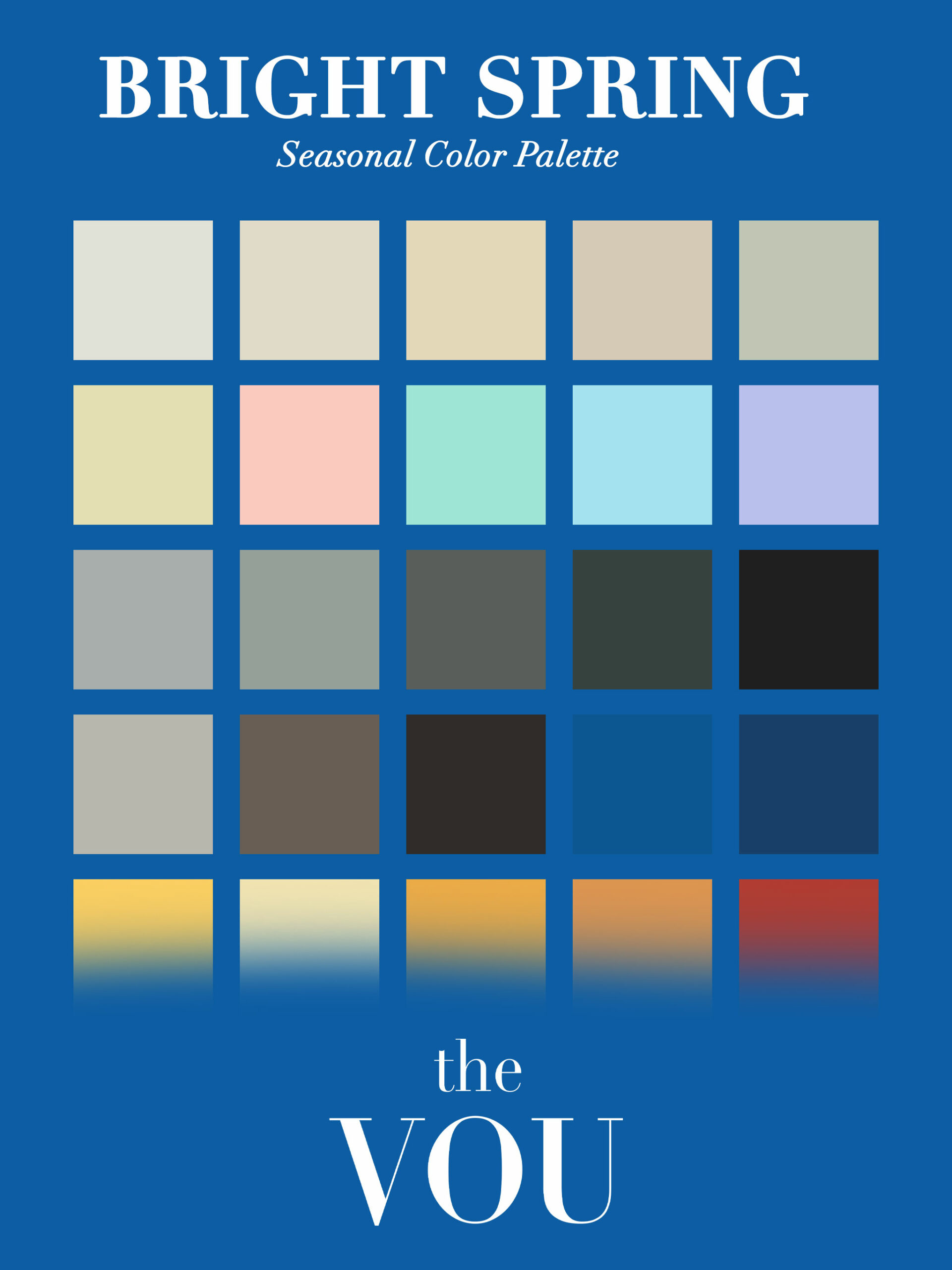
The table below shows the same five colour families in Bright/Clear Spring and in its two neighbours inside the family, so you can see what changes and what stays the same.
The Light Spring column illustrates the Light Spring guide.
Scroll horizontally to see all columns →
| Colour family | Bright/Clear Spring | True/Warm Spring | Light Spring |
|---|---|---|---|
| Blue | Electric blue | Turquoise | Powder blue, pale aqua |
| Green | Bright lime green | Grass green | Soft mint |
| Yellow | Lemon yellow | Sunny yellow | Buttercup |
| Pink and red | Clear coral red | Coral | Peach blossom, soft coral |
| Purple | Vivid violet | Orchid | Lilac |
These are example colours chosen to show the direction of each palette, not a complete list and not exact specifications.
Read across a row and the warmth is shared; what changes is intensity between Bright and True, and lightness between True and Light.
The names differ between providers.
Bright Spring and Clear Spring are the same palette under the twelve-season convention this site follows, and some systems place the vivid, clear group in its own “Clear” category that straddles Winter and Spring.
This page uses Bright/Clear Spring throughout so that the name matches the rest of the site, and the comparisons name the palettes involved.
What Practitioners Describe in This Palette
Record skin depth and any visible cast separately.
An olive-looking cast or deeper skin does not assign you to a palette; an unclear cast means the observation remains unresolved, not that you have proved a neutral undertone.
Warm or cool is the styling interpretation you are investigating.
The descriptions below are what colour analysts commonly write about Bright/Clear Spring colouring.
They are descriptions of what is often observed, not entry requirements, and no single feature rules the palette in or out.
Skin. Practitioner descriptions often mention a neutral to warm-looking cast.
Record what you can actually see without treating skin depth or a luminous-looking photograph as proof of a season.

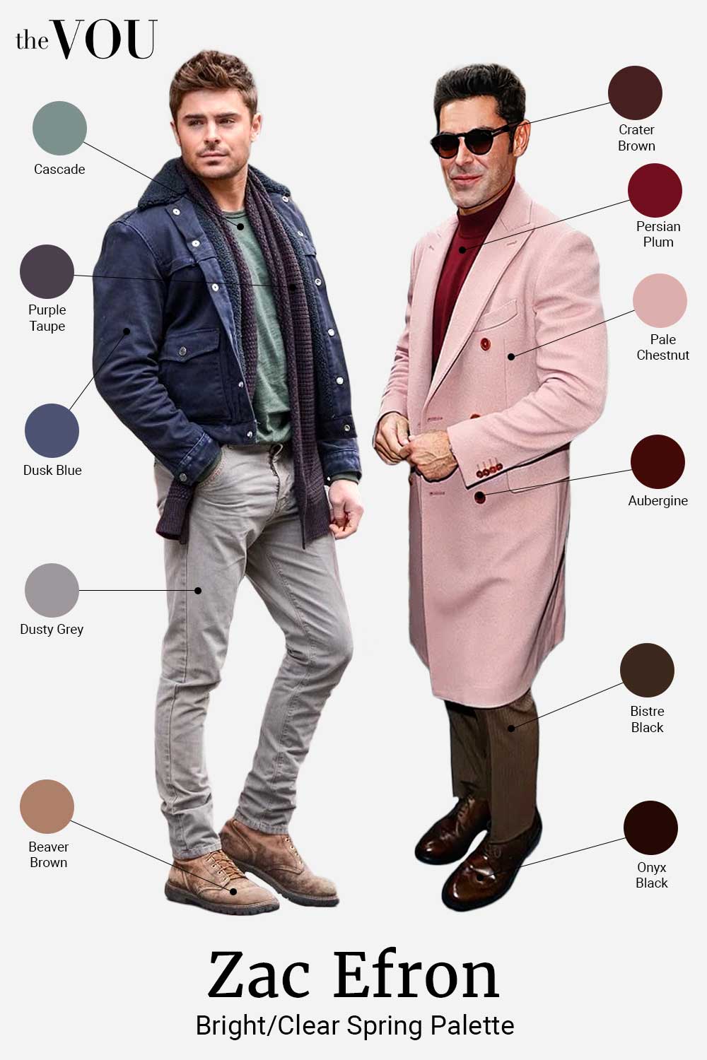
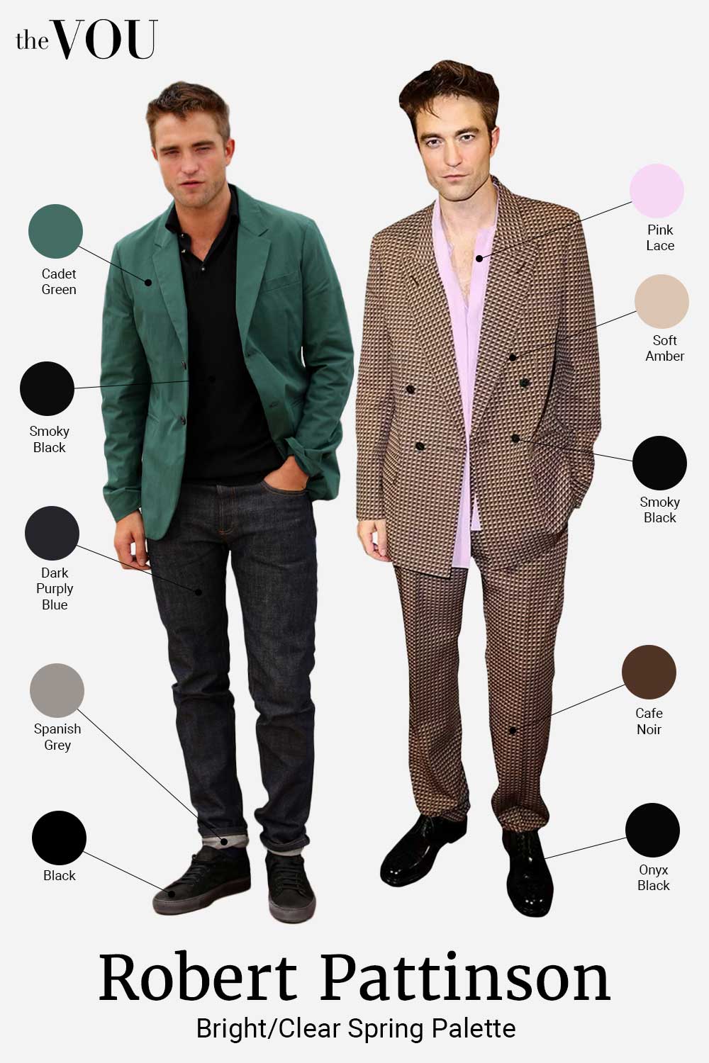
Hair. Medium to dark golden blond with highlights is one common description, and copper, auburn or a medium brown with reddish undertones is another.
A cool ash cast is mentioned less often for this palette; if you have one, run the Bright/Clear Winter comparison below rather than treating it as a disqualification.
Eyes. Clear and bright with a warm cast is the usual description: turquoise or clear blue, clear green, a hazel with golden flecks, or a warm amber-brown.
Contrast. The named provider describes relatively high contrast between features.
Record differences such as brow against forehead or iris against the white of the eye; the description is not a threshold you must meet.
Wrist-vein colour, tanning, burning and jewellery preference do not establish a seasonal palette on their own.
The sources reviewed do not establish their accuracy as standalone seasonal tests.
Record a tan as context for the appearance you are styling, and do not seek sun exposure to test your colours.
Record natural hair where you can see it and current hair separately, including dye, highlights and greying.
Do not guess an unavailable natural shade.
Brows and beard contribute to the appearance you are styling; if you are bald, compare with your visible skin, eyes, brows and any facial hair.
Note the iris’s main colour and any different centre or edge without requiring every feature to match.
Trying Bright/Clear Spring Out With Clothes You Own
This is an approximate styling comparison, not a calibrated test.
Garments may differ in hue, lightness, intensity, pattern or finish.
Note the qualities that change and repeat a useful comparison before narrowing your shortlist; an unclear result can remain open.
To get as close as you can: use daylight and keep the light the same for both, match the garment’s area, its position on you and its finish, keep lightness close when the difference you are after is temperature or intensity, and change lightness deliberately when depth is what you want to see.
Where a pair also changes hue or intensity, that is a limitation of the pair rather than a result, and each comparison below says which.
What to look for is on you rather than on the cloth: a colour cast on the skin around the jaw and under the eyes, shadows that look heavier or lighter, and whether your face stays the first feature you notice.
Repeat on another day before you conclude anything.
Comparison one: Bright/Clear Spring against Bright/Clear Winter.
What you are trying to change is temperature while holding brightness.
A clear warm red against a clear cool red is one possible pair to try, because the two sit near each other in lightness and intensity and differ mainly in whether the red leans orange or blue.
A warm turquoise against a vivid fuchsia is a wider gap: the hues are far apart, so treat a result from that pair as weaker evidence than the red one.
Clarity alone does not separate these two palettes, which is why this comparison is on the page.
The Bright/Clear Winter guide runs a comparison in the other direction.
Comparison two: Bright/Clear Spring against True/Warm Spring.
Here you are after intensity, and the pair will usually move hue a little as well: an electric blue is not simply a brighter turquoise.
A clear coral red against a softer coral is the closer pair, because the hues sit nearer each other.
Both palettes are warm and both are clear; the question is whether the most vivid version looks right on you or a fraction too strong.
Comparison three: Bright/Clear Spring against Light Spring.
This pair changes lightness and intensity together, on purpose, because that is what separates the two palettes: a clear turquoise against a pale aqua, or a lemon yellow against a buttercup.
Two qualities changing at once is a limitation to name rather than a flaw to fix here.
The Light Spring guide explores lighter and softer Spring comparisons.
As another observation, compare a soft white with a warmer ivory in similar plain cloth.
Neither colour name proves a season; record the effect and your preference separately.
If it stays close.
Keep both palettes in your shortlist; a close result is a result, not a failure to try hard enough.
Bright/Clear Spring and Bright/Clear Winter overlap at the vivid end, so clear turquoise, bright emerald and a clear true red are worth trying in both their warmer and cooler versions, and a wardrobe built from the garments that looked right will serve you while you keep comparing.
The Bright/Clear Spring Palette
Main Colours
Blues are clear and bright, from a cerulean to an electric blue, with a clear turquoise at the warm end.
They are neither as deep as a traditional navy nor as icy as the Winter blues, and a cerulean dress shirt is one alternative to the usual light blue.
Reds are clear and warm, from a vibrant tomato red to a lively coral.
They have a zest that separates them from the deeper, earthier reds of the Autumn palettes and from the blue-based reds of the Winter ones.
Yellows run from a clear lemon to a warm golden buttercup, vivid and energetic, without the mustard or amber cast that belongs to the Autumn palettes.
Greens are fresh and vibrant, from a grass green to a zesty lime, clear and bright rather than deep or mossy.
Neutrals
Neutrals are what most of the wardrobe is actually made of, and in this palette they keep the same clarity as the colours.
Whites. Soft white and a gently yellowed off-white are light-neutral options in the reference palette.
Compare the actual shirts before buying several; a required white evening shirt can stay in your wardrobe.
Greys. Compare a warmer grey or yellow-leaning charcoal with a colder silver-grey.
A light-to-medium warm grey suit is one possible alternative to navy when the dress code permits.
Browns are warm and clear, from a light camel to a rich cocoa, never muddy or very dark.
A camel overcoat is versatile and goes with both the casual and the tailored halves of a wardrobe.
Navy is a neutral in most wardrobes, including many old money wardrobes.
For this palette the version usually named is a clear navy with a noticeable blue in it rather than one that reads almost black.
Black and charcoal. The reference palette includes warm-leaning near-black and charcoal options.
Compare the actual garment instead of ruling out every black by name.
Keep black shoes or formal clothes when the dress code calls for them.
Accent Colours
Accents are the colours that do most of their work in small quantities: a tie, a pocket square, a scarf, the shirt under a jacket.
Purples are clear and vibrant, from a bright violet to a clear magenta, neither as deep as the Winter purples nor as muted as the Autumn ones.
Oranges run from a vibrant tangerine to a clear peach, warm and bright, without the burnished quality of the Autumn oranges.
Pinks are clear and vibrant, from a bright watermelon to a warm flamingo, neither pastel nor dusty.
A pink dress shirt is a colour some men hesitate over; in this palette it is one of the easier bright colours to wear near the face.
Teals are bright and clear, bridging blue and green, from a vivid peacock to a bright aqua.
Colours Often Listed to Avoid, and What to Try Instead
Nothing here is forbidden.
These are the colours practitioners most often say sit awkwardly beside Bright/Clear Spring colouring, with a clearer or warmer alternative beside each one.
Whether that matters depends on where the colour sits: trousers and shoes are furthest from your face, a jumper or a shirt collar is closest, and an overcoat can be either depending on how it is worn.
Muted colours. If dusty rose, sage or greyed navy feels too subdued beside your face, try clearer pink, green or navy.
Keep muted trousers or favourite garments when you prefer the whole outfit.
Very deep colours such as burgundy, forest green and midnight blue.
The usual alternative is the brighter version: a clear tomato red, a bright lime or emerald green, a clear navy.
Trousers and shoes keep a deep colour away from your face; a coat or a scarf brings it close to it, so a deep overcoat is worth the same comparison as a deep knit.
Earthy tones such as mustard, rust and olive.
These are the Autumn versions of colours this palette has clear versions of: try a lemon yellow, a clear tangerine and a bright lime instead.
Cooler colours. Compare a warm red with a cool blue-based red, or a warm turquoise with a cooler version.
If cooler colours repeatedly give the effect you prefer, keep Bright Winter on your shortlist.
Black tie. Conventional black tie includes a black or midnight-blue dinner suit, a white evening shirt and a black bow tie.
A seasonal palette does not require a coloured bow tie or different dinner jacket.
Follow the invitation and the dress-code guidance; creative black tie and black tie optional are distinct instructions.
What to Consider Buying First
Start with a garment you need and already know how to use.
A shirt, knit or accessory is one way to try a colour near your face; which purchase makes sense depends on your wardrobe, dress code and budget.
The list below is a set of options in that light, not an order of merit.
If you need shirts, a soft white is the palette’s everyday one, with a clear light blue or turquoise for the days you want some colour.
If you need tailoring, a clear navy suit suits the palette: look for a navy with a visible blue in it rather than one that reads almost black, since the difference between those two navies is what the palette is sensitive to.
If you need a coat, camel or a warm grey are neutral options to compare beside your face.
Choose by the clothes it must cover and the weather it must handle.
If you want the palette to show at the weekend, knitwear in one clear colour, such as a turquoise, a bright lime or a coral, is the simplest way.
Ties, pocket squares and scarves in coral, turquoise and lemon put the palette into an outfit that is otherwise neutral, without replacing anything.
Sportswear and swim shorts provide another way to use vivid colour if you need those garments.
Prioritise comfort, function and fit; colour need not determine which equipment you buy.
Where the shoes and belt are yours to choose, medium to light brown leather sits with the palette’s warmth.
Two complete outfits to try
For work. Clear navy suit, soft white shirt, coral tie and dark brown leather Oxfords.
The suit remains the neutral base and the tie supplies one vivid warm accent.
Choose black shoes instead if the dress code calls for them.
For a casual day. Turquoise crew-neck knit, light grey chinos and white trainers.
The knit puts clear colour near the face while the trousers and shoes give it space; there is no need for a second bright garment.
Outfit Options Through the Year


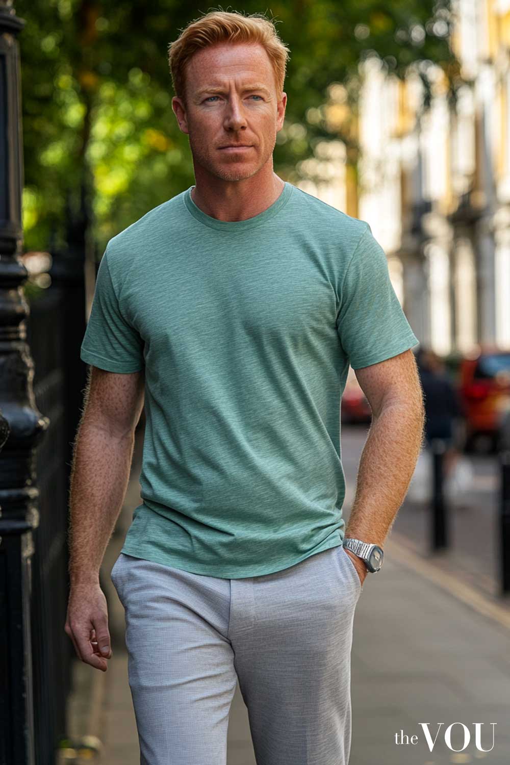
The table gives one formula per season and occasion.
They are starting points to adapt, not a uniform, and the dress code you are actually dressing for comes first.
Scroll horizontally to see all columns →
| Season | Casual | Business | Evening |
|---|---|---|---|
| Spring | Coral polo, light grey chinos, white trainers | Clear navy suit, soft white shirt, lemon tie | White shirt, turquoise blazer, clear navy trousers |
| Summer | Lemon t-shirt, medium-wash shorts, mid-brown sandals | Light grey suit, clear light blue shirt, coral pocket square | White linen shirt, clear blue chinos, tan loafers |
| Autumn | Grass green jumper, clear beige chinos, mid-brown boots | Clear navy suit, white shirt, bright green tie | Electric blue shirt, camel blazer, light grey trousers |
| Winter | Turquoise jumper, medium-wash jeans, white trainers | Light grey suit, soft white shirt, clear red tie | Clear navy rollneck, camel coat, light grey trousers |
In spring and summer, linen and light cotton in the brightest colours (coral, turquoise, lemon, lime) are at home, with white and clear beige as the neutrals.
In autumn and winter, the deeper end of the same palette carries the outfit: a clear navy, a bright teal, a warm golden yellow, with camel and cocoa as the neutrals.
A bright scarf still does the work near the face when the coat is camel.
Availability varies by retailer and season.
Compare the actual garments rather than the colour name in a catalogue, and check the return policy when ordering online.
A useful colour can work in different weather when its fabric and construction suit the conditions.
Colour Combinations That Use the Contrast
These are illustrative outfit combinations, not measured colour-wheel positions.
Use their proportions as a starting point and judge the garments together.
Scroll horizontally to see all columns →
| Type | Colour 1 | Colour 2 | Colour 3 | Outfit |
|---|---|---|---|---|
| One colour family | Electric blue | Clear sky blue | Clear navy | Electric blue blazer, sky blue shirt, clear navy trousers |
| Two-colour contrast | Coral | Turquoise | White | Coral shirt, turquoise accessories, white trousers |
| Related colours | Bright lime green | Lemon yellow | Turquoise | Lime jumper, lemon t-shirt, turquoise scarf |
| Three-colour outfit | Vivid violet | Tangerine | Bright green | Violet shirt, tangerine tie, green pocket square |
| Neutral base | Camel | White | Clear red | Camel coat, white shirt, clear red scarf |
These examples use two or three colours to make the combinations easy to follow.
More or fewer can work; the number is not a palette requirement.
A coral shirt under a turquoise blazer, or a soft white shirt with a grass green jumper and a clear navy blazer, are two that are easy to picture.
The high contrast this palette is described with is also usable in a plainer way: a soft white shirt against a clear navy jacket gives a strong difference in lightness before any colour is added, and one bright accessory is often enough on top of that.
In a conservative office, let neutrals carry the outfit and use one clear colour at the collar.
A navy suit, soft white shirt and coral tie is one option.
Patterns follow the same logic.
Clear, well-defined stripes and checks suit this palette better than a blended or watercolour print, and scale is a matter of preference rather than of rule.
Wearing the Palette With Your Body Shape
Colour and cut are separate decisions, and a palette cannot correct a fit.
Your preferred emphasis can guide where you place colour; a body-shape label does not determine the most useful position.
If you want a more noticeable area, try a clearer colour against quieter garments and compare the effect.
Near the face is the usual choice; lower down is a different effect rather than a mistake.
The triangle, inverted triangle, oval and rectangle guides each set out the cut decisions for one shape.
A block of one colour from shoulder to shoe puts fewer breaks in an outfit than a light top over dark trousers does.
What that does for you is a matter of taste rather than a promised effect.
Neutrals from this palette, clear navy, light grey, camel and white, carry the parts of an outfit you are not trying to draw attention to.
Metals, Glasses and Small Details
Metals. Gold and rose gold with a bright, polished finish are the metals usually named for this palette, and an antiqued or brushed finish is the one usually placed elsewhere.
Silver is described as workable here more often than in the other two Spring palettes, because of the neutral-warm undertone.
If a watch or a ring is not yours to change, it is not a problem to solve.
Leather. Medium to light brown is the usual suggestion for shoes and belts.
Black shoes with a clear navy suit are ordinary enough that nothing about the palette rules them out, and some dress codes ask for them.
Glasses. Tortoiseshell, clear warm brown and gold frames are the ones usually suggested.
Frames sit closer to your eyes than anything else you wear, so this is one of the few places where the comparison is easy to run in a shop mirror.
Denim. A clear medium wash is the version usually named, rather than a heavily faded or distressed one; that is a description of what suits the palette, not a reason to replace jeans you like.
Shopping for the Palette
Screen colours can differ from the garment: the same shirt photographs differently on two sites, and a screen shows you the photograph rather than the cloth.
Check the return policy before ordering a colour you have not seen in person.
Compare in consistent daylight.
Two colours judged in different light are not really being compared, so if you can, look at both together in daylight rather than one under shop lighting and the other at home.
Two similar blues side by side tell you more than either one alone.
Retail colour names are a starting point, not a specification.
Compare the garment itself: vintage may describe a style or finish rather than muted colour.
A colour you can see beside your own face is the one you can judge.
If you are buying one garment to try the palette, something worn at the collar or the neck is easier to assess than trousers or shoes.
Follow the garment’s care label when washing and drying it.
A colour guide cannot determine suitable care from a shade or seasonal category.
Texture can add variety without adding more colours.
Compare a matt cotton and a lustrous weave in a similar clear blue, then choose the effect that suits the occasion and the clothes you own.
If the result remains unclear
Keep a shortlist rather than forcing one label.
Wear the combinations you prefer, repeat a specific unresolved comparison in consistent light, and note when a garment changes several qualities at once.
Personal preference can overrule a palette suggestion.
House of Colour describes a lasting seasonal label, while Colour Me Beautiful offers a tonal review when appearance changes.
You can reconsider the depth and contrast of your clothes without treating those systems as identical.
A consultation is optional; ask which framework is used and how the assessment works.
Where to go next
The seasonal colour overview explains the full system, and the Spring family guide compares its three palettes.
For a closer comparison, read Bright/Clear Winter.
True/Warm Spring and Light Spring cover the other Spring directions.
Use the capsule wardrobe guide to work from clothes you own and the smart-casual guide for occasion-specific choices.
If you want help with a close comparison, ask The VOU how its colour consultations are run.
Framework note. The paired names in this collection refer to the same palette within its twelve-season convention.
Kettlewell’s sixteen-type descriptions use some familiar names differently.
Check the provider’s framework before equating two results.
Related guides on The VOU:
Preppy Style Clothing Brands for A Classic-Modern Blend
6 Sloane Ranger Outfits for Men: British Old Money Looks to Copy
Five BCBG Outfit Ideas for A Perfect Old Money French Style
Bright Spring Seasonal Colour Palette for Men
Professional Body Shape Analysis for Men
Professional Seasonal Colour Analysis for Men
The 7 Men’s Body Shapes, and How to Tell Which Describes You
Styling Beyond Seasonal Colours
Knowing your seasonal palette is a small step towards dressing like a confident and successful gentleman.
Your body type and colour palette help you choose clothes that fit well, in colours that suit you; our guide to styling by occasion, location, season and time of day covers the next step.
And if you want to learn, we’re here to help; start by knowing your body type and unique colour palette so you can select clothes for your body shape in colours that match your skin, eyes, and hair.
It also helps to know which fashion brands to shop from and how to style these garments, footwear, and accessories to create a look of subtle luxury and success.
After learning to choose fashion from heritage fashion brands according to your body shape and colour palette, you can move on to styling by occasion, location, season, and even time of day.
If you feel overwhelmed, we can help, starting with three quizzes:
1. Find Your Body Type
Different garments flatter different physiques, so knowing your body type is the first step in dressing like a confident man; take our body shape quiz for men.
Once you know your unique body type, take the second quiz to discover your unique colour palette.
2. Find Your Seasonal Colours
Remember, fashion comes in various colours, but not every hue complements your natural colour.
Take our seasonal colour quiz for men to find the colours that suit you.
3. Find Your Fashion Style
By now, you should already know your body type and unique colour palette, so the next step is to discover your personal fashion style.
To find it, take our fashion style quiz for men; it suggests a style direction, outfit ideas and fashion brands to explore.
Personal Help from The VOU
For personal help, you can book a consultation with our image consultants and fashion stylists.
Our styling services for men are paid consultations; the shop page lists what each one includes.
Owning luxury clothes is not enough on its own; knowing your body type and colour palette makes styling by occasion, location, season and time of day easier.
Contact us to book a consultation once you have taken the three quizzes.